

What if your CPG brands struggle to grab the attention of the prospects on crowded store shelves? If the label does not make you stand out then chances are that your brand may get unnoticed.
Your customers may skip over your competitors without a strong and catchy label design. Any sort of poor visual appeal or inconsistency may lead to weak sales and low recognition. The major success of every label design depends on how creatively you execute the design if you want to know how.
In this blog, you will discover label design tips that every CPG brand should know.
Why Can Label Design Matters in CPG Branding?
Your can label is a visual introduction to your brand. Everything from the colors and fonts to the logo placement creates an image in the mind of the customer.
A clear and attractive label tells the buyer what your brand stands for. It communicates:
Quality
Style
Trust
People may question the quality of your product if your label looks unprofessional or unclear. On the other hand, a clear and attractive label can make people pick your product over a competitor's.
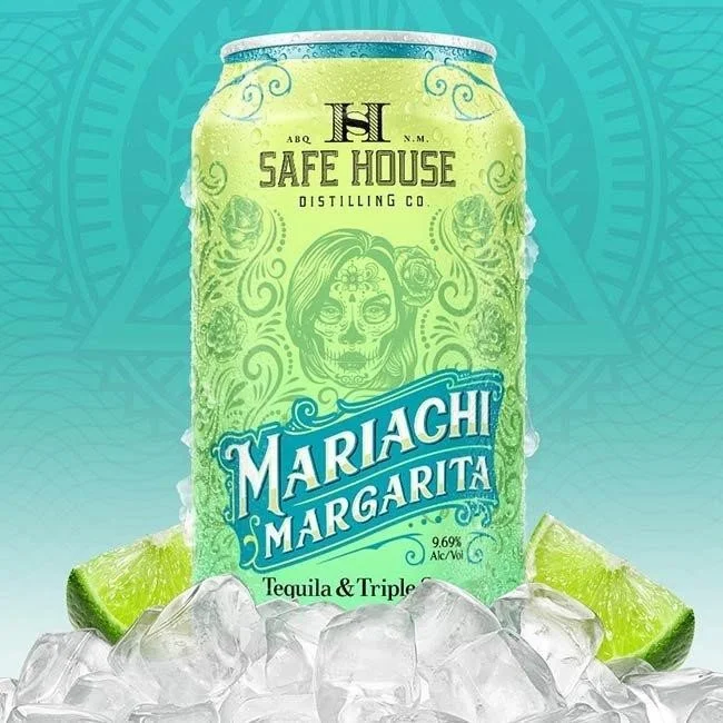
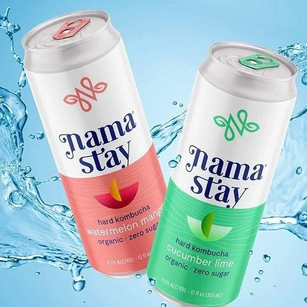
The visual appeal of your label has a strong effect on consumer perception. Bright colors, neat layouts, and well placed branding elements increase shelf visibility in your beverage label design. This is called product shelf appeal. Since most buyers make decisions in a few seconds, your label must make an instant impact.
A good can label should reflect your brand story. It should speak to your target audience and stay consistent with your other packaging and marketing efforts. This builds a strong CPG brand identity and helps your product stand out.
Core Elements of a Good Can Label

A great can label starts with the basics. There are key parts that every label should include:
Brand Logo: Your logo must be clear and easy to find. It helps people recognize your brand quickly.
Product Name: Make sure the name of the product stands out on the beverage label graphics and is easy to read.
Visual Hierarchy: Use size, font, and placement to guide the eye. The most important details should be the easiest to spot.
Typography on Labels: Use fonts that match your brand tone. A bold font might work well for energy drinks, while a more elegant font fits premium foods.
Colors: Choose a color palette that matches your brand and product type. Warm tones may work for food items while cool tones can suggest freshness.
Images or Illustrations: These should support your message and never clutter the design.
Brand Consistency: Make sure the label design looks like it belongs with your other packaging. Use the same color themes and design style.
When done right, these elements create a clean and attractive label that gives the customer confidence in your product.
Legal and Regulatory Considerations
Your can label must meet legal standards. The FDA and USDA have clear rules on what information must be shown. This may include:
Product identity (name of the product)
Net weight or volume
Ingredient list
Nutrition facts
Manufacturer's name and address
Allergen information
Barcodes or QR codes
It is important to follow these laws in your beverage graphic design to avoid penalties and to keep customer trust. Always check the latest labeling rules that apply to your product type. For example, beverages often need additional information about serving size or caffeine content.
Following regulations does not mean your label has to be boring. You can still be creative while meeting all legal needs. Just make sure the required information is clear and easy to find.
Design Tips for Different Types of Cans
Not all cans are the same, and your label should reflect that. Different products require different design approaches.
Beverage Cans: These are often viewed from a distance and handled quickly. Choose bold fonts and bright colors that catch the eye. Include easy to read product names and clear flavor labels. Carbonated drinks may benefit from energetic designs that reflect movement and refreshment.
Food Cans: These are stored on shelves and often examined more closely. Highlight ingredients or use mouthwatering images to create appeal. Use earthy or rich colors to suggest warmth and comfort for soups or sauces.
Think about how the can will be used. Is it meant to be stored in a pantry or grabbed quickly from a fridge? Understanding the context can help you make better design choices.
Print and Material Considerations
The material and printing process can affect how your label looks and feels. Common label materials include:
Paper: Good for dry or short term use but may wear down in humid conditions.
Plastic or Film: More durable and water resistant which is good for beverages.
Metallic Foil: Gives a premium look but may cost more.
The printing method also matters. Digital printing is cost-effective for small batches and allows for full-color designs. Flexographic printing is better for large runs and may reduce unit costs.
Think about durability too. Labels that will be refrigerated or exposed to moisture must be able to withstand those conditions without fading or peeling. You want a label that looks good from the first use to the last.
Final Thoughts
Can label design be a major factor in how customers see your product? A strong label creates brand recognition and makes your item stand out on the shelf. Investing in high quality label design will pay off if you run a new CPG brand or manage a growing line of products.
Every choice you make in your label design helps build your brand. Make sure your labels work as hard as you do to connect with your customers and reflect your values.
Connect with Lien Design to learn more about packaging solutions or explore design services for your next CPG product. Talk to us today and let us make your brand great together.