
You might have a fantastic product, but if it does not grab the attention, then chances are that it will be overlooked on the crowded shelves.
A strong brand image in 2025 helps sellers stand out in the crowded market, as consumers now prioritize what's inside over just the label.
They want a brand that inspires them and creates an experience, as outdated and generic labels can make the best product fade in the background.
In this post, we will explore the top beverage label design Now? of 2025 that can help your brand stand out.
1. Transparent Labels give Product Visibility
94% of consumers are more likely to be loyal to a brand that offers transparency, including clear and accurate product labeling.
These numbers show that modern buyers want to know exactly what they are buying, such as:
What are the ingredients of the product?
Sustainability of the product?
Why is the product different?
Being upfront about your beverage product creates a sense of authenticity and resonates with the consumers. This transparency leads to long-term loyalty as they feel what they are buying. Brands that use beverage label graphics and bold graphics give a polished appearance.
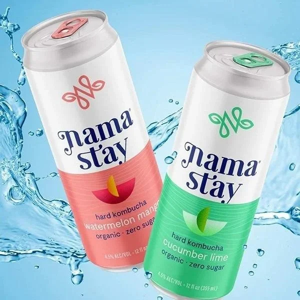
2. Minimalist Label Design:
One of the best trends that has emerged in the sea of products is minimalist design to make a lasting impression. The key goal of effective beverage packaging is to influence the buyer to make a purchasing decision, and this is where minimalist design can play a key role.
A minimalist beverage graphic design approach focuses on simplicity, functionality, and clarity. It means that cluttered labels are out and consumers are embracing philosophy

Simplified layouts
Whitespace to enhance readability
Muted color palettes with one or two accent colors
Minimalist labels signal premium quality and help consumers to process the information at a glance.
3. Bold Typography and Statement Fonts
A font can be a tricky thing, but it should not be something that distracts the reader, and they should be able to read at a glance. Here are some of the key elements of a readable font. Typography-driven labels
Communicate confidence and uniqueness
Improve the brand recall value
Pair seamlessly with minimalist backgrounds
Text is no longer just a supporting but one of the key features in many modern label designs. Brands are using custom typefaces that reflect their identity and some even use metallic or holographic finishes that shimmer under light and create a striking effect. These typography-driven labels do more than look attractive.
4. Mascot variations:
A unique mascot can have a lasting impact on customers. This reflects your brand's personality to create a strong brand image that lasts.
One of the best things about some of the big brands is that users can picture their brands with mascots. Kellogg's and McDonald's are some of the brands that brand their product via mascots.
Mascots add personality to the brand and create an emotional connection. Creating a memorable mascot will be one of the key decisions that changes the brand image in 2025.
5. Textures and Tactile Finishes:

Brands know that creative packaging design should stand on the shelves. But when there are many products that are vying for attention, going along with colors and container shapes is not enough. That is, there has been a breakout of the tactile label trend.
Adding a textured dimension to the beverage labels makes the brand a premium and memorable experience. This can be particularly good for luxury goods, wine, and perfumes.
These textures make the packaging feel special and memorable and that is why it is important in markets where branding must show quality and sophistication. Textured labels improve the appearance of products on store shelves, and they have become a key part of the identity and story of the product.
6.Die-Cut Labels:
Die cut labels are custom labels created using die cutting. These labels serve an important function to brand the product.
Die-cut labels are labels that are cut into custom shapes instead of traditional squares or rectangles. This packaging trend offers brands the freedom to design labels that match their identity and stand out on the shelf.
One of the biggest advantages of die-cut labels is their versatility. You can apply them to various surfaces such as bottles, jars, boxes, and flexible pouches. They are also cost-effective when produced in large quantities. This is what makes them ideal for brands that want bold results without a high price tag.
7. Geometric Patterns and Shapes:
Simple, clean lines are sure to capture your attention. Geometric patterns and shapes are a popular design choice for modern labels. They offer a sense of order and sophistication that makes people notice them right away. These patterns create visual impact while maintaining a clean and organized look.
Using shapes on labels can help guide the viewer's eye and highlight specific details about the product. They also provide a design language that can be used in many industries, including skincare tech accessories and wellness products. Geometric labels often look good with minimalist layouts or contrasting color blocks that add depth without overwhelming the overall design.
8. Eco Friendly Materials and Sustainable Design
Sustainability has become a basic expectation for today's consumers. Companies that use eco-friendly materials and sustainable design in their products show that they care about the environment and are committed to reducing their impact.
This is a smart way to package products and makes customers trust the company more. It also makes more people want to buy from the company, as it shows people that you support businesses that are responsible.
Sustainable label design is about more than just choosing the right materials. It includes smart design techniques that reduce waste during production and improve recyclability.
9. Cultural and Regional Influenced Label Design
Designing labels that are inspired by culture and region helps brands connect with consumers on a deeper emotional level.
Regional influences are especially powerful in industries like food and beverage and artisan crafts. A wine label that reflects the design style may show where the product comes from and why it is unique.
This design approach also supports storytelling through packaging. It encourages customers to learn more about where the product comes from and the culture behind it.
Brands that embrace cultural and regional influences show respect for tradition while appealing to global markets looking for diversity and depth in design.
Conclusion

Every choice that your brand makes is a signal of what your brand stands for. The real question for brands is not just "How do we stand out on the shelf?" but "What lasting impression will our label leave in someone's mind?"
If your label could speak to a future customer, what story would it talk about your brand, and would it be a story they want to be part of?
We at Lien Design can turn your brand ideas into reality when you work with us. We can help you express your vision through label designs with our extensive experience. We help your packaging and labels to show the world what it deserves.
Read More: How to make a beverage label stand out