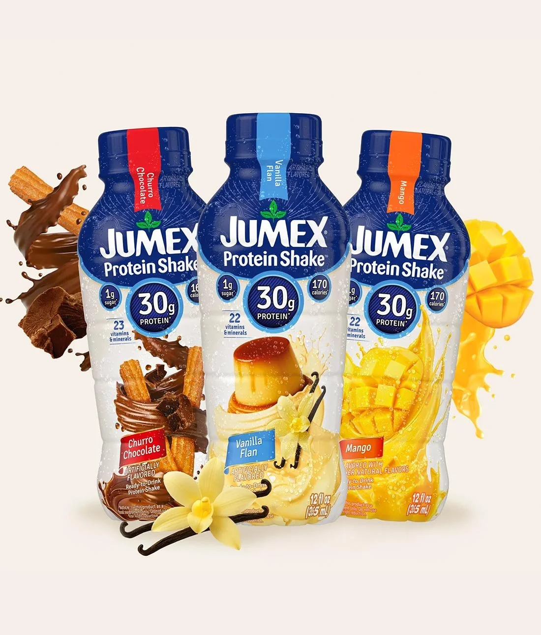
Jumex already has a really recognizable look, so we didn’t want to reinvent the brand for its new Protein Shake line. The challenge was figuring out how to make it feel like Jumex, but still look believable in the protein drink category.
We kept the familiar blue and white branding up top and gave the Jumex logo plenty of room. The large 30g Protein callout became one of the main focal points on the front, since that’s likely one of the first things a shopper is looking for. Other nutritional information is there too, but we tried not to let the front of the bottle turn into a bunch of competing claims.
The flavor imagery does a lot of the heavy lifting. Churro Chocolate has a much richer, more indulgent feel, with chocolate and churro imagery wrapping around the lower half of the bottle. Vanilla Flan is softer and creamier. And Mango is bright, colorful and much more fruit-forward. Each one has its own personality, but they still clearly belong to the same product line.
We also used color at the neck of each bottle to make the flavors easier to tell apart. It’s a pretty simple detail, but it helps when several varieties are sitting together on a shelf or in a refrigerated case.
A lot of protein drink packaging can start to feel overly technical or gym-focused. We wanted these to feel more approachable and more like something you’d actually want to drink.
The finished protein shake package design gives Jumex a strong entry into the ready-to-drink protein category while still feeling connected to the brand people already know. It’s a good example of how beverage packaging, bottle design and CPG branding can introduce something new without making the brand itself feel unfamiliar.