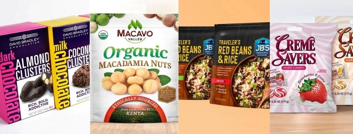
When you walk down any aisle (or scroll any marketplace), you'll notice a common pattern among all the best-sellers - Their packaging and labels quickly communicate one clear promise at a glance. The best packaging design does that with smart hierarchy, high-contrast visuals, and a message that feels immediately relevant to the buyer.
Great packaging is not only about the visual appeal but also decision support to the consumers. It allows them to notice the type of product quickly, trust it more quickly and recall it later, which is why the packaging design is commonly considered a key determinant of perception and purchase behavior. In this blog, we will discuss the crucial elements of a packaging design that capture customers' attention and how you can ensure that your product incorporates those elements.
What "Instant Attention" Really Means?
Instant attention is not the same as "loud." It's the moment a shopper's eye lands on your product and can answer three questions in under three seconds: What is it? Who is it for? Why should I care?
That speed comes from clarity. When design tries to say everything, it usually says nothing, so the goal is to reduce cognitive load while increasing desire (through taste cues, texture cues, or lifestyle cues that fit your category).
The Visual Hierarchy That Wins Shelves
The fastest way to earn attention is to control the order of information. Your front panel should guide the eye intentionally - brand, product type, and the primary benefit should be readable without effort.
Here are the hierarchy elements that tend to perform well in real shopping conditions:
Brand mark: Visible first, consistent across the line.
Product type: Unmissable (e.g., "sparkling water," "protein oats," "hot sauce").
One primary benefit: Not a paragraph - one sharp promise.
Flavor/variant: Designed as a navigational cue (color or icon system helps).
Trust builders: Simple proof points (certifications, key ingredients, "no added sugar," etc.).
If you're in a label-heavy category, the best packaging design must also balance beauty with transparency, since many shoppers actively scan ingredient, nutrition, sourcing, and sustainability information.
Key Takeaways
The best packaging grabs attention by communicating one clear promise in under three seconds.
Strong visual hierarchy - brand, product type, and one primary benefit- drives faster recognition and trust.
"Instant attention" comes from clarity and restraint, not loud design or overcrowded claims.
Modern, disciplined design systems help products feel premium, current, and memorable across shelves and screens.
Winning packaging reduces cognitive load while triggering desire, guiding shoppers effortlessly toward purchase.
Modern Cues That Feel "Now"
Shoppers often equate contemporary visuals with better quality, even when the formula hasn't changed. A strong modern packaging design usually leans on:
Fewer fonts and more intentional typography.
Bold negative space.
Controlled color systems.
Simple, iconic shapes or illustrations that still read at thumbnail size.
Tactile finishes used sparingly.
The key is restraint. "Modern" isn't a template; it's a disciplined system that looks current today and still credible two years from now.
Food Products: Turning Browsing Into Craving
With food, attention is emotional first. People buy with their senses, so food packaging design works best when it makes the product feel vivid -crispy, creamy, fresh, indulgent, or comforting, without needing a long explanation.
Three practical ways to trigger appetite while staying premium:
Use "taste signals" that match the product (warm tones for baked goods, cool tones for refreshing drinks, natural earth tones for clean-label items).
Make the hero visual unmistakable (photo, illustration, or ingredient collage, choose one approach and commit).
Keep claims secondary to appetite (benefits support desire; they shouldn't replace it).
What the Best Brands Do?
Some brands become recognizable because packaging assets are treated like brand property. Elements like shape, color, and layout become identifiers, not just decoration.
On crowded cookie shelves, Oreo is often referenced as a classic case of recognizable color and logo-first simplicity, using a familiar blue and a clear brand block that's easy to spot quickly.
The lesson isn't "copy the look." It's: build one or two distinctive assets (shape, layout, color, pattern, or illustration style) and use them consistently until shoppers can find you instantly.
Step-By-Step: An "Attention Audit" Checklist
Use this checklist to evaluate whether your packaging will win the first three seconds, both online and in-store.
Do the "5-foot test": Can you identify product type and variant from 5 feet away?
Do the "1-second test": Cover everything except the front panel - does it still communicate the main promise?
Check hierarchy order: Brand - product type - primary benefit - variant - trust cues (in that order).
Validate contrast: Text must be readable under harsh retail lighting and on mobile.
Simplify claims: Keep one core benefit on the front; move supporting details to side/back.
Build a system: Ensure the design scales across flavors, sizes, and future line extensions.
Stress-test with real shoppers: Show a shelf set and ask, "What is this?" and "Which one would you try, and why?"
If you fail steps 1–3, no amount of premium finish will save the design.
Common Mistakes That Kill Attention
Most underperforming packs don't have a "bad idea"- they have too many ideas at once. Watch out for:
Overloaded fronts.
Weak product-type cues.
Low-contrast typography.
Inconsistent line architecture.
Trend-chasing without strategy.
Fixing these is often more about editing than adding.
Final Words
With the wide nature of the market, it is difficult to be different from others. This is where having the best packaging design can work in your favor. Nonetheless, in order to make sure that your logo attracts the consumers, it is essential to be aware of the most important aspects.
In case you want to engage an expert packaging designer to make your vision come alive, get in touch with Lien Design for proper guidance and quality service.
FAQs
What makes packaging capture attention in seconds?
A clear visual hierarchy, high legibility, one main benefit, and distinctive brand assets (like a consistent color block or layout) usually win the first glance.
Should packaging prioritize brand or product information?
Both matter, but in order: shoppers need to identify the product type first, then recognize the brand, then understand the benefit.
How do I design packaging that works online and in-store?
Design for thumbnails and shelves: strong contrast, fewer words, and a hero element that stays recognizable at small sizes.
What's the biggest mistake brands make with packaging redesigns?
Changing too much at once. Keep recognizable equity (core colors, layout cues, key icons) while modernizing structure, typography, and clarity.
How can I test packaging before printing thousands of units?
Mock it up, place it in a competitive shelf set (or an e-commerce grid), and run quick shopper interviews focused on "What is it?" "Who is it for?" and "Why would you buy it?"