
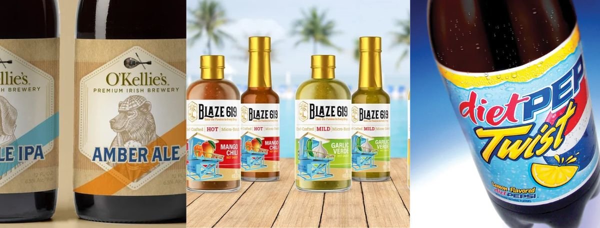
Let's be real- beverage packaging moves incredibly fast. Most trend roundups you read online just recycle the exact same five talking points we've all seen since 2022. But what actually gets someone to pull a drink off a crowded shelf today looks radically different. We are seeing a massive shift where mono-material formats are completely replacing complicated multi-layer setups, and cans are suddenly the main event instead of a budget compromise. Throw in a sharp divide between stripped-down minimalism and loud, maximalist artwork, and it becomes clear the game has completely changed. If you want to nail current packaging design trends, you absolutely have to grasp these core shifts.
This post cuts through the industry noise to break down what is genuinely driving sales in 2026. We'll walk you through navigating these 2026 CPG visual identity shifts so you can apply them directly to your own brand. Expect an honest look at sustainability moves that go way beyond slapping a green leaf on a label, the minimal vs. maximal debate, functional beverage cues, and a very real retro revival.
Sustainable Packaging Is Getting More Specific, Not Just More Visible
In 2026, sustainable packaging design has finally matured past basic recyclability promises and those generic green leaf icons. We're seeing a massive push toward reduced-material formats- like mono-material cans or lighter glass- and containers built specifically for everyday recycling streams rather than specialized, hard-to-use programs.
Mono-Material and Reduced-Layer Formats
Because single-material formats actually make it through municipal recycling systems, mono-material packaging is rapidly replacing complex multi-layer laminates.
Brands are actively ditching composite pouches and foil-lined cartons in favor of single-polymer options that standard facilities can handle with ease.
Retailer scorecards are forcing this structural change just as much as everyday consumer demand for eco-conscious beverage containers.
Visible Sustainability Cues, Without the Greenwashing
Shoppers and lawmakers alike are cracking down hard on greenwashing, making vague eco-friendly claims completely useless on today's shelf.
Instead, brands are leaning heavily into visible sustainability cues like uncoated stock, clearly stated recycled-content percentages, and muted natural palettes.
To actually succeed with current packaging design trends, your label needs to offer specific, verifiable facts rather than just pretending to care by using green ink.
Bold Minimalism vs. Maximalist Illustration: Two Opposite Bets
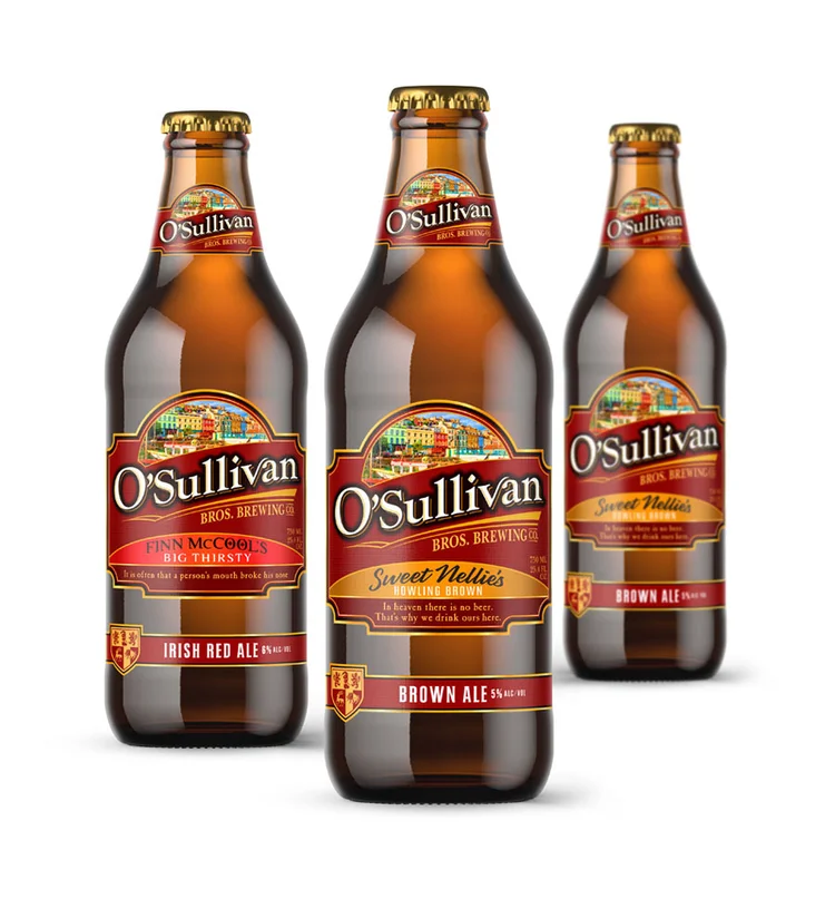
Beverage packaging in 2026 isn't settling into one uniform style; it is aggressively splitting in two totally opposite directions. Brands are either embracing strict minimalism to project premium clarity, or they are going all-in on wildly detailed illustration to win purely on personality and visual noise.
Bold Minimalism
Using just a single dominant color, intentional negative space, and huge type strongly signals a modern, high-end vibe.
This minimalist packaging approach absolutely dominates the spirits and better-for-you aisles, where shoppers need to sense brand confidence instantly.
Since so many brands do this now, you have to rely on flawless typography, smart color choices, and often a matte finish for solid shelf visibility.
Maximalist Illustration
Acting as the total opposite approach, maximalist illustration leans heavily on dense patterns, hand-drawn art, and highly saturated colors.
You will see this look everywhere in craft beer and personality-driven brands where standing out matters a lot more than showing restraint.
If it isn't expertly art-directed, it just looks like a mess- which makes having smart beverage retail shelf strategies absolutely crucial to pulling it off.
Functional-Beverage Design Is Borrowing From Skincare, Not Energy Drinks
Functional and better-for-you drinks are completely rethinking how they present themselves to the world. Instead of relying on the glaring, high-energy aesthetics of older sports drinks, they are borrowing functional beverage cues straight from high-end supplement and skincare lines- think calming, earthy colors and clean, clinical text.
Muted, Ingredient-Led Color Palettes
Those neon, aggressive colors are out, making way for muted, ingredient-led palettes that feature sage, clay, oat, and soft natural tones.
This kind of intentional restraint tells a buyer "this is actually good for you" much better than loud, visible energy ever could.
By quietly adopting established skincare conventions, these drinks manage to build consumer trust almost instantly.
Front-of-Pack Ingredient Callouts
Highlighting specific functional benefits, adaptogens, or electrolytes right on the front is doing way more heavy lifting than the brand name itself.
When someone is scanning the aisle looking for a specific health boost, they want their question answered plainly and immediately.
Putting these details front and center stops people from having to pick up the can and hunt around the back panel.
Can-First Design Is the New Default, Not the Budget Option
Designing "can-first" means treating the aluminum can as your primary canvas from the very start, rather than just awkwardly shrinking a bottle label to fit a cylinder later on. This shift demands full-wrap graphics, colors that hold up on a curve, and layouts optimized specifically for a frosty cooler door.
Designing for the Cooler Door, Not the Shelf
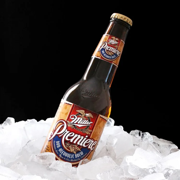
Because cans are now the go-to launch format instead of a cheap fallback, the entire creative process has shifted dramatically.
Taking a look at why beer label design drives craft beer sales perfectly shows why starting with a can-first design mentality works so well.
Designers have to guarantee that colors and text stay perfectly legible when wrapped on a curved surface and viewed from a distance.
This takes real planning and high-converting packaging formats right from concept one, since designing for a glass-door cooler is totally different than a flat grocery shelf.
Nostalgic and Retro-Inspired Branding, Done Precisely
Modern retro branding isn't about slapping together a vague "vintage" mood board; it requires nailing exact references to specific decades, brought to life with today's premium print techniques. This aesthetic manages to hit the sweet spot, pulling in both nostalgic older buyers and younger crowds discovering the style for the first time.
The absolute best retro designs capture a specific era's exact color grading and typography instead of just generally nodding at the past.
This hyper-focused approach feels incredibly authentic and helps brands sidestep that tired, generic throwback look.
We see this working beautifully across different markets, especially in wine, where historic cues are being cleverly reinterpreted.
Take a look at the best wine bottle label design ideas and trends for 2026 for a solid blueprint on pulling off retro aesthetics the right way.
What's Not Working Anymore
Part of mastering beverage packaging trends is knowing exactly what to leave in the past. Those super glossy finishes, cheap stock graphics, and crammed layouts are quickly losing their grip on today's shoppers.
Generic globe or leaf icons are failing miserably now that people- and regulators- demand real, transparent proof.
Stuffing back-label nutrition facts onto the front panel doesn't look transparent; it just looks chaotic and messy.
While high-gloss laminate used to scream "luxury," today it usually comes across as a cheap, budget-tier finish.
Brands leaning on basic stock illustrations- like standard grapes, hops, or generic waves- are getting completely overshadowed by custom artwork.
Aggressive, saturated "energy drink" colors just don't make sense anymore for drinks trying to position themselves as a healthy choice.
Final Words
When you step back and look at these shifts, the biggest takeaway is the raw power of being specific. Whether you are staking a sustainability claim, spotlighting a unique ingredient, or channeling a retro vibe, packaging that makes a precise statement easily beats designs that just gesture at a vague feeling. You really don't need to chase every single fad on a packaging design trends list to win. The trick is to strategically adopt the moves that genuinely fit your brand's specific category and price point.
If you're ready to capitalize on the packaging design trends 2026 demands, Lien Design is here to help. Check out our complete beverage packaging design guide or get a free packaging design estimate to see how we can elevate your brand. We'll sit down, review your exact product, and map out a plan to dominate the shelf.
Why You Should Trust the Experts at Lien Design
To build a beverage brand that genuinely connects with people and dominates the aisle, you need an expert packaging designer in San Diego. That's exactly where Tom H. Lien comes in. As the founder of Lien Design, Tom brings over two decades of top-tier agency experience paired directly with boutique, personalized service. His classically trained team doesn't just make things look pretty; they focus entirely on measurable sales growth. Partnering with Tom means investing in an evidence-based design architecture that turns a quiet product into a powerful, undeniable brand.
FAQs About Packaging Design Trends
What's the biggest packaging design trend right now?
The biggest shift is mono-material and reduced-layer packaging, driven by retailer scorecards and shopper demand, alongside a sharp split between bold minimalism and maximalist illustration strategies.
Is sustainable packaging still trending in 2026?
Absolutely, but vague eco-friendly claims are out. Brands are replacing them with verifiable moves like using mono-material formats and clearly stating their recycled-content percentages right on the label.
What packaging design trends are fading out in 2026?
Generic sustainability icons, cluttered front-of-pack nutrition panels, glossy laminates on premium products, and generic stock illustrations are all quickly losing their effectiveness on the modern retail shelf.
Do these trends apply to non-alcoholic and functional beverages too?
Yes, functional drinks are actually driving many of these shifts. We see this especially with the move toward muted, earthy color palettes and highly visible front-of-pack functional ingredient callouts.
How often should a brand redesign its packaging to stay current?
Smart brands typically revisit their packaging every few years rather than blindly chasing fads. The primary goal is always to stay legible, relevant, and maintain a premium feel on the shelf.