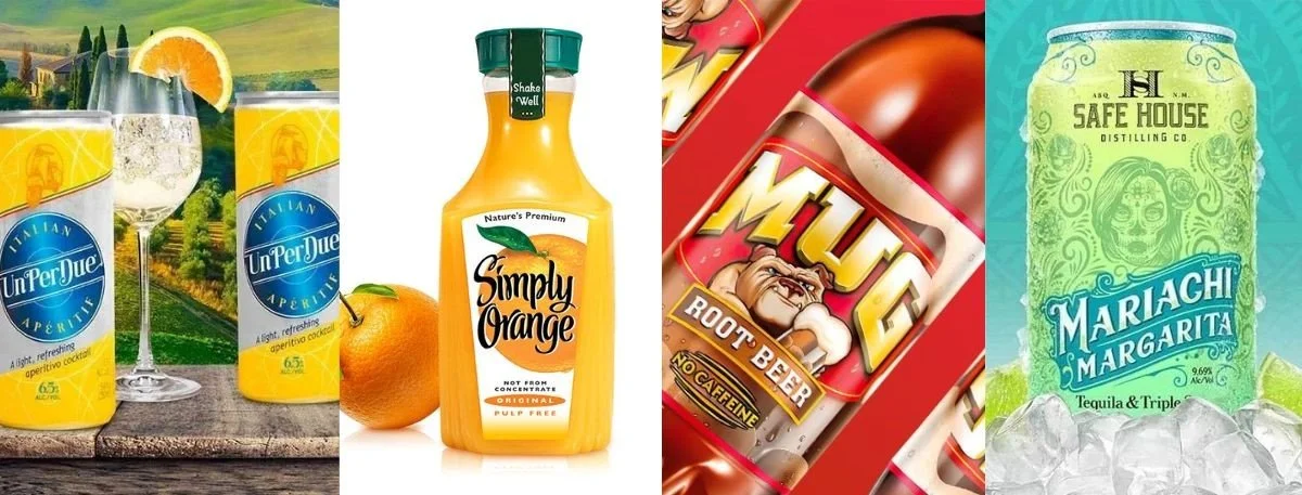
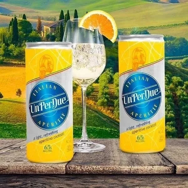
There is a reason why some bottles fly off shelves while nearly identical ones sit untouched for weeks. It is not always about the product inside. Consumers rarely get that far on a first encounter. What stops them- or does not- is the beverage label design staring back at them from the shelf. That first visual impression sets the tone for everything: perceived quality, price worthiness, and whether the product even gets a second glance.
A label is not decoration. It is the brand's only representative at the most critical moment- when a stranger is deciding whether to reach out and pick it up. Get the design right, and an ordinary product suddenly feels premium. Get it wrong, and even a genuinely exceptional product rarely gets the chance to prove itself. This blog covers exactly what separates labels that sell from those that do not.
What Makes a Beverage Label Design Effective?
Not every good-looking label sells. Effective beverage label design collapses an entire brand identity into a few square inches and makes the right person feel something- instantly.
That feeling might be curiosity. Trust. Aspiration. But it has to land fast.
A strong label does three things at once-
Tells the buyer exactly what the product is and who it is for.
Creates an immediate emotional impression- sophistication, warmth, playfulness, or authority.
Signals quality through visual choices alone, long before the product is ever tasted.
The Design Psychology Behind Perceived Value
Consumers do not just see a label. They feel it. And that gut reaction is shaped almost entirely by design choices most buyers never consciously notice.
Color is one of the biggest drivers-
Deep navy and black suggest refinement and sophistication
Gold communicates luxury without a single word
Earthy greens and browns anchor a product in craft and nature
Bright, high-contrast palettes signal energy and excitement
Typography works the same way-
Classic serif fonts with careful spacing say heritage and patience.
Clean sans-serif fonts feel modern and direct.
The wrong font, even on an otherwise strong label, can quietly undermine premium positioning in ways that are hard to pinpoint but immediately felt.
White space is where most brands get it wrong-
Crowding a label with information signals cheapness, even unintentionally.
Giving elements room to breathe signals confidence.
Premium labels feel calm, deliberate, and confident.
Did You Know? Shoppers form packaging opinions in under 90 milliseconds- and those first impressions directly shape their assumptions about product quality, taste, and price worthiness.
How to Create Eye-Catching Beverage Label Graphics?
Beverage label graphics are where strategy meets execution. A smart concept that does not hold up under retail lighting- surrounded by competing bottles- is a concept that fails where it matters most.
Step-by-Step Checklist for Standout Label Graphics
Step 1 - Lead with brand personality, not aesthetics
Define what the brand stands for before choosing a single color. Artisan? Playful? Luxurious? Every visual decision should follow from that answer.
Step 2 - Build a color palette with emotional intent
Choose two to three colors that match how the target buyer should feel. Pleasant colors are not enough- they need to say something specific.
Step 3 - Pick typography that earns its place
One strong display font for the brand name. One clean secondary font for supporting text. Nothing more.
Step 4 - Balance imagery with negative space
Strong beverage graphic design is never cluttered. Whether the approach is illustrative or minimal, every element needs a clear reason to be there.
Step 5 - Design for every format
The label must work on glass, aluminum, cartons, and website thumbnails. Test across all formats before committing.
Step 6 - Proof at actual size
Always review at true product scale under real lighting before finalizing. Screen designs can lie.
Why Is Beverage Graphic Design Important for Sales?
Here is where design becomes a business conversation. Beverage graphic design has a direct relationship with sales through what behavioral scientists call the "halo effect." When a single visible attribute signals quality, buyers automatically assume that everything else meets that same standard.
Put two bottles of cold brew coffee side by side-
One has a generic, template-style label.
The other has a considered color palette, a confident logo, and intentional typography.
The second bottle commands a higher price and earns more trust- not because the coffee is better, but because the design says it is
The commercial case goes further-
A beautifully designed bottle becomes organic marketing in a world where products get photographed and shared constantly.
Every social media post featuring it is a reach that no paid campaign can fully replicate.
Strong beverage label design protects margin, builds brand equity, and earns visibility- all at once
What Makes a Wine Bottle Label Look Premium?
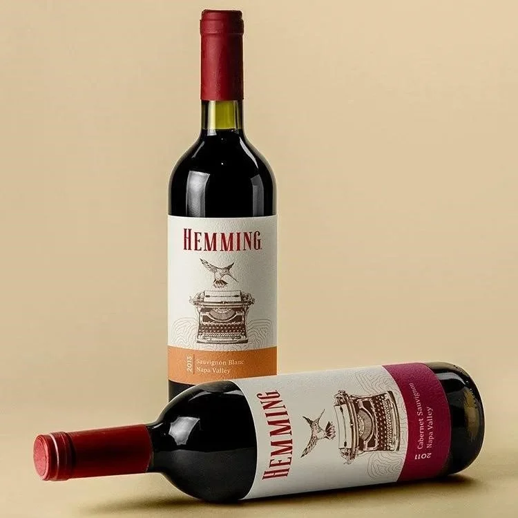
In wine, the label carries an almost unfair burden. Most shoppers are choosing between bottles they have never tasted, from producers they do not know. The wine bottle label becomes the entire basis for the decision.
Premium wine labels consistently share the same qualities-
Restrained color palettes- Rarely more than two or three colors, often anchored by a neutral background.
Quality materials- Textured paper, foil stamping, embossing, or letterpress finishes that communicate craft through touch as well as sight.
Refined typography- Heritage serifs or carefully considered modern fonts that feel deliberate, not selected by default.
Clear visual hierarchy- Winery name, varietal, vintage, and region each hold a defined position without competing.
Intentional negative space- Room on the label signals confidence, not incompleteness.
How to Choose the Right Wine Label Designer?
Choosing the right wine label designer is one of the most consequential decisions a beverage brand can make. Attractive artwork is only part of the picture.
A strong designer brings three things to the table-
Brand strategy- the ability to translate a brand's identity into visual language.
Print production knowledge- foil, embossing, die-cutting, specialty substrates, and how each behaves in real production.
Retail psychology- understanding how shoppers actually behave in front of a shelf.
When evaluating a designer, look for-
A portfolio specific to beverage and wine, not general design work
Strategic thinking- the ability to explain design decisions, not just present them
Familiarity with wine labeling compliance requirements
Designs that have driven sales, not just earned creative recognition
Key Takeaways
Strong beverage label design earns premium positioning before the product is ever tasted
White space is not emptiness- it is one of the clearest signals of quality and confidence on a label
Beverage label graphics must hold up at shelf scale and across every packaging format
A premium wine bottle label communicates quality through material and finish as much as visual design
The right wine label designer combines aesthetic skill, print knowledge, and genuine brand strategy
Final Words
A strong label makes a product feel worth it- before the customer has any other information to go on. That is a significant amount of commercial leverage packed into a small piece of paper. And it is exactly why serious beverage brands treat label design as a strategic priority, not a finishing touch.
If there is a gap between how your product actually is and how it appears on the shelf, that is a design problem with a clear solution. Lien Design specializes in exactly this- pairing visual craft with commercial strategy to build beverage label design that earns its place on competitive shelves.
Contact us through our official website and start building a beverage brand that looks as good as it tastes.
Read More: Beer label design drives craft beer sales
FAQs about Beverage Label Design
Can a label redesign genuinely turn around a product that is not selling?
It can. There are documented cases of brands relaunching with a redesigned label and seeing significant sales lifts without changing the product itself. Design is frequently the variable that holds the product back.
What makes a wine label look premium?
Restrained color palettes, quality print finishes, refined typography, and deliberate white space all signal high perceived value before the product is even opened.
What should beverage label graphics include?
A clear brand identity, purposeful color palette, intentional typography, balanced imagery, and adaptability across different packaging formats.
Why does wine bottle label design matter for sales?
In most retail settings, the label is the only information a shopper has. It must communicate quality and personality in a single glance- making it the primary purchase trigger in the category.
What should brands look for in a wine label designer?
A beverage-specific portfolio, solid print production knowledge, strategic thinking, and a track record of commercially successful work- not just visually impressive concepts.