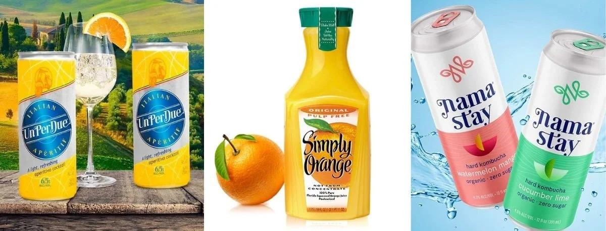
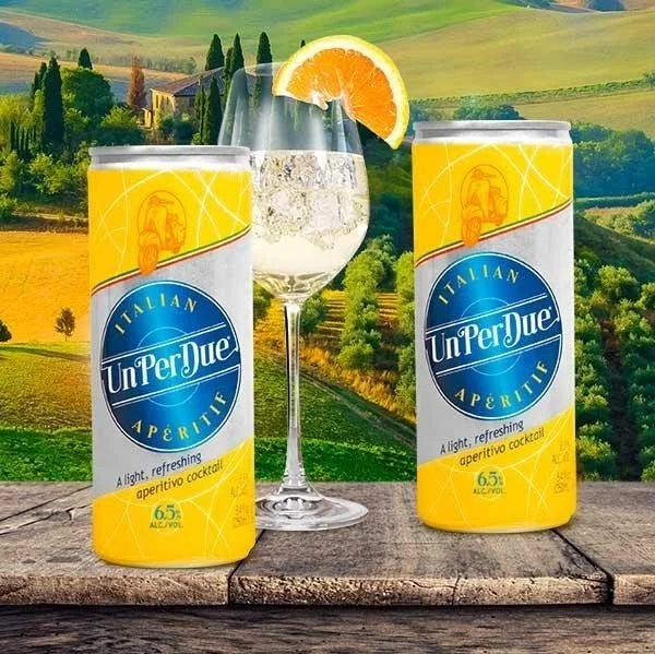
You know that moment when you’re standing in a store, scanning the shelves, and one bottle just calls out to you? You haven’t even tasted what’s inside, but something about it, maybe the way the colors connect, the texture of the label, or even the quiet confidence of the font, makes you trust it instantly. That’s the silent magic of beverage label design.
In a world where everything competes for attention, design becomes your handshake, your first impression, your story told in three seconds flat.
A label can turn an ordinary drink into something people associate with style, emotions, and even their lifestyle. It’s not just what you sell- it’s how you make people feel about holding it. In this blog, we will discuss the reasons why beverage labels matter so much and how they can transform a simple product into a premium one.
Why Does Beverage Label Design Matter So Much?
Most people don’t realize how much packaging guides their decisions. But think about it- how often have you reached for a drink simply because it looked right? Visuals play directly into our instincts, long before logic ever joins the conversation.
Here’s what sets strong beverage label design apart-
It narrates your brand story- A great label captures who you are and why you exist- without saying a word.
It builds instant credibility- Clean structure and professional finish hint at quality inside the bottle.
It creates tactile joy- From matte paper to embossed foil, that little feel under your fingers says “premium.”
It makes you memorable- The right design helps your audience recognize your brand the next time they browse.
How Does Design Psychology Shape What We Buy?
There’s an entire science behind how a label makes someone say, “This one feels right.” Every design choice builds emotional connection.
Color brings emotion to life. Cool shades feel crisp and pure; earthy tones feel grounded; gold shouts luxury.
Typography adds personality. Serif fonts show history and heritage. Sans-serif feels modern and confident.
Imagery and space balance imagination and clarity. White space allows trust to breathe; detailed designs build curiosity.
Design psychology isn’t manipulative. It’s storytelling through the senses. The right balance between color, font, and form can make a drink seem more refreshing, more crafted, even more honest- before the cap is twisted open.
Did you know- A well-designed beverage label can trigger taste curiosity- people often imagine how a drink tastes simply by the style, color, and feel of its packaging.
What Makes Beverage Label Graphics Stand Out?
Think of beverage label graphics as your brand’s “face” in a crowd. You don’t get a second chance to make it recognizable.
What makes graphics pop without feeling overbearing-
Consistency with identity- Every visual element should echo the tone of your brand.
Readability- People decide fast- if they squint, they skip.
Creative simplicity- Great design isn’t busy; it’s balanced.
Adaptability- Your graphics should work whether they’re printed on a glass bottle, aluminum can, or featured in a social ad.
Why Is Wine Label Design So Tied to Prestige?
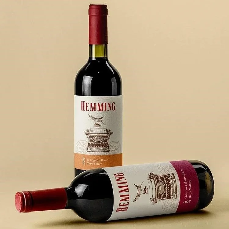
When it comes to wine label design, subtlety often speaks louder than extravagance. This space thrives on tradition, craftsmanship, and just the right amount of mystery.
A well-designed wine label doesn’t shout. It feels timeless. Here’s what gives it that quiet authority-
Muted tones- cream, matte black, or warm silver- that evoke sophistication.
Fine typography that suggests centuries of winemaking wisdom.
Gentle textures that feel expensive without needing to say “luxury.”
Small storytelling touches- maybe a sketch of a vineyard, or a handcrafted logo symbolizing heritage.
Read More: How to choose a wine label designer in san diego california
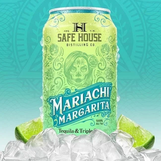
What About Beer? How Does Design Reflect Its Personality?
Beer is where freedom lives. Especially craft beer. The labels here are bolder, funnier, sometimes rebellious- but always purposeful.
Beer label design thrives on individuality. It’s where brands get to wear their personality on their sleeve.
Art-driven concepts- an illustrated mascot, a witty pun, or even pop-art references- invite conversation.
Vibrant palettes help brands stand out in chilled aisles packed with competition.
Typography becomes a playground- loud, playful, and dynamic.
Eco-aware materials reflect a growing concern for sustainability- a trait modern drinkers respect deeply.
Step-by-Step Guide to Crafting the Perfect Beverage Label
If you’re about to design your label, this quick guide helps you think strategically and creatively-
1. Start with your story
Why does your brand exist, and what emotion should your label evoke?
2. Research your audience
Understand who’s buying your product and why. Millennials love authenticity- luxury buyers want refinement.
3. Choose materials that express value
Gloss, matte, or textured- each creates a distinct feel.
4. Create a clear visual hierarchy
Make sure your logo and product name are instantly recognizable.
5. Stay legally compliant
Include all mandatory details- barcodes, nutrition info, disclaimers- without clutter.
6. Test across platforms
Screen, print, and social previews help spot inconsistencies long before launch.
7. Get expert input
Professional designers bridge intuition, storytelling, and trends you might not see.
Great design is teamwork- between brand vision, design instinct, and audience psychology.
What Mistakes Should Brands Avoid?
A strong design can boost sales. A weak one can sabotage trust. Some missteps to steer clear of-
Overloading your label with too much information.
Poor contrast between background and text.
Copying your competitors instead of uncovering your own flavor.
Ignoring printing limitations.
Choosing aesthetics that don’t match your brand voice.
Clarity often beats complexity. And in design, restraint is a sign of confidence.
Key Takeaways
First Impressions- Labels act as a brand’s silent salesperson, shaping perception instantly.
Emotion in Design- Colors, fonts, and spacing influence how people connect with the drink.
Category Personality- Wine leans on elegance; beer thrives on creativity.
Smart Strategy- Testing designs and understanding audiences amplify impact.
Professional Edge- Expert designers pair beauty with brand intelligence for consistent results.
Final Words
A good beverage label design doesn’t just decorate- it transforms. It tells the drink’s story, sets the tone, and makes an instant emotional promise. Long before customers taste your product, they feel it- through design.
That’s the art of transformation- a simple drink becoming something aspirational. At Lien Design, their team doesn’t just “design labels.” They will help you build a visual identity that moves off shelves and into hearts.
FAQs on Beverage Label Design
1. What defines a premium label?
Quality materials, thoughtful simplicity, and finishing touches like foil or embossing that quietly imply sophistication.
2. How does design influence purchase behavior?
Customers respond emotionally before logically. A great design triggers interest, trust, and desire in seconds.
3. Can small brands afford high-end design?
Absolutely. Smart design choices and storytelling often matter more than large budgets.
4. Which beverage categories see the most design innovation?
Craft beer, functional drinks, and boutique wine brands are leading with creativity and originality.
5. Why collaborate with a professional design agency?
Because great design isn’t about decoration- it’s about understanding psychology, markets, and aesthetics seamlessly.