In a crowded retail aisle or on an e-commerce grid, your label has seconds to earn attention, build trust, and make the choice feel easy. Done right, wine label design signals quality, price point, and personality before anyone tastes a drop.
This guide explains what “professional” really means in label design and how a strategic wine bottle label can increase shelf appeal and sales. We will also discuss what to expect from a full concept-to-print workflow- so your next release looks premium, stays compliant, and is ready to scale across SKUs.
What Is Professional Wine Label Design & Why Is It Important for Wineries?
Professional wine label design is a combination of brand strategy, visual storytelling, regulatory knowledge and print production expertise into a single entity. It has a straightforward objective- to make your bottle immediately recognizable, luxurious-feeling, and purchasable.
For wineries, a label isn’t just art. It’s your first conversation with buyers, sommeliers, distributors, and consumers- often before they taste a drop. A professionally designed label also reduces costly print errors and helps your portfolio look consistent across varieties and vintages.
How a Strategic Wine Bottle Label Increases Shelf Appeal and Sales?
A strategic wine bottle label allows attention to be directed in the sequence that buyers look at in a natural way- brand, variety, cue and price justification. In case this hierarchy is obvious, shoppers feel secure in using quicker- particularly when they are comparing similar bottles.
Here are five high-impact elements that typically move the needle-
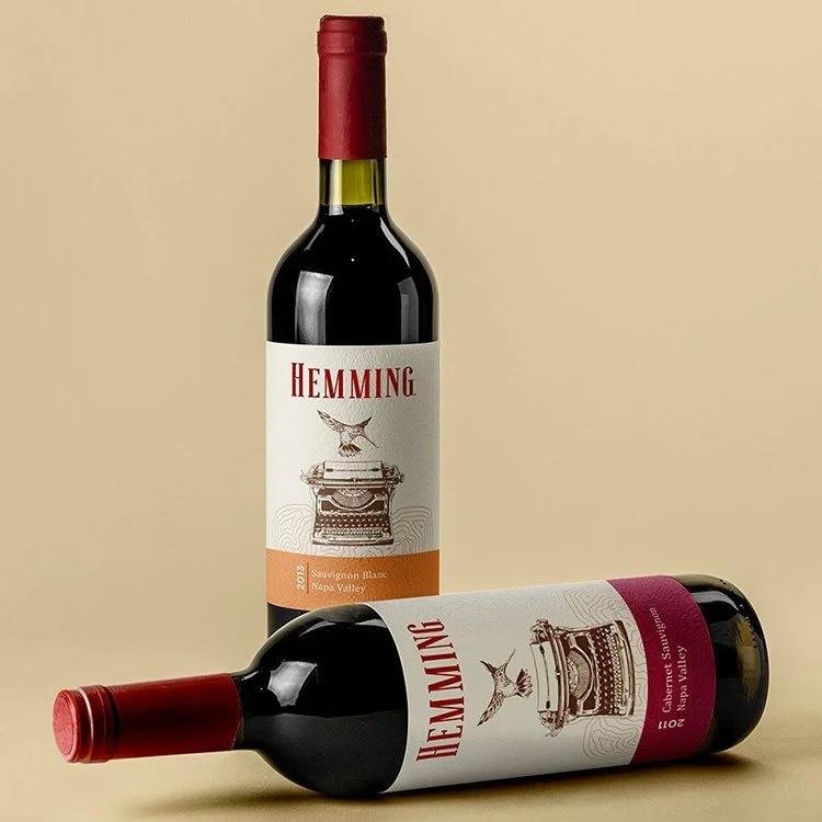
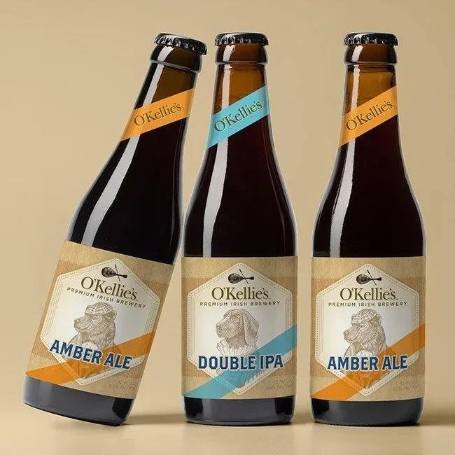
Clear Brand Hierarchy- Your winery name reads from 3–6 feet away, so the bottle doesn’t disappear on the shelf.
Strong Varietal Readability- Customers find Cabernet, Pinot, or Rosé without squinting or turning the bottle.
Premium Materials & Finishes- Paper texture, foils, emboss, and varnish support a higher perceived value.
Visual Differentiation by SKU- Color systems and icons help shoppers “trade up” within your lineup.
Back-label Storytelling- A short origin note plus practical tasting cues reduces purchase hesitation.
Did you know- In many retail settings, shoppers often decide within seconds whether a bottle feels “premium,” and label clarity is one of the strongest drivers of that snap judgment.
Working with an Expert Wine Label Designer for Premium Brand Positioning
A dedicated wine label designer brings an outside-in perspective- what signals premium in your category, what feels overdone, and what will reproduce accurately at scale. This matters because premium positioning comes from consistent details, not just a trendy illustration.
The best collaborations start with positioning inputs, then translate those into type, color, composition, and finish recommendations. You also get practical guidance on what’s feasible for your printer, timeline, and MOQ- so the final look is as strong in-hand as it is on screen.
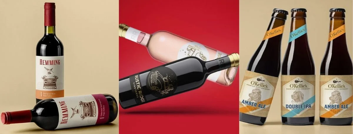
Custom Wine Bottle Label Design for Red, White & Sparkling Wines
Different wine styles often need different visual cues, even within the same brand family. Reds can carry deeper palettes, bolder type, and heavier textures. Whites usually benefit from higher contrast, cleaner spacing, and brighter stocks. Sparkling wines often lean into celebratory finishes and elegant vertical composition to complement the bottle silhouette.
A smart approach is to design a flexible system- one core brand structure that adapts by variety through controlled changes. That way, each SKU stands out without looking like it belongs to a different winery.
Complete Label & Packaging Design Solutions for Wine Brands.
Premium perception is built across the full unboxing and shelf experience, not only the front label. That’s why label and packaging design should be treated as one connected brand system- label, capsule, carton, shipper, neck tag, and case stack visuals.
This is also where beverage label design experience helps, because the same fundamentals apply- legibility at distance, compliant information layout, and consistent brand assets across formats. When all touchpoints match, your wine looks established, even if it’s a newer label entering the market.
San Diego Wine Label Designer for Custom Label & Packaging Design
Working with a San Diego-based partner can be especially helpful if you want responsive collaboration, local print coordination, and faster iteration during pre-press. It also tends to streamline real-world checks like paper samples, proof reviews, and color matching across reorders.
Whether you’re distributing locally in Southern California or scaling nationally, the goal stays the same- build a label system that’s distinctive, production-ready, and consistent enough to support growth across new SKUs and seasonal releases.
From Concept to Print- Our Wine Bottle Label Design Process
A reliable process protects quality and avoids last-minute surprises at the printer. It also keeps stakeholders aligned- founders, winemakers, marketing, and compliance-so feedback is focused, and timelines stay realistic.
Step-By-Step Checklist
Discovery & Positioning- Audience, price tier, channel, competitors, and brand story inputs
Creative Directions- 2–3 routes for typography, layout, and visual language
Label Architecture- Front/back hierarchy, required info planning, and SKU system rules
Material & Finish Planning- Paper stock, foils, emboss/deboss, varnish, and capsule coordination
Pre-press Production- Dyelines, bleeds, color setup, barcode placement, and print-ready exports
Proofing & Print Support- Press checks or hard proofs, then final adjustments before full run
This is also the stage where we ensure your assets hold up in real use cases- cold storage, condensation, and handling- especially for sparkling and chilled whites.
Sustainable Wine Label & Packaging Design for Modern Brands
Sustainability is not a luxury anymore- it is becoming a part of brand credibility. Recycled stocks, papers with a responsible source, lighter materials, and water-based adhesives are some of the options that would not compromise on the premium feel but would decrease impact.
Design plays a role here too- optimizing label size to reduce waste, selecting finishes that don’t complicate recycling, and planning packaging that ships efficiently. The best sustainable solutions feel intentional and on-brand- not like a compromise.
Why Professional Wine Label Design Services Deliver Long-Term Brand Impact?
Professional wine label design services pay off when your brand needs to scale- new varieties, new markets, and new packaging formats- without losing recognition. A strong label system creates brand memory, supports price integrity, and makes your lineup easier to shop.
It also lowers operational friction- fewer printer issues, faster approvals, and smoother reorders because your files, specs, and rules are documented. Over time, that consistency becomes part of your reputation, which is one of the most valuable assets a wine brand can earn.
Key Takeaways
Premium labels start with hierarchy- Make brand and varietal instantly readable
Strategy beats decoration- Design choices should reflect positioning and channel realities
Systems scale better than one-offs- Build a flexible SKU framework for future launches
Print details protect quality- Stock, finishes, and pre-press prevent expensive mistakes
Consistency builds trust- Cohesive touchpoints support long-term brand equity
Final Words
If you want your next release to feel unmistakably premium, invest in a label that’s strategic, production-ready, and consistent across your lineup. Great wine deserves a label that earns attention quickly and holds up to close inspection.
If you’re exploring wine label design support for a premium brand impact- plus packaging that matches- reach out to Lien Design to discuss your goals, timeline, and the right creative direction for your bottles.
FAQs on Wine Label Design
How long does a custom wine label project usually take?
Most projects take 3–6 weeks, depending on concept rounds, compliance review, and print timelines.
What files do printers typically need for a wine label?
Print-ready vector files (often AI/PDF), with correct dyelines, color setup, and outlined fonts.
Can you design a label system for multiple varieties?
Yes, building a consistent system across SKUs is one of the best ways to look premium and scale cleanly.
Do you help with back-label layout and required information?
Yes, good teams plan front/back hierarchy so the required info is clear without crowding the design.
What’s the biggest mistake wineries make with labels?
Overcrowding the front label or choosing finishes that look great on screen but reproduce poorly in print.