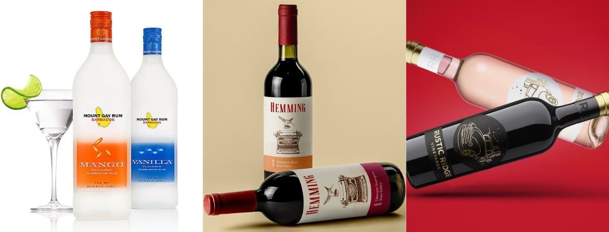
First-time wine buyers rarely walk into a store planning to evaluate tannins, appellations, or barrel-aging. They make a fast decision with limited knowledge, and the label becomes the "front door" to the experience, signaling taste, quality, and fit in seconds. Understanding wine label design psychology helps brands reduce uncertainty, increase confidence, and earn that all-important first purchase.
In this blog post, we will discuss how a wine label design can have a great influence on the buying decisions of a first-time buyer.
Why First-Time Buyers Rely on Visual Cues?
Lack of Brand Familiarity
Almost all new consumers are not aware of producers, vineyards, or importers. Therefore, they cannot depend on reputation. At this point, the label can make the product look familiar: it informs them of what type of wine this is and whom it is targeted at.
This is the reason why the behavior of wine purchasers usually resembles that of other packaged goods. Individuals browse quickly, sift through what they find valuable, and select the most secure (or exciting) option they can afford.
Design as Trust Shortcut
Buyers who are unable to check quality seek what they consider to be believable signals. Professionalism and care can be suggested by clean typography, regular spacing, and a deliberate use of colors. Meanwhile, messy layouts can invoke suspicion. Consider the label as a promise: "This is a bottle that will suit the event you are thinking about." Unless the pictures are aligned to that event (gift, dinner party, casual night in), new buyers pass by without examining the information.
Key Elements That Attract New Buyers
Color Psychology
Color works before words. A first-time buyer often uses color to guess flavor intensity, sweetness/dryness, or mood, even if those assumptions aren't technically accurate.
Common shopper interpretations (use strategically, not rigidly):
Dark, high-contrast palettes often read as bold, serious and premium.
Light, airy palettes often read as crisp, refreshing and approachable.
Warm tones can feel festive or "rich," while cool tones can feel clean or modern.
The goal isn't to follow trends. It's to align color with the product's personality and the shelf context, so the bottle creates immediate shelf appeal next to competitors.
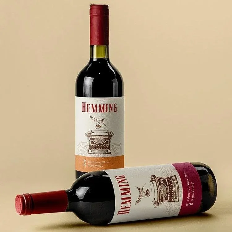
Clear Hierarchy
Hierarchy answers: "What should the buyer notice first, second, third?" If everything is loud, nothing is heard.
A practical hierarchy for first-time buyers:
Brand or collection name (fast recognition point)
Varietal (helps them choose: Cabernet, Pinot Noir, Rosé)
Style cue (dry, sweet, reserve, sparkling, etc., if relevant)
Region/appellation and vintage (important, but usually later in the decision)
Strong hierarchy reduces cognitive load and supports faster decisions, an essential principle in wine label design psychology.
Read More: Wine label design guide
Readable Naming
Names are often the first verbal hook a buyer repeats to themselves. If the name is hard to read at arm's length, you lose the benefit of memorability.
Design for real shopping conditions:
Readable at about 1 meter distance.
Avoid overly thin fonts on textured backgrounds.
Don't let decorative type sacrifice clarity for style.
Step-by-Step: First-Time Buyer Label Scan Checklist
Use this quick checklist to evaluate whether your label communicates in the first 3–5 seconds:
Can a shopper identify the wine type (red/white/rose/sparkling) instantly?
Is the varietal readable without picking up the bottle?
Does the label communicate a clear "vibe" (modern, classic, fun, luxe)?
Are the most important words the largest and clearest?
Is there enough contrast between text and background?
Do the visuals match the likely occasion (gift, dinner, casual, celebration)?
If you answer "no" to 2 or more, consider revising layout, contrast, or typography before printing.
What Makes a Wine Label Feel Approachable?
Avoiding Intimidation
Many first-time buyers worry about choosing "wrong." Labels that feel overly complex can amplify that anxiety.
Approachable labels typically:
Use plain-language cues (when appropriate) rather than insider terminology.
Avoid blocks of dense copy on the front label.
Create a sense of welcome with open space and calm structure.
Approachability doesn't mean "cheap" or "simple." It means the design respects the buyer's limited time and knowledge.
Balanced Design Language
A label can be artistic and still easy to shop. The key is balancing expression with clarity.
Ways to keep that balance:
Pair an illustrative focal point with restrained typography.
Use one primary visual idea (not three competing themes).
Keep decorative elements away from critical information (varietal, name, style cue).
A well-balanced label bridges emotion (why I want it) and function (what it is), shaping wine buyer behavior toward confident trial.
Design Mistakes That Push Buyers Away
Overcrowded Labels
Overcrowding often happens when brands try to communicate every detail up front. For first-time buyers, too much information reads as noise, especially in a small format with foil, texture, or busy imagery.
Common overcrowding triggers:
Too many font styles (looks inconsistent)
Tight spacing and minimal margins (feels stressful)
Multiple focal points fighting for attention (no clear "entry")
When in doubt, remove or relocate secondary details to the back label and let the front label breathe.
Confusing Messaging
There can be situations that can create confusion due to the language (reserve, old vine, proprietary red), or a wrong visual. Unless the buyer can distinguish between the casual and special-occasion wine, they will be hesitant, and everyone knows that hesitation kills conversion. One feasible solution: specify one promise that the front label has to make and make sure that every single aspect reinforces it.
Final Words
When introducing a new wine or revamping the design of an existing one, it is vital to learn the wine label design psychology that draws the attention of customers. A good wine label design can get your wine to shine in the market, if it is designed with a lot of care and the right research.
If you are looking to hire a product label designer to create a label for your wine, check out Lien Design. They are well-versed in designing, thanks to their over two decades of experience.
FAQs
How does a wine label influence first-time buyers the most?
It reduces uncertainty. A clear, well-structured label signals quality and helps shoppers quickly understand what the wine is and what experience it offers.
What label elements do new buyers notice first on a shelf?
They usually notice color, the main image or icon, and the largest text (often the brand/collection name). Varietal is typically next if it's readable at a glance.
Does minimalist label design sell better than illustrated labels?
Either can sell well if it matches the wine's positioning and creates fast clarity. Minimalism can signal modern premium, while illustration can signal personality and approachability.
What's the biggest label mistake for attracting new customers
Overcrowding and weak hierarchy. If shoppers can't quickly identify the varietal or understand the vibe, they move on to an easier option.
How can a brand improve shelf appeal without a full redesign?
Start with small, high-impact changes: increase contrast, simplify fonts, enlarge the variety, reduce front-label copy, and tighten the hierarchy so the top 2–3 messages land instantly.