
Most supplement teams obsess over sourcing, dosage, and novel ingredients, and they should. But in the real buying environment, shoppers usually can't evaluate your formula quickly, and they definitely can't verify quality on sight. That means your label is doing the first job of marketing: making a credible promise fast.
When the supplement label design is unclear, generic, or "too good to be true," even a strong formula can lose to a competitor with better visual communication. In this blog, we will discuss how a label plays a bigger role than your ingredients when it comes to sales and the key steps to check during your redesign phase.
Ingredients Don't Speak, Signals Do
A label acts like a set of trust signals. Before a customer reads your supplement facts panel, they react to cues like hierarchy, whitespace, typography, color, and the clarity of your claim language.
Here's the uncomfortable truth: many customers decide in seconds whether your product feels legitimate. If the front panel looks cluttered, inconsistent, or overly "salesy," people assume the product is low-quality, regardless of what's inside.
The "Credibility Gap" in Supplements
Supplements carry an inherent credibility challenge because consumers have seen hype, sketchy claims, and knockoff brands. Your label must close that credibility gap by looking consistent, compliant, and intentional.
If your packaging looks like it was rushed, shoppers may unconsciously expect the same about your manufacturing and quality checks.
Compliance and Risk: The Label Is Where Brands Get Hurt
Even great brands get into trouble because the label becomes the last-minute dumping ground for claims, disclaimers, and mandated details. That's risky for two reasons:
Regulatory exposure: Structure/function claims, qualifiers, and disclaimers must be handled carefully, and "implied" disease claims can sneak in through design and wording.
Operational exposure: Errors in net quantity, allergen statements, addresses, or Supplement Facts formatting create reprint costs, delays, and retailer issues.
Strong supplement label design doesn't just look good, it reduces business risk by forcing disciplined hierarchy and accurate information architecture.
The Supplement Facts Panel Is Not "Just Compliance"
Customers read it as proof. When the panel is cramped, hard to scan, or visually disconnected from the brand front, it can signal corner-cutting.
A clean, legible, well-spaced panel suggests maturity and quality control, even though it's "only" typography and layout.
Buying Psychology: Labels Win Because They Simplify Decisions
Most shoppers don't compare formulas line-by-line. They use shortcuts:
"This looks premium, so it's probably better."
"This looks clinical, so it's probably safer."
"This looks natural, so it's probably cleaner."
Your label's job is to guide those shortcuts toward your true differentiators, without exaggeration. This is where creative choices matter, because the most effective brands use creative packaging design to make complex benefits feel simple and believable.
Shelf and Scroll: Your Label Competes at Thumbnail Size
On e-commerce, your bottle is usually seen as a small image first. That means your primary benefit and product type must be readable at a glance, or you'll lose clicks before ingredients ever enter the conversation.
Design for "instant comprehension" first, and "deep reading" second.
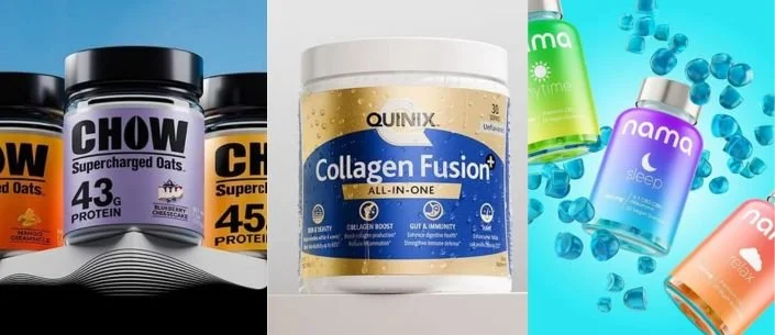
Differentiation: Most Supplement Labels Look the Same
Walk any supplement aisle and you'll notice patterns: black-and-gold - "premium," green - "natural," white - "clinical," loud gradients - "performance." If you follow the category template too closely, you become invisible.
Differentiation doesn't mean being weird. It means being distinct while still communicating the basics clearly: what it is, who it's for, and why it works.
Many packaging design companies can make something attractive; fewer can balance attraction with credibility, compliance, and conversion. That balance is where brands earn repeat buyers, not just first-time trials.
Brand Equity: Labels Build Memory Faster Than Formulas
Formulas are hard to remember. Visual identity is easy to remember.
When your typography, icon system, and color logic remain consistent across SKUs, customers can recognize your brand instantly and "trade up" within your line. That's how labels create lifetime value: they make it easy for people to repurchase and to try the next product.
If you want the best packaging design outcome, think in systems, not single SKUs, because customers don't buy one product forever. They buy brands that feel coherent.
A Practical Checklist: How to Audit Your Current Label
Use the steps below before you redesign, so your next iteration solves the real problems (not just aesthetics).
6-Step Label Redesign Checklist
Define the one-sentence promise: Write a single sentence that explains who it's for, the primary outcome, and the usage context.
Set a front-panel hierarchy: Make sure a shopper can read product type, primary benefit, and form factor in 33 seconds.
Validate claims and qualifiers: Review structure/function claims, disclaimers, symbols, and "implied" language with a compliance-minded lens.
Simplify the Supplement Facts experience: Increase legibility, spacing, and scan-ability; avoid squeezing in marketing language near regulated areas.
Design for thumbnail and shelf tests: Print a mockup and also view it at small size on a phone; confirm it stays readable and distinctive.
Lock a repeatable system: Build rules for typography, color, icons, and SKU architecture so new products don't drift off-brand.
Done well, supplement label design becomes a conversion tool, a trust mechanism, and a scaling asset.
When a Redesign is Worth It?
Consider a label redesign when:
Your conversion rate is flat despite good reviews.
Retailers say you don't stand out.
Your brand expanded into multiple SKUs and now looks inconsistent.
You changed positioning (clinical to natural, premium to value, etc.).
You're entering a more regulated or more skeptical category.
Final Words
Packaging and labels are often known as the 'silent marketers'. No matter your line of products, label designs are one of the most important factors that drive sales. If you're planning to refresh or create a label for a new product, hiring a professional designer is the way to go.
If you are looking to hire a professional designer who is well-versed in supplement label designs, check out Lien Design.
FAQs
Do customers really choose supplements based on the label?
Yes, especially at first purchase. Most shoppers use visual cues to decide what feels trustworthy, and then read details only for finalists.
Should we prioritize a premium look or a clinical look?
Prioritize what matches your positioning and audience expectations. A premium aesthetic can support higher price points, while a clinical aesthetic can increase perceived safety and seriousness.
What are the most common label mistakes that hurt sales?
Crowded front panels, unclear product type, weak hierarchy, and overclaimed benefits tend to reduce trust. Poor thumbnail readability is a major issue for e-commerce.
How do we balance marketing copy with compliance?
Start with compliant claim frameworks and build a design hierarchy around them. Avoid implying disease treatment and ensure disclaimers and qualifiers are properly placed and legible.
How can we tell if our label needs a redesign versus minor edits?
If the core problem is confusion, distrust, or inconsistent SKU architecture, redesign usually wins. If the product is clear and converting well, targeted edits (hierarchy, typography, claim cleanup) may be enough.