Healthy food rarely gets judged only by ingredients. In real shopping environments, crowded shelves, quick scrolls, and split-second decisions, people use packaging as a shortcut for trust, taste, and quality. That's why healthy food packaging design isn't just a "nice to have"; it's often the first proof a shopper sees that a product matches their lifestyle.
Consumers read packaging, whether to their advantage or not, as a story: Is this clean? "Is it premium?" Is it really healthy, or is it being marketed as such? Your graphics, design, and text provide the answer to those questions before anyone looks at the nutritional label. If you're still in doubt about how a packaging design can have a role to play in a customer's decision-making, here is a guide to how a packaging can influence a customer, increase your brand's credibility, and key steps to follow to improve your packaging design
How Food Packaging Design Influences Customer Buying Decisions?
Consumers rely on mental cues because it's hard to verify health claims instantly. Instead, they infer healthiness through design signals that feel familiar, credible, and consistent.
Maintaining Clarity: People associate health with simplicity: fewer ingredients, fewer additives, and fewer mysteries. Packaging that looks overly busy, overly loud, or overly promotional can make shoppers skeptical, even if the product is genuinely nutritious. A clear hierarchy (brand - product type - key benefit - supporting details) reduces cognitive load and increases perceived honesty.
Maintaining Consistency: Once the visuals of a design feel legitimate, typography, color scheme, photography/illustration type, and spacing, consumers will unconsciously interpret the product as a more regulated and more trustworthy one. The same effect can be observed in well-done food packaging labels: the item becomes compliant, thoughtful and less dangerous to try out.
Using Color to Send Clues: Color is one of the fastest perception triggers: Greens often suggest natural, plant-based, fresh, or eco-aware positioning. Whites and light neutrals signal cleanliness, minimal processing, and modern wellness. Earth tones imply rustic, organic, or "from the farm" authenticity. Bright, saturated colors can work for "active" wellness (sports nutrition, hydration, energy), but they must be controlled to avoid "candy-like" associations
Using Font as a Message: The kind of font used to market a product is the first message that you send to a customer. If you are marketing your product as a classy one, using subtle and clear fonts is better. However, if the target base is younger customers, then a label with heavy graphics would be better. The mistake brands make is picking type purely for style rather than meaning. The best packaging design uses typography as a message to the customers.
Materials and Finishes: Packaging is physical evidence. If it feels flimsy or poorly printed, consumers may assume the product quality is equally compromised. Conversely, tactile upgrades (matte finishes, soft-touch, embossed marks, well-chosen paper stocks) can increase perceived value and trust, especially in premium healthy categories.
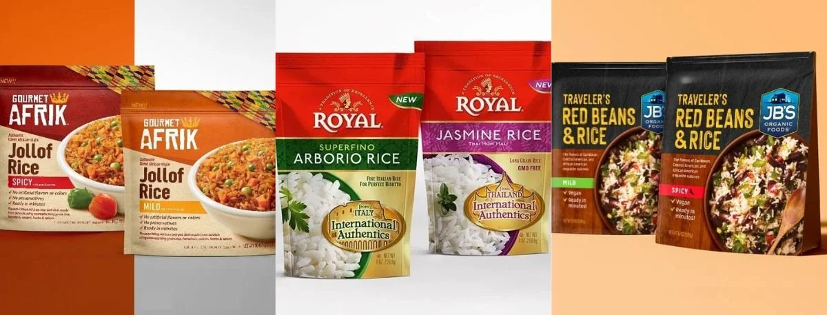
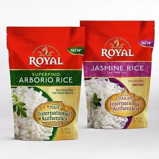
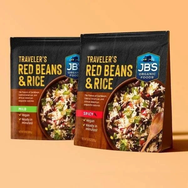
Photography vs. illustration: Healthy products still need taste appeal. The most effective approach depends on your promise: Real ingredient photography supports freshness and transparency. Prepared-serving imagery supports craving and convenience. Minimal ingredient icons support simplicity and easy scanning. Illustration can reduce "processed" vibes, or create a friendly lifestyle identity.
A common pitfall is making "healthy" look sterile. If it doesn't look enjoyable, people assume it won't taste good.
How Does a Label Design Influence Credibility?
Food packaging labels do more than list facts; they help shoppers decide whether to believe you.
Claims must look supported: Front-of-pack claims ("high protein," "no added sugar," "gut friendly") can increase conversions, but only when they're visually balanced. If claims dominate the layout, shoppers may read it as hype. When claims are organized cleanly and supported by clear ingredients, they feel more credible.
Regulatory and readability details build confidence: Consumers may not understand every labeling requirement, but they notice when something feels off: crowded micro type, confusing serving callouts, or messy nutrition panels. Precision creates trust. A polished label system also helps across SKUs, making line extensions easier to shop and easier to recognize.
Perception differs by health-food segment
"Healthy" is not one universal look. Packaging should reflect the specific health motivation driving purchase.
Organic and clean-label: This segment rewards simplicity, ingredient visibility, and calm color systems. It also punishes anything that feels too engineered or overly promotional.
High-protein and performance nutrition: This segment needs function-forward structure: clear macros, quick-read benefits, and bold differentiation, without drifting into "synthetic" aesthetics.
Kids and family health: Parents want reassurance (safety, nutrition, simplicity), while kids respond to fun cues. The best solutions separate "parent trust" signals from "kid appeal" signals so neither audience feels ignored.
Checklist: Improve Healthy Food Packaging Design without Losing Trust
Use this step-by-step checklist to pressure-test whether your packaging supports the perception you want.
Step 1: Define the health promise in one sentence
Example: "Low-sugar snack that still feels indulgent."
Step 2: Choose three proof points shoppers can verify fast
Examples: "10g protein," "no added sugar," "real cocoa."
Step 3: Build a visual hierarchy for a 3-second scan
Brand - product type - primary proof point - flavor/variant - secondary details.
Step 4: Align design cues to the promise
Color palette, typography, imagery style, and layout should tell the same story.
Step 5: Make labels easy to read in real conditions
Test legibility from a distance and under store lighting. Check contrast, font size, and clutter.
Step 6: Create a repeatable system for SKUs
A strong system reduces confusion and helps your line look bigger and more established.
Step 7: Validate with quick consumer feedback
Even a few target shoppers can reveal whether your packaging reads "healthy," "tasty," "premium," or "confusing."
Final Words
If your product is getting lost on shelf, if shoppers misunderstand your health benefits, or if your brand looks inconsistent across formats, it may be time for a packaging refresh or a full system build. By incorporating the services of a professional designer to create or enhance your healthy food packaging design, you can ensure that your product is as good-looking from the outside as it is healthy on the inside.
If you are looking to hire a reliable designer with over two decades of experience, check out Lien Design for all your packaging and design needs.
Read More: Healthy food packaging design