Imagine you're in a store, and you walk down any beverage aisle, and it hits you fast: there are too many choices. Rows of cans and bottles blur together, and most of them claim the same things: better taste, fewer calories, “clean” ingredients, more energy, more hydration.
In that moment, shoppers don’t study. They scan. They reach. And the beverage label design introduces your product before the cap is ever opened. These labels can change the customer's mind without them needing to try a product. This blog will serve as a guide to why label designs can be your strongest market tool.
First Impressions Happen Fast
Retail is a speed game. People are tired, distracted, and in a hurry. Your label has a tiny window to make sense.
Small details carry significant meaning:
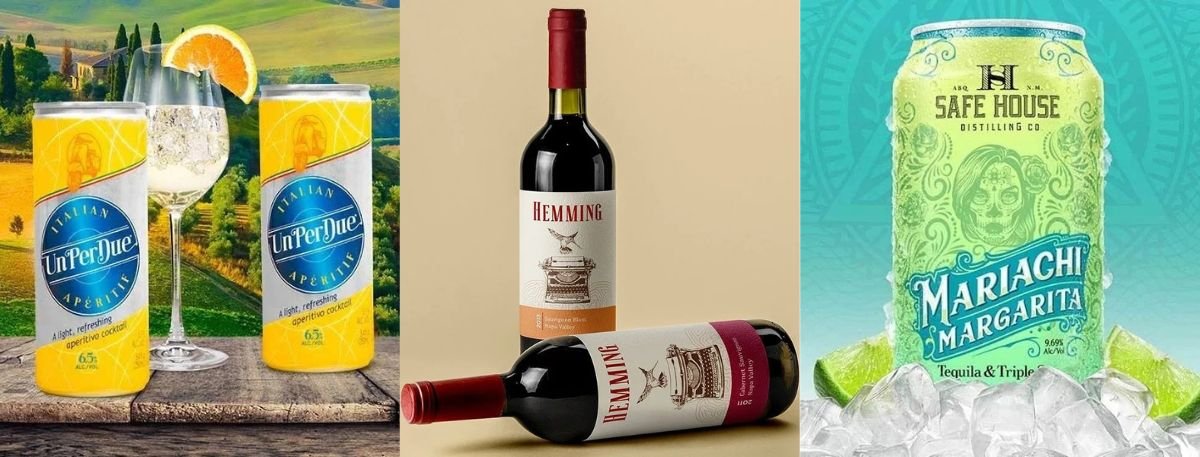
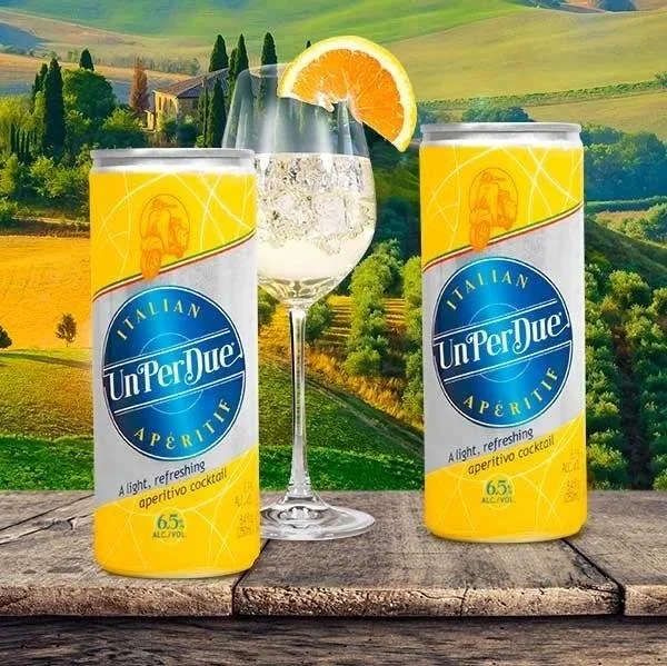
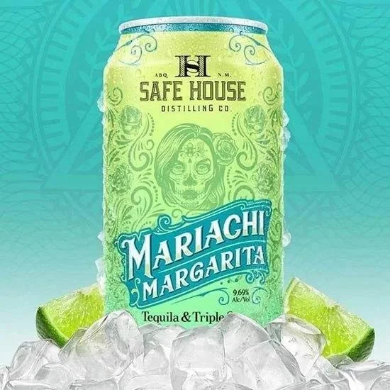
Color signals flavor and mood (lime green feels crisp, deep red feels bold)
Type hints at personality (clean and modern vs. classic and traditional)
Layout shows confidence (clear structure feels trustworthy)
Readability decides whether people bother to learn more
If the front is hard to read from a short distance, it’s already losing. If it looks messy, chances are, the customer will assume the product is messy too.
Your Label Is the Brand’s Voice
A good label doesn’t just “look nice.” It sets expectations. It tells shoppers what kind of drink this is, who it’s for, and what moment it fits into.
Think about how different these feel:
A minimalist sparkling water with lots of white space
A bright, loud energy drink with heavy lettering and bold beverage label graphics
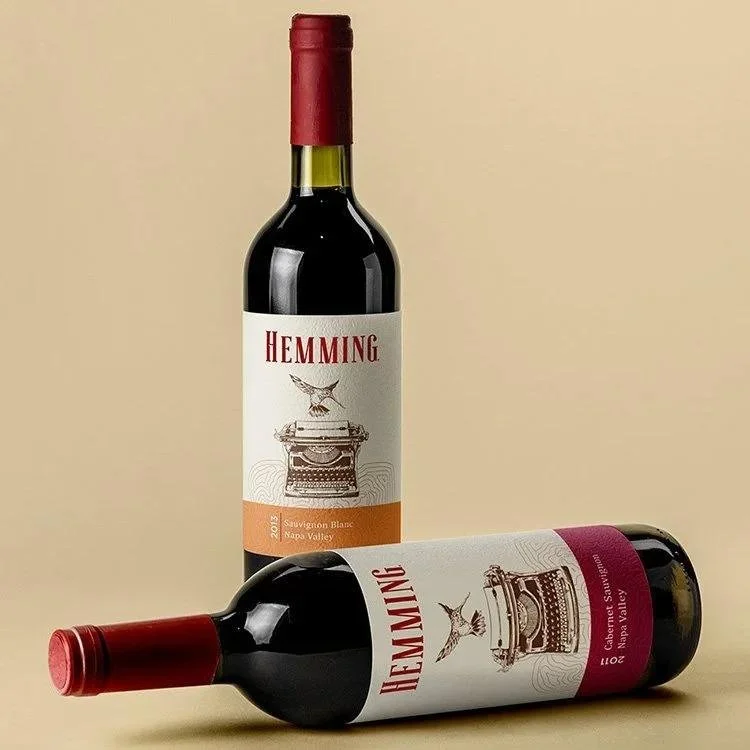
A heritage-style wine label design with ornate details
A playful kombucha with hand-drawn icons
None of those is wrong. The problem is when the label and the drink don’t match. If the design promises premium, but the product feels budget, customers notice. If the label looks childish but the price is premium, people will hesitate to buy.
People Buy Moments, Not Just Drinks
Most beverages aren’t only about thirst. They’re tied to routines and little life moments, gym bag, office desk, late-night drive, weekend hangout, and family dinner.
Design can support that emotional pull:
Cool colors can feel refreshing and “light.”
Warmer tones can feel cozy and comforting
A simple design can feel calm and confident
Detailed art can feel handcrafted and special
When the label fits the moment someone wants, it feels like the right choice. That feeling is a big reason people buy again.
Why Clarity Matters More than Creativity
Standing out matters, but clarity matters more. A shopper should know what the drink is at a glance.
Make the basics obvious on the front:
What it is (soda, tea, electrolyte drink, or a juice label design)
What flavor is it is
What makes it different (zero sugar, caffeine level, protein, real fruit)
Size and key callouts people care about
A simple rule that helps: if someone has to rotate the bottle to understand it, the beverage label design has already failed.
How Quiet Design Choices Create Strong Beverage Brands
The beverage market is crowded and highly competitive. Many brands try to win by being louder, but loud isn’t the only way to be memorable.
Some of the strongest “stand out” choices are actually quiet:
One bold color and a clean layout
A strong icon that’s easy to recognize
A confident name with plenty of breathing room
A clear flavor system that’s consistent across the lineup
Standing out works best when it feels true to the product, not like a costume.
Materials and Finish Change Perception
A label isn’t only graphics. It also feels. Shoppers touch the bottle. They feel the texture. They notice the finish, even if they don’t say it out loud.
Common finish includes:
Matte: This finish can feel modern and premium
Gloss: This finish can feel energetic and bright
Soft-touch: This finish can feel upscale and “designed.”
Embossing or texture: This finish can feel crafted and high-quality
These choices affect how much value people think they’re holding before they taste anything.
Why Being Consistent Matters
If you sell more than one flavor, the brand labels need to be consistent. When someone likes one flavor, you want them to spot the next one instantly.
Ways to build recognition:
Keep logo placement consistent
Use the same font style across flavors
Keep the layout structure the same
Change color by flavor in a predictable way
This makes shopping easier. Easy shopping leads to repeat buying.
Why Staying Up To Date With Trends Matters
Packaging trends come and go. Minimal labels, retro looks, “natural” paper textures, bold type, these cycles keep moving.
It’s smart to stay current, but it’s risky to chase every trend. The best updates keep the brand recognizable while cleaning up what’s dated.
Good “refresh” updates often look like this:
Slightly better readability
Cleaner spacing and less clutter
A tighter color system
Stronger consistency across the product range
If someone already knows your drink, they should still recognize it immediately after the update.
A Label Keeps Marketing After the Ads Stop
While ads and social media posts disappear after a while, a well-designed beverage label design continues to market the product. Wherever the exposure might be (on the shelf, in the fridge, in someone’s hand at the gym or office, or even in photos and videos, people share.
That repeated exposure builds familiarity, and familiarity builds trust. Over time, the label becomes the shortcut in a shopper’s brain: “I know this one.”
Final Words
A beverage label isn’t decoration. It’s your first pitch, your brand personality, and your silent salesperson, working nonstop without asking for a bigger ad budget.When the beverage label design is clear, consistent, and true to the drink inside, it also builds trust, raises awareness about your brand and of course, gives you an edge over the competition.
If you are looking to hire a reliable label designer with over two decades of experience, check out Lien Design for all your label design needs.
FAQs
How much should a beverage label design cost?
It depends on who you hire and how many versions you need. A simple label from a freelancer may cost less, while a full brand system (logo, flavor range, print-ready files) can cost much more.
What’s the biggest label mistake new beverage brands make?
Trying to fit everything on the front. Avoid common clutter traps such as too many badges and claims, too many fonts, too many colors fighting each other, and a layout with no clear message.
Should my label be bold or minimal?
Pick what fits the product and the buyer. Bold works when the drink is energetic or playful. Minimal works when the drink is clean, modern, or premium. Both can win if the design is clear and consistent.
How can I tell if my label will work on a real shelf?
Do a quick shelf test, place it next to 5–10 competitors and check if you can read the name and flavor quickly.
Do label shape and finish really matter?
Yes, especially in the hand. Shape and finish can make your drink feel more expensive and more “giftable,” or more fun and casual.


