Are you wondering why Apple chose the Helvetica font for iPhones? The main reason is the readability of this typeface on smaller screens. Additionally, Helvetica is widely used in macOS, Apple's operating system, due to its clean and modern appearance style. However, this is not the only reason for selecting the Helvetica typeface for such a massively commercial enterprise.
Helvetica is not just a font; in fact, many more inspirations in this typeface force you to choose this font family for any technology.
Let’s explore more hidden truths about the Helvetica fonts family and the reason why Apple has picked this typeface for their devices
Typographical Identity of Apple: Helvetica Neue
The journey of Apple and Helvetica started way back in 2010 when the Apple company began the contract of using their typefaces. As it is a sans serif typeface, it looks quite decent on any size of the text. Helvetica is installed as a system font in macOS, meaning it is automatically activated and locked by the operating system. At that time, the Retina display matters a lot, and the Helvetica fonts deliver this facility.
A single thicker line of this typeface displays high contrast even on low resolution. The font weight is perfect for displaying any textual character, and its viewer will never get bored with this typeface. It is good enough for both capital letters and any other font book smooth curves.

When Apple introduced iOS 7 in 2013, again, the Helvetica Neue was their number one choice for the entire user interface of this smart operating system. Helvetica interacts with other system fonts in macOS, maintaining consistency and legibility across the platform. The legibility of this typeface is again perfect on these devices. The slightly thicker weight of Helvetica Neue again helps this typeface improve the Apple brand’s textual designs. The low-resolution display of this typeface also helps the iOS users for easy on-screen work and retain a legible environment for the viewers.
Unlock the potential of your brand's visual identity with our expert design services. Contact Us Today to learn more!
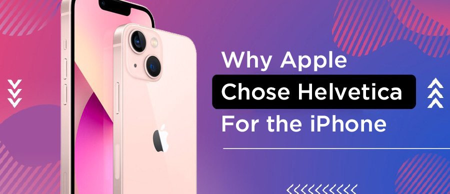
The Secret of Apple Picking the Helvetica Typeface – 5 Simple Reasons
The benefits of a Helvetica Fonts Family are infinite. Apple manages font conflicts on multiple computers, including system font conflicts on macOS, by carefully handling Helvetica to avoid rendering issues and renaming font families when necessary. The iPhones are quite famous, and if you see this font family on these devices, you will surely trust it.
Proper configuration of the font file is crucial to ensure the functionality of applications. The success of this typeface is infinite. Over the years, the designer community has trusted helvetica font free links for classic and modern textual looks. It will rise its popularity and make it a typographic celebrity. The influence of the Apple brand and iPhones is, of course, made this font family so famous as well. Now, let’s come up with why Apple has picked this typeface for their iPhones.

A Classic Look
A classic look of the Helvetica font with a modern touch will make it a game-changing option for many top enterprises. The italic version of Helvetica adds versatility and can significantly impact design aesthetics. It is the right name for many brand owners. Nowadays, some company managers use this typeface as a marketing strategy and try to communicate with their brand consumers.
The impact of this classic look also impresses technologists, and that’s why you have seen this font on iPhones and many other popular devices. The classic view also gives you the luxury to display icons in this font on the top cover of your book or any other similar spot to impress your viewers.
Many other brands adopt this Helvetica font due to better legibility and simplicity. Of course, there is not a shortage of fancy typefaces, but again most designers as well the readers prefer easy-to-read content. They will not take your brand message if you find any difficulty or if system fonts have some legibility issues.
Perfect for any Brand: A Sans Serif Font family
It’s the technology or any other business nature that Helvetica font can be adopted; in fact, this typeface will show great results for every type of industry. Helvetica is part of the fonts included in macOS, making it readily available for users. This is only one user one of the main reasons that Apple chose the Helvetica font for their iPhones.
This standard typeface can be adopted for any nature of business and on any spot to create and display a modern textual look with simplicity. Many other top designers also prefer this typeface because of its legibility and simplicity. They will pick this typeface option in the very first instance and show off their information perfectly.
Technically Stronger Typeface
This sans serif font is quite unique, and that’s why it technically strongly influences its viewer. The different font weights of Helvetica, such as those in the Helvetica Neue LT Std family, enhance its technical strength by providing versatility in design and readability. Many other popular brands also use Helvetica fonts for their brand communication and will get many responses after adopting this typeface. It outperforms many top industrial-level typefaces in both small and large cases. The monotone stroke weights also make it stronger and will provide the right motion to its reader. This will also give enough time to the viewer to think about the brand message hidden behind the content.

Ideal Spacing
Another major reason for this font's popularity, especially on the technology side, is its ideal spacing feature. You can surely adopt this typeface for shorter display areas, and closer contact between its characters will increase its readability.
Many graphic designers also carry this typeface to their personal computers. It is also a perfect way to spread this typeface and adopt it for many of their other enterprises as well. This is another reason this font's popularity is increasing all the time. So, the advantage of this perfect spacing feature will make this typeface so famous.
Functionality and Context
Now, you don’t have any doubt about this typeface’s simplicity and readability. The digital Helvetica typeface is great for both the user interface and other display text of your design. As a screen font, Helvetica is optimized for digital interfaces, ensuring clarity and precision. This functionality helps designers to make their projects more professional and responsive.
These benefits will increase the compatibility of your content. You can demonstrate features of your text more easily to help its viewer with legibility issues. The user believer helps these designers get more results and stand out for their brand’s identity in this jam-packed market.
Enhance your digital presence with fonts that speak volumes. Explore Our Design Solutions now!

Why was Helvetica Font Family so Widely Used?
The Helvetica fonts emerge in every era because of the easy readability of common fonts for all characters. Compared to other commonly used fonts, Helvetica and the same fonts like Arial and Times New Roman are often automatically activated by macOS, making them easily accessible. Legibility and neutrality also make this typeface so popular that many larger enterprises consider this font format for commercial purposes.
The designer community also love helvetica typeface for their logo or other custom designs. The power of this font’s family can be seen in many corporate designs. Apple also chose this font for their iPhones and other devices because of its readability and the right dimensions for any screen. The text size is absolutely perfect on all devices, so you will never think about replacing this default with any other option.
Besides all this, the pro designers are the main source of spreading this typeface. They even download and print this free font for their personal computers and apply this simple font to their major projects. It will increase the popularity of this brand to a great extent.
So Much More than Just a Typeface: Helvetica in Mac OS
Now, you will not consider the Helvetica Fonts Family just a typeface. Compared to Helvetica, the San Francisco typeface, designed by Apple, is also consistent, legible, and friendly. There are many more aids that you have seen in this short post. You also understand the reason why Apple choose the Helvetica font for iPhones. The San Francisco font, however, is specifically used for creating mock-ups of user interfaces in software products running on Apple's iOS, OS X, tvOS, or watchOS operating systems. There is actually not a single reason for this choice; the Apple brand impresses with plenty of good points of the Helvetica fonts family.
You will get the perfect size of your textual data on any resolution of the iPhone. The elegance and simplicity of this typeface will outperform many famous fonts. The designer community also recommends Helvetica fonts for their enterprises. You can also continue your designs with the Helvetica fonts family and show your text in the simplest format.
Join the ranks of iconic brands with our bespoke packaging and branding services. Get Started with Lien Design and elevate your brand!
Frequently Asked Questions for Helvetica Font Apple:
Does Apple use the Helvetica font?
Since the introduction of the 1st-generation iPhone in 2007, Apple has used Helvetica in its software design. iOS for the iPhone, iPod touch, iPad, and Apple TV employs various versions of the font, alongside its use on iPods beginning with the 6th-generation iPod classic and 3rd-generation iPod nano.
Does Mac have Helvetica font?
One noteable font on a Mac is Helvetica. Generally, Helvetica is no longer standard fare on a PC system. So, if you use Helvetica then show it on a PC, the font will be replaced with a similar font, probably Arial but it won't look the same and may ruin your slide layout. Best advice: Don't use Helvetica.
Is Helvetica a free font?
Helvetica is licensed by Linotype, so you would have to pay for it. Helvetica® font family | Linotype.com has the information you would need. You can buy a Web only license for less than a full license. Another option would be to look for free or less expensive alternatives.