In crowded retail aisles, beverage label design often decides whether a shopper pauses or keeps walking. Before anyone tastes the product, the label has already shaped expectations around quality, flavor, trust and price. That is why a well-crafted label does more than decorate a bottle or can. It acts like a silent salesperson that helps a drink feel polished, memorable and worth paying more for.
Why Premium Labels Win Faster
Strong beverage graphic design helps people process a product in seconds. It tells them what the drink is, who it is for and whether it feels modern, artisanal, healthy or indulgent. In categories packed with lookalikes, speed matters. If the visual message is unclear, buyers move on.
Emotion Shapes the First Decision
Shoppers rarely analyze packaging line by line. They react emotionally first, then justify the choice later. Color sets mood, typography signals personality and spacing creates a sense of confidence. Deep greens, muted neutrals and matte black often suggest refinement while bright citrus tones feel energetic and fresh.
Premium Value Is Often Perceived, Not Explained
A label does not need to shout “luxury” to feel expensive. Clean structure, thoughtful contrast and controlled detail can do that work quietly. This is where premium drink packaging design becomes a real growth tool. When the front panel feels intentional, the product appears more trustworthy and more giftable.
Did You Know - Packaging can influence expected taste before the first sip. In consumer testing, people often describe the same drink as more premium, smoother or more refreshing when it appears in elevated packaging rather than plain packaging.
Core Design Elements That Increase Value
Great beverage label design is not about adding more. It is about choosing the right details and arranging them in the right order so the product feels clear and distinctive at a glance.
Color, Type and Hierarchy
Use a visual hierarchy that guides the eye naturally:
Brand name first, so recall builds quickly.
Product type second, so buyers know what they are picking up.
Differentiators third, such as flavor, origin, low sugar, botanical ingredients or small batch cues.
Typography should also reflect the promise of the product. Elegant serif fonts can suggest heritage and craft. Clean sans-serif fonts feel contemporary and direct.
Material and Finish Create Physical Memory
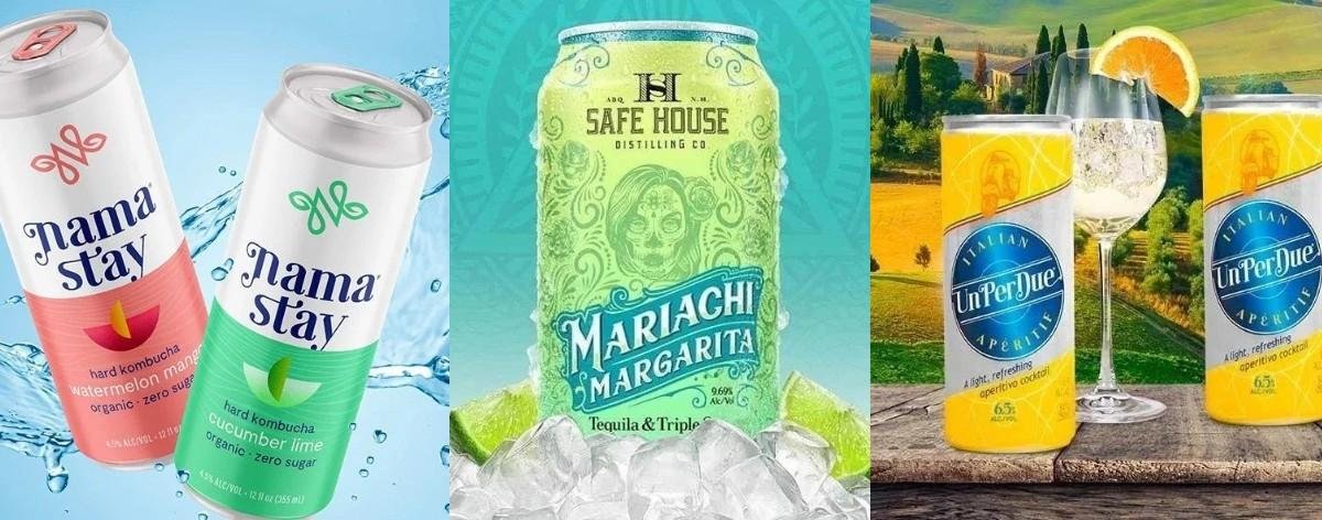
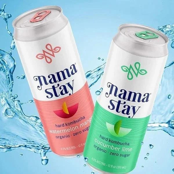
The feel of a label matters more than many brands realize. Matte stock, soft-touch finishes, embossing and subtle foil accents can turn a simple container into something people want to hold longer. For craft-focused launches, beer label design often performs best when bold illustration is paired with sharp readability. That balance creates personality without losing trust.
Before production, review samples through custom beverage label printing so you can test legibility, color accuracy and shelf impact under real lighting.
From Shelf to Screen - Packaging Must Work Everywhere
One major aspect in packaging discussions is that labels no longer live only in stores. Today, your beverage graphic design also appears on quick commerce apps, online marketplaces, social ads and delivery thumbnails.
Design for Tiny Screens and Fast Scrolls
Before approving a label ask:
Can the product name be read on a phone screen?
Does the pack stay recognizable from a distance?
Will the design still stand out when photographed cold and reflective?
This is where shelf ready beverage packaging becomes more strategic. A strong color block, one memorable focal point and simple front panel messaging can improve both retail visibility and digital discovery. Brands that design with both shelf and screen in mind often build recognition faster and waste less time reworking assets after launch.
Sustainability and Compliance Are Now Brand Signals
Another overlooked area is the way sustainability shapes premium perception. Many buyers now associate responsible packaging choices with better brand values and better product quality. That is why current craft beverage packaging trends often lean toward lighter materials, recycled papers, natural textures and restrained ink coverage.
Compliance Should Look Effortless
In alcohol packaging design, legal information must remain readable without overwhelming the front label. A smart layout system helps fit warnings, ABV, barcodes and volume details without making the pack feel cramped.
Brands that also sell mixers, syrups or nutrition-led products can learn a lot from food label design, where transparency is often central to buyer trust. Ingredient clarity, clean claims and honest information do not weaken branding. They strengthen it.
Common mistakes to avoid:
Using too many font styles on one label.
Choosing low-contrast text that disappears in store lighting.
Copying competitor aesthetics too closely.
Ignoring condensation, handling and print limitations.
Conclusion
The best beverage label design does far more than make packaging attractive. It shapes perceived quality, supports premium pricing and helps a drink stand out in stores and online. If you want packaging that feels strategic, distinctive and built to perform, Lien Design can help bring that vision to life.
Ready to turn your bottle or can into a brand asset customers notice instantly? Book a consultation today and create packaging that sells at first glance.
FAQs
1) What makes a drink label look premium?
A premium label usually combines clear hierarchy, refined typography, quality materials and a focused brand story that supports a higher perceived value.
2) How does beer label design affect craft beer sales?
Beer label design helps products stand out in crowded coolers, communicate personality quickly and increase trial by making the style and flavor easier to grasp.
3) Why is alcohol packaging design important for compliance and trust?
Alcohol packaging design matters because it blends legal clarity with strong branding, helping buyers feel confident while keeping the product market ready.
4) How is food label design different from beverage labels?
Food label design often gives more weight to ingredients and nutrition, while beverage packaging relies more heavily on instant visual cues and flavor recognition.
5) What should brands test before final custom beverage label printing?
Test readability, barcode scannability, condensation resistance, color accuracy and how the pack looks on both shelves and mobile screens.
Key Takeaways
Beverage label design shapes first impressions of quality, trust, flavour, and price before the drink is even tasted.
Premium labels help shoppers understand the product fast and stand out in crowded categories.
Strong colours, typography, and clear hierarchy make a label feel polished and more valuable.
Materials and finishes like matte textures or foil accents add a premium feel and lasting impact.
A strong label should work well both on store shelves and on digital screens.
Sustainability, compliance, and clear information now play a bigger role in buyer trust.