A first-time purchase is usually a fast decision. A shopper notices a product, gives it a quick look, and decides whether it feels right. Price matters, of course. But food packaging labels often do the real work- especially the label. It signals what the product is, what it stands for, and whether the brand feels credible enough to try.
Repeat purchases work differently. Customers come back when the product experience matches expectations, and the packaging keeps making life easy. Clear information. Familiar cues. No confusion on the shelf. In this blog, we will cover how labels shape trust, which key elements matter most, how to stand out without sacrificing clarity, and a practical checklist for designing for loyalty.
Food Packaging Labels: The Loyalty Lever Most Brands Underuse
Here’s why the label is so powerful: it sells in seconds, then keeps proving itself at home. For the first purchase, it reduces uncertainty. For the second purchase, it creates recognition- so the customer can find your product quickly and feel confident choosing it again.
When food packaging labels are built with loyalty in mind, they typically deliver:
Instant clarity about what the product is and who it serves
Lower perceived risk through transparent ingredients and allergens
Faster repurchase because the pack is easy to spot in a busy aisle
Brand familiarity through consistent structure across SKUs
The thing is, shoppers do not “study” the front panel. They scan it. If the hierarchy is unclear, they move on.
Did you know? Shoppers often judge product trust by readability. When key details are easy to find and easy to understand, people associate the brand with transparency, quality control, and safer manufacturing standards.
What Are the Essential Elements of Effective Food Packaging Labels?
An effective label feels simple, even when it contains a lot. That simplicity is not accidental. It comes from a clear hierarchy and disciplined messaging.
Core elements that support both conversion and loyalty:
Product name + variant that can be read quickly at shelf distance
A recognizable brand block (logo, color system, placement consistency)
One clear promise supported by 1–2 secondary benefits
Scannable layout (headline, subhead, icons used selectively)
Ingredients, allergens and nutrition information are placed where shoppers expect them
Traceability details (lot/batch area, best-by placement, QR if relevant)
Proof points such as certifications, verified claims, or sourcing cues
And the most important part: the label should match reality. If the product experience falls short of the promise, loyalty breaks quickly.
Healthy Food Packaging Design That Earns Trust Fast
Health-focused shoppers tend to be more careful. They compare options, read ingredient panels, and question vague claims. That makes healthy food packaging design a trust exercise, not a visual trend.
What usually drives repeat purchase in better-for-you categories?
Clean structure with comfortable spacing
Claim restraint (say less, mean more)
Ingredient-forward storytelling that avoids exaggeration
Readable typography for real-world use, not just a mockup
Consistency across flavors so customers can shop quickly next time
Plus, “healthy” can still look premium. Premium is often about refinement- strong type choices, intentional layout, and print details that support the brand story.
What Makes a Food Label Design Legally Compliant & Attractive?
A strong food label design is built with compliance from the start, not patched in later. Late-stage compliance edits tend to create clutter, shrink type, or force awkward layout compromises.
A practical compliance-and-appeal baseline:
Correct product naming conventions for your market
Accurate net quantity statement and proper placement
Correct nutrition format (FDA, EU, CFIA, etc.)
Clear allergen declarations that are hard to miss
Claims that are supportable and appropriately qualified
Legible type sizes with strong contrast
Barcode sizing and placement that scans reliably
But compliance does not have to look clinical. With a smart hierarchy, the required information can feel organized and brand-aligned.
Designing For the Second Purchase, Not Just the First
First purchases are often driven by curiosity. Second purchases are driven by ease and confidence. Your packaging system should make that second decision almost automatic.
What helps most:
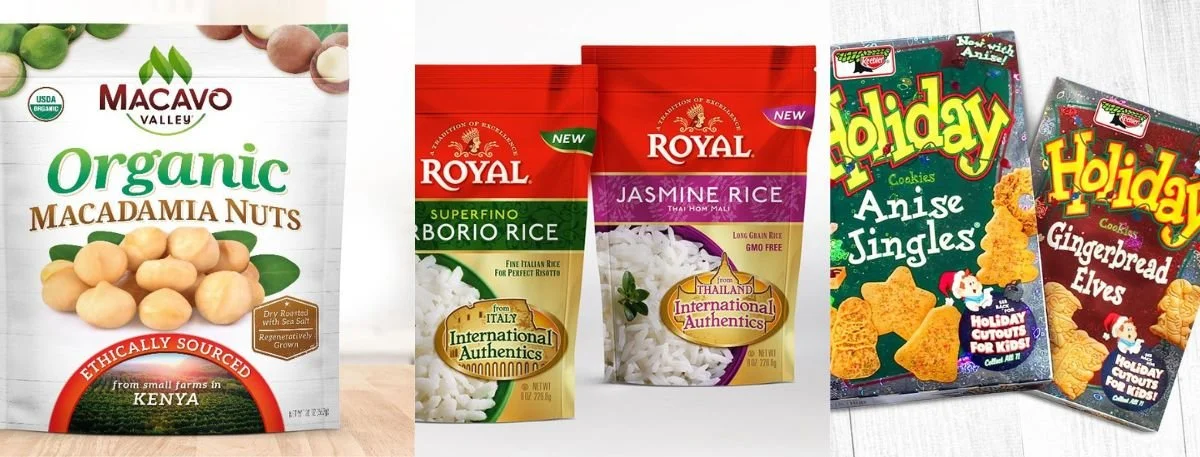
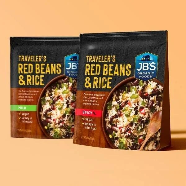
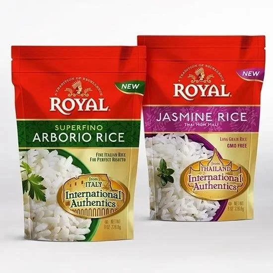
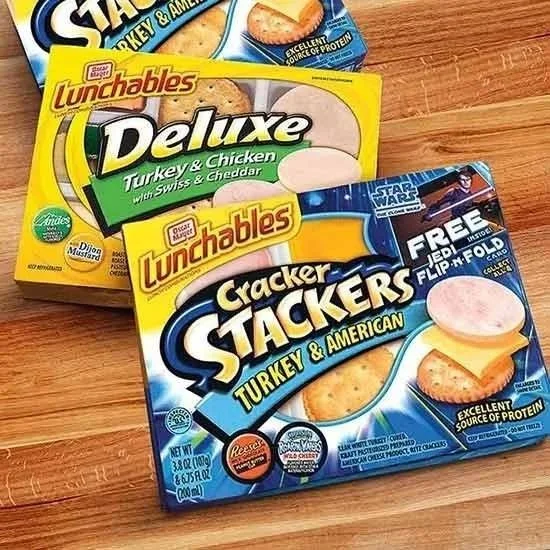
Consistent SKU architecture (same layout logic across the range)
Clear differentiation (variant cues that are obvious, not subtle)
Distinctive brand assets (color palette, typography, ownable motifs)
Real-world durability (condensation, freezer use, handling, scuffing)
And a quiet loyalty driver is the at-home moment. If the package is easy to store, open, reseal, or reference during use, customers remember that convenience.
How Do I Choose The Right Food Packaging Design for My Product?
Start with context, not taste. The right food packaging design depends on where it is sold, how it is shopped, and what the buyer needs to decide quickly.
A simple decision framework:
Channel Fit- grocery, convenience, club, foodservice
Shelf Distance- must it work from 2 feet or 10 feet?
Buyer Mindset- impulse snack, family staple, premium gift, functional health
Competitive Set- what codes dominate, and what space is underused?
Production Reality- print method, materials, lead time, budget constraints
But avoid guessing. Shelf audits and quick concept testing can prevent expensive redesigns later.
How Can I Make My Food Packaging Stand Out On Crowded Shelves?
Standing out is not the same as adding more. Many packages look “busy,” but they do not communicate. The strongest packs are often the easiest to understand.
Approaches that improve shelf presence while protecting trust:
• Pick one primary visual idea and commit to it
• Build contrast intentionally (color, whitespace, scale, typography)
• Design for scan order: brand - product - benefit - variant
• Create a recognizable shelf block across multiple units
• Use finishes with purpose (matte, spot UV, foil), not decoration
If your goal is the best packaging design, aim for memorability with clarity. Shoppers should recognize your brand immediately on the next trip.
Step-By-Step Checklist for Food Packaging Labels
Product name and variant are readable in under 2 seconds
The top benefits are specific and do not compete with each other
Ingredients, allergens, and nutrition are easy to find and read
Claims are supportable and written appropriately for regulations
SKUs follow a consistent structure with clear differentiation
Barcode scans reliably (contrast, size, placement, quiet zones)
The design holds up in real conditions (glare, moisture, handling)
Brand recognition works even if the pack is partially blocked
The system can scale to new flavors and formats
Files are print-ready (bleeds, dielines, finishes, color setup)
What Are the Top Mistakes to Avoid in Food Packaging Design?
Common issues we see during audits and redesign work:
Front-of-pack claims that feel bigger than the ingredient story supports
Thin fonts, low contrast, or crowded panels that hurt readability
Too many icons and callouts are fighting for attention
Inconsistent SKU logic that forces customers to search
No testing in real retail lighting, leading to glare and lost information
Compliance was handled late, causing messy layouts and rushed changes
But most fixes are straightforward: simplify, strengthen hierarchy, and validate in real conditions.
Key Takeaways
A clear hierarchy builds trust quickly and supports faster repurchase.
Consistent SKU systems help customers find your product without effort.
Compliance and design should be built together to avoid last-minute clutter.
Standing out works best when the message is simple and ownable.
Real-world testing reveals what mockups hide.
Final Words
New customers become repeat customers when the packaging is clear, accurate and consistent. By using food packaging labels as a marketing tool, they can help with recognition, trust and loyalty.
If you are launching a new product or refurbishing an existing portfolio, Lien Design can develop a label and packaging system that works on and off the shelf.
FAQs about Food Packaging Labels
How do I choose the right food packaging design for my product?
Base it on channel, buyer mindset, shelf distance, and production constraints.
What are the essential elements of effective food packaging labels?
Clear hierarchy, readable product info, compliant details, and consistent branding.
How can I make my food packaging stand out on crowded shelves?
Use one strong visual idea, high contrast, and an easy scan path.
What makes a food label design legally compliant and attractive?
Correct required information, supported claims, and a clean layout that stays readable.
What are the top mistakes to avoid in food packaging design?
Overclaiming, poor readability, messy SKU systems, and skipping real-world testing.