
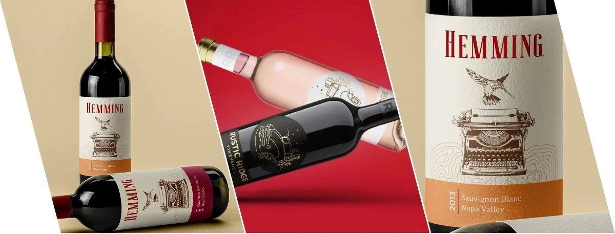
A bottle of wine sits on a shelf. Nobody's tasted it yet. But someone's already decided it's worth $45 - not $12. That decision? It came from the label. Wine label design carries far more weight in the purchase decision than most brands give it credit for. Shoppers lean on visual cues- color, texture, typography- to estimate what's inside before they've read a single word on the back.
And this isn't a coincidence. It's the result of deliberate, strategic design choices that communicate luxury, craft, and authenticity in seconds. This blog breaks down how premium labels shape price perception, which design elements do the heaviest lifting, and why the label might be the most commercially important part of the bottle.
The Psychology Behind Wine Label Design and Price Perception
First Impressions Happen in Seconds
The brain processes visuals faster than language. By the time a consumer's hand reaches for a bottle, the label has already made its case.
A heavy embossed label feels expensive before it's even read.
Clean, intentional typography reads as sophisticated- not accidental.
Gold or metallic foiling is a price signal before the numbers are even seen.
Wine is one of the few product categories where the buyer has very little objective information at the point of purchase. They can't taste it. They often don't recognize the producer. So the label becomes the primary decision-making tool- and premium design fills that gap with confidence.
Color, Font, and Texture - The Real Work Behind the Label
How does wine label design affect price perception? It starts with three elements that rarely work alone:
Color: Deep burgundy, matte black, aged cream- these shades communicate depth and heritage.
Typography: Thin-stroked serifs suggest tradition; considered sans-serifs suggest modernity.
Texture: Soft-touch coatings, letterpress, embossing- these create a tactile story the eye alone can't fully tell.
The thing is, none of these land in isolation. A premium label earns its premium feel by balancing all three into something coherent- a visual argument for why this bottle costs more.
Did You Know? Consumers make purchase decisions at the shelf in as little as a few seconds. In a category like wine, where taste testing isn't possible before buying, the label is often the only signal a buyer has to go on.
What Makes a Wine Bottle Label Feel Premium?
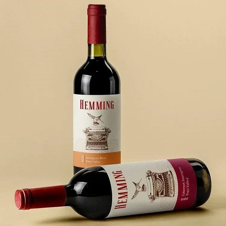
A wine bottle label that commands shelf respect doesn't get there by accident. There's a clear pattern to what works- and what quietly signals mass-market instead.
Design Checklist: Elements of a High-Perceived-Value Wine Label
Minimalist Layout- White space isn't emptiness. It's restraint. And restraint reads as confidence.
Quality Foundation- Cotton paper, textured stock, and specialty materials change how the label feels in the hand.
Foil Stamping or Embossing- Metallic and relief elements catch light in ways flat printing simply can't.
Custom Illustration or Crest- Unique artwork signals heritage. It says this brand has a story worth telling.
Consistent Brand Typography- One carefully chosen typeface, used well, builds recognition over time.
Sophisticated Color Palette- Overly saturated colors frequently read as entry-level, even when the wine isn't.
Back Label Narrative- A well-written story adds depth. And subtly, it justifies the price.
Each element does the quiet work. Together, they prime the buyer to expect- and accept- a higher number on the tag.
How Label and Packaging Design Builds Consumer Trust?
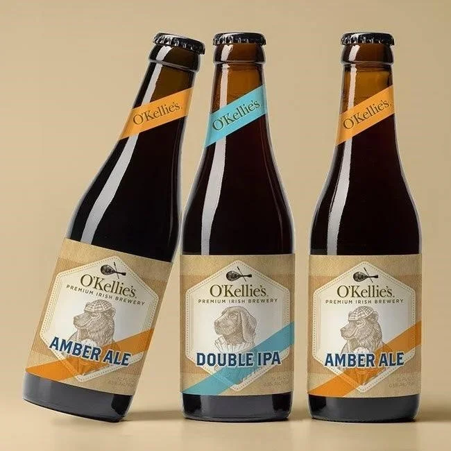
Label and packaging design is about more than stopping someone mid-aisle. It builds trust. And in the wine category, trust converts directly into willingness to pay more.
When a brand invests in precision packaging, it signals a few things without saying them out loud:
High production standards across the board
Attention to detail that extends beyond the bottle
A brand that actually respects its customers
But here's what's interesting- buyers rarely register these signals consciously. The decision to pick up a bottle often happens before rational thinking even enters the picture. Premium packaging and labeling meet the consumer in that pre-rational moment and make a wordless case for value.
Beverage label design and consumer buying behavior share a well-documented connection in retail psychology. Visual credibility- the immediate sense that a product looks trustworthy and high-quality- is one of the strongest drivers of purchase intent in self-serve retail environments.
The Role of Beverage Label Design in Market Positioning
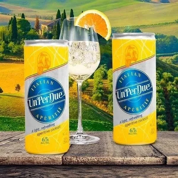
Beverage label design isn't a purely aesthetic exercise. It's positioning- plain and simple.
Brands competing in the $20–$40 range use design to pull away from the $8–$12 shelf. Brands targeting $50 and above use design to create an entirely different category in the consumer's mind. And the visual tier a label communicates often becomes a self-fulfilling outcome- retailers shelve accordingly, and buyers respond to that placement.
A few positioning signals labels carry quietly:
Regional Identity: European-language script and châteaux-style crests suggest Old World prestige without stating it.
Estate Branding: A named vineyard tells a single-origin story- and that story is worth more.
Limited Edition Cues: Numbered batches and hand-applied elements whisper scarcity before the price tag even shouts it.
What makes a wine label look expensive? Precision. Restraint. Intentionality. Three qualities that translate directly into shelf presence- and perceived value.
Packaging and Labeling as a Revenue-Generating Decision
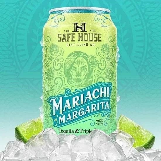
The smartest wine brands don't treat packaging and labeling as an overhead cost. They treat it as something that earns its keep.
The reasoning is straightforward: a well-executed label design investment can support a meaningfully higher price per bottle. At any real production volume, that difference compounds- and the brand equity built through consistent, premium presentation pays dividends long after the initial design spend.
You might often wonder, "Why do premium wine labels sell at higher prices?" This is because in the absence of a taste test, the label is the product. It carries the entire first impression. Plus, on a retail shelf where hundreds of bottles compete side by side, the label is the only salesperson available.
Key Takeaways
Wine label design shapes how consumers perceive both quality and price- before a single drop is tasted.
Premium finishes like embossing and foil stamping signal craftsmanship and support higher price expectations.
Color, typography, and texture work together- each element reinforces the others.
Premium wine packaging psychology shows that visual credibility is one of the strongest drivers of purchase intent in retail wine settings.
A great label isn't just attractive- it's a measurable, revenue-generating brand asset.
Final Words
A wine label isn't a decoration. It's the first conversation a brand has with a buyer- and in most cases, it's the conversation that matters most. Every choice in wine label design, from the color to the font, shapes how that buyer values what's inside. Premium labels sell at premium prices because great design genuinely earns that trust.
For wine brands ready to compete at higher price tiers and build real market credibility, the label is where that work begins. Lien Design creates a built around both craft and commercial intent- visual systems that don't just look right, but perform.
If you are looking to revamp your existing line or launch a new one, Lien Design can help you get that definitive edge in a crowded market.
FAQs about Wine Label Design
Does wine label design actually affect how much consumers are willing to pay?
Yes- visual quality signals are one of the primary cues consumers use to estimate price and quality in a category where pre-purchase tasting isn't possible.
What design elements make a wine bottle label appear expensive?
Embossing, foil stamping, restrained layouts, quality paper stock, and refined typography consistently signal premium value.
How important is color in beverage label design?
Very. Muted, deep, or heritage-toned palettes communicate quality more effectively than bright, saturated colors in most consumer-facing wine contexts.
What separates label and packaging design from basic labeling?
Strategic label design integrates brand identity, consumer psychology, and market positioning- it goes well beyond printed product information.
Can a premium label actually influence where a wine gets shelved in retail?
Yes- retailers frequently use visual tier signals to determine placement. Premium-looking labels are more likely to land at eye level in the right section.