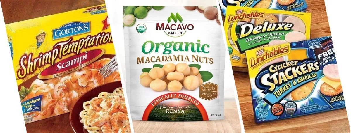
The health food aisle is extraordinarily competitive right now. Simply having a nutritious product inside the box is no longer enough to guarantee retail success. Standing out requires highly strategic, healthy food packaging design that communicates value the second a shopper glances at the shelf. But getting that visual messaging perfectly right is deceptively difficult. Countless emerging brands fall victim to subtle layout errors that actively confuse potential buyers. And confusion always leads directly to lost revenue.
Modern consumers expect absolute transparency. They want clear, immediate nutritional validation before putting anything in their grocery carts. The thing is, even minor graphic tweaks can completely shift how the market perceives product quality and pricing. Whether launching a new plant-based snack or overhauling an existing supplement line, recognizing these common pitfalls is essential. Here is exactly what this blog will cover- the most frequent visual mistakes brands make and how to permanently fix them in six precise steps.
The Real Impact of Healthy Food Packaging Design
Shoppers make complex purchase decisions in a matter of seconds. If a wrapper looks cluttered or the nutritional claims seem exaggerated, they instantly move to a competitor. Well-executed visuals do heavy lifting for brand credibility.
Many emerging companies severely underestimate the psychological impact of their physical presentation. They focus entirely on the recipe itself. But the outer box is always the very first touchpoint.
Here is why getting these visual elements right is absolutely non-negotiable for scaling a brand-
Establishes immediate authority with highly educated, health-conscious demographics.
Creates stark differentiation from conventional, heavily processed grocery alternatives.
Relays essential dietary facts and certifications at a single glance.
Follows strict healthy food brand design guidelines for maximum retail impact.
Lowers overall customer acquisition costs by drastically improving organic shelf-appeal.
6-Step Guide to Fixing Food Packaging Labels
Misaligned marketing ruins conversions in physical stores and online catalogs alike. When buyers cannot figure out what the actual item is within three seconds, the sale is lost. Follow these six actionable steps to troubleshoot and correct common errors on food packaging labels.
Step 1- Declutter the Primary Display Panel
Too much text completely paralyzes the shopper. Brands frequently attempt to cram every single selling feature onto the front of the pouch. Keep the core visual message incredibly simple.
Highlight only the top two primary nutritional benefits.
Utilize highly recognizable dietary terms like "gluten-free," "paleo," or "vegan."
Shift dense ingredient lists and secondary features to the side panels.
Maintain ample negative space to let the primary logo stand out clearly.
Create a distinct visual hierarchy that guides the eye naturally downward.
Step 2- Select Highly Legible Typography
Unreadable fonts destroy consumer trust instantly. Buyers need to read ingredients effortlessly without squinting. Ditch those overly stylized, complex script fonts right away.
Implement clean, modern sans-serif typefaces for all primary nutritional data.
Ensure maximum color contrast between the lettering and the background.
Scale typography appropriately so it remains perfectly legible on small snack bars.
Avoid using more than three different font families on a single package.
Standardize the weight of the text to separate headers from descriptive copy.
Step 3- Prioritize Natural Color Psychology
Neon shades often signal artificial flavors and excessive synthetic sugar. Earth tones, on the other hand, strongly suggest freshness. Align the overall color palette with nature to visually reinforce the product's health claims.
Select muted greens and warm browns for organic, farm-to-table items.
Integrate bright, clean white spaces to successfully convey ingredient purity.
Avoid aggressive reds unless specifically designed for high-energy sports nutrition.
Use soft pastel accents to differentiate various flavor profiles within a product line.
Match the exterior palette to the actual color of the food inside whenever possible.
Did you know? Health food items utilizing muted green and earthy brown tones experience a fifteen percent faster purchase decision rate because shoppers subconsciously associate these colors with natural ingredients.
Step 4- Optimize for Digital Storefronts
Physical grocery shelves are not the only vital battleground today. E-commerce platforms matter just as much. Design graphics that pop vividly on small mobile screens.
Ensure the brand name remains highly visible when scaled down to tiny thumbnail sizes.
Implement bold color blocking to stand out sharply against white digital backgrounds.
Study exactly how to fix food packaging mistakes specific to online catalog renders.
Consider how digital lighting affects the 3D rendering of the physical box.
Test the artwork on various screen brightness levels to ensure color accuracy.
Step 5- Emphasize Environmental Sustainability
Modern buyers care deeply about minimizing their personal carbon footprint. If the wrapper utilizes compostable elements, display that fact prominently on the front. Eco-friendly materials perfectly complement a holistic health narrative.
Print easily understandable recycling instructions near the barcode.
Utilize raw, unbleached cardboard textures to visually communicate environmental care.
Reduce unnecessary plastic windows that contradict the core eco-friendly messaging.
Adopt emerging trends in sustainable packaging in 2026 to stay ahead of competitors.
Display recognized environmental certifications clearly on the back panel.
Step 6- Maintain Strict Regulatory Compliance
Do not play guessing games with federal regulations. Nutritional panels must strictly adhere to complex sizing, formatting, and placement laws. Reviewing these mandates early prevents incredibly costly mandatory redesigns.
Verify that all specific allergen warnings are bolded and legally positioned.
Confirm the net weight appears in the precise lower portion of the display panel.
Ensure all explicit health claims are scientifically substantiated and legally sound.
Double-check barcode sizing to guarantee seamless scanning at retail checkouts.
Keep the ingredient list font size strictly compliant with FDA minimum requirements.
Elevating Your Food Label Design for Target Demographics
A beautifully rendered aesthetic is merely the baseline in today's saturated market. The real magic happens when your food label design seamlessly blends visual form with functional retail strategy. But many companies forget who they are actually designing for. They design for corporate stakeholders, not the end consumer.
To remain highly competitive, the creative approach must evolve. Consider these crucial elements to upgrade the final presentation-
Integrate high-contrast visual cues specifically designed for accessibility.
Apply matte finishes or soft-touch physical coatings to project a premium feel.
Execute the best practices for organic food packaging to build immediate brand authority.
Guarantee the physical design translates flawlessly into flat social media graphics.
Ensure the structural shape of the box provides logistical efficiency for shipping.
Plus, an exceptional organic food label requires deep industry expertise. A generic, standardized template simply fails when targeting highly discerning health enthusiasts. Custom food packaging design communicates a distinctly unique brand story. And it resonates on a psychological level with the precise audience required for long-term growth.
Key Takeaways
Limit front-panel text to prevent shopper overwhelm and accelerate purchase decisions.
Choose crisp, highly readable typography to establish immediate consumer trust.
Leverage natural, earthy color palettes to subconsciously reinforce stated health benefits.
Highlight eco-friendly material usage to attract environmentally conscious modern buyers.
Strictly follow all FDA regulatory formatting guidelines to avoid expensive product recalls.
Final Words
Correcting the most frequent visual mistakes converts a product into a retail item in great demand. Strategic healthy food packaging design acts like an unobtrusive, constant salesperson that is always persuading people who are simply window-shopping to become brand loyal. By intentionally decluttering layouts, applying accurate color psychology, and prioritizing legal compliance, brands gain a massive competitive edge. Ready to develop retail packaging that actively drives sales and establishes unshakeable market authority? Partner with Lien Design today to craft expert, lead-generating design solutions perfectly tailored to your health food brand.
FAQs about Healthy Food Packaging Design
What defines successful health food packaging?
Clear nutritional messaging, natural color palettes, and completely legible typography drive consistent health food sales.
Why is sustainable material usage important?
Eco-friendly materials matter because modern consumers actively prioritize brands that demonstrate genuine environmental responsibility.
Can color palettes influence perceived nutritional value?
Yes, earthy and natural tones subconsciously signal fresh, wholesome ingredients to skeptical grocery shoppers.
Where should dense nutritional information go?
Always place complex ingredient lists and legally mandated nutritional panels on the back or side.
Do regulatory guidelines dictate visual design choices?
Absolutely, strict federal rules mandate the exact sizing, placement, and content of all nutritional facts.