
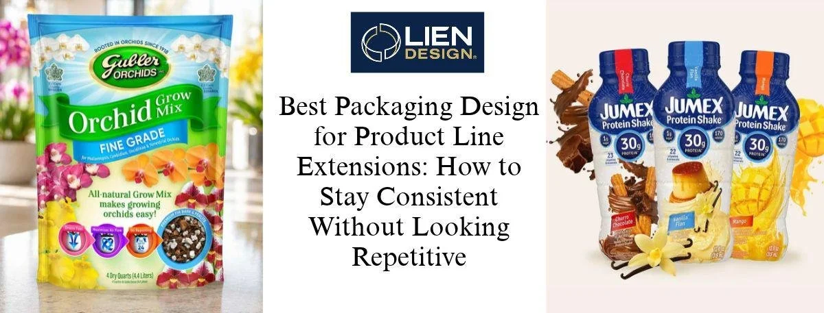
The best packaging design for a product line extension means retaining the same logo, layout, and primary color, but altering only one obvious aspect of the packaging for each product variation, such as a new flavor or size. That's it. The family is immediately recognized by shoppers, and they still know which variant is which. At Lien Design, we do this balance before we even pick up a swatch. Now, we will discuss how to build a brand system, introduce variation, test the shelf, prepare for print and compliance, and when to refresh.
Why Line Extensions Go Wrong
Every time you have a line extension, here's the issue you'll face. If they are alike, no one will be able to tell the difference between cherry and vanilla. If they are too different, they appear to be some other brand. Either way, you lose sales—because a shelf is a rewarder of quick recognition and quick choice.
It is not a fancier box. It's a system. The first few simple questions are the key to the best packaging design for a product family.
Who buys it?
How is it to be displayed in the shop?
What are the factors that people use to make their decision?
After answering those, all future Stock Keeping Units (SKUs) are carried by the system.
Start With a Brand System, Not the Variants
Your brand system is the rulebook for all the new packs to adhere to. First, tightly lock down these 5 things, and the later ones become a breeze for package design agencies to get your desired look.
Logo lockup
Use the same brand mark size and location for each pack. Customers will find out where to look, and they won't have to search for you
Layout grid
Do not use more than one structural grid on each dieline. This ensures that the product name, flavor callout, and nutrition panel are always positioned in the same spot for all package shapes.
Type hierarchy
Choose a primary and a backup font and assign each of them a role. Headlines, flavour names, and claims must always be consistent in appearance and tone, and must sound like they are from the same brand.
Anchor color
Select one signature colour and use it in the same place in each pack. It works like a backbone, which allows other colours to move freely without any confusion.
Imagery style
Plan ahead whether you are going to use photos, illustrations, or custom lettering and then do it! A line that is in a mix of styles looks as though it has been assembled by several different people.
Test the Shelf Before You Print Anything
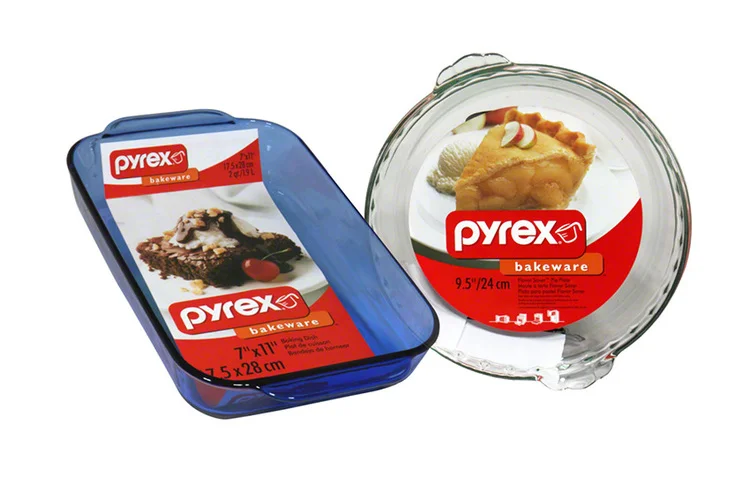
A line can look great on your screen and still disappear in a store aisle. That's why we lean on shelf presence, color psychology, and legibility checks before files go to the printer. Here's a simple way to do it:
1. Build a mock shelf
Put the new variant next to its siblings and a few competitors, using a realistic mockup or 3D render.
2. Do a squint test
Step back and squint. Can you still read the brand name and flavor?
3. Check contrast
Small text and claims need to stay readable on every accent color, especially the light ones.
4. Ask real shoppers
Run a quick survey or A/B comparison to see which layout people pick and what they notice first.
Spending a little here beats paying for a bad print run later. And you'll have proof, not just opinions, when your team starts arguing about it.
Get Your Custom Retail Packaging Ready for Print and Compliance
It's not enough to have a great concept – it takes a great vision to bring it to completion. Your custom retail packaging also needs to go through the printer, the legal checklist, and the retailer.
Technical dieline: Create an accurate electronic dieline with correct safe areas and bleeds for the final art. Otherwise, avoid folding, sewing, or cutting out your logo or key claims.
Coordinate with your printer: Discuss materials, ink, finish, and colour matching early on with your printer. If you do not have all variants regularly printed the same way, it will not work.
FDA and legal panels: Reserve space for nutrition info, ingredients, allergens, and net contents. Each new flavor affects that copy as well, and sometimes the size of the panel.
Add UPC barcodes: Add a UPC to each variant and store them in a consistent, scannable location. Then the checkout and inventory systems will know the difference between the items without mixing them up.
Polished 3D renders: Request a polished 3D mockup of the completed packs. They come in handy for online listings, social posts, and retailer pitches, before physical samples arrive.
Starting from an AI-generated concept? It still needs a human-built dieline and a compliance review before it hits the shelf.
Know When It's Time to Refresh the Whole Line
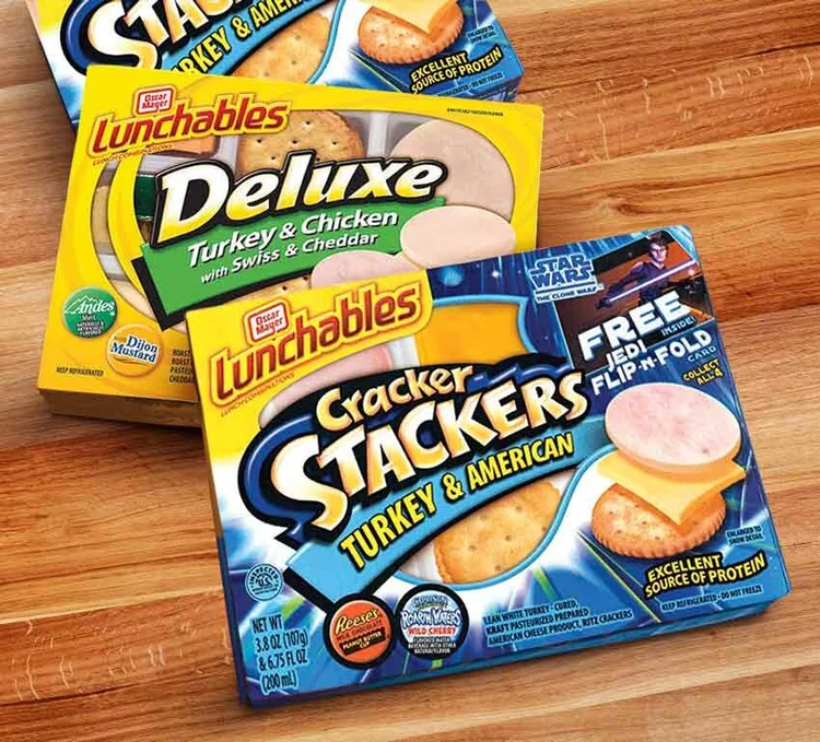
Sometimes it's the system that has to be fixed. Many times, your line is out of style, new styles don't fit on the grid anymore, or the rules of a retailer have changed, and you don't want to waste time copying the old design. Refresh the entire family at once; don't create a half-and-half appearance. Make a living style guide, too. As the line expands, it provides the same set of rules to all the designers, printers, and co-packers.
Final Thoughts
Consistency and freshness are not enemies. Use your logo, grid, type, and anchor color. Flex one or two zones per variant. Test the shelf and prepare all files to be printed and compliant. Do it, and a line doesn't sound so familiar that everybody seems to have heard it before. For the best packaging design for your next product launch, San Diego package design agency Lien Design can help you bring your custom retail packages to life that your family shoppers will recognize.
View our work now and get in touch for unique packaging design. Call now for a clear estimate today!
FAQs
What exactly is a brand system for line extension packaging?
It's the set of rules every pack follows: logo spot, grid, colors, fonts, and image style. Keep those steady so each new variant looks related, with room left for flavor cues.
How much can the color palette change across a product line?
Keep one anchor color in the same spot on every pack, then change only the accent color. People should notice the family first and the difference second.
Why does shelf presence matter for each new product variant?
Shoppers decide in seconds. Clear placement and a familiar logo help a new variant get noticed and trusted right beside the products they already know and buy.
When should a brand redesign its whole product line at once?
Think about a full refresh when the line looks dated, retailer rules change, or new products stop fitting the system. Update everything together so the shelf looks unified.
Can AI creations become print-ready custom retail packaging?
Yes. Lien Design turns AI images into print-ready files with a technical dieline, FDA-compliant panels, and 3D renders. Only five discounted projects are open each month.