
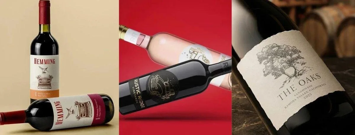
Picture standing in the local grocery store wine aisle on a Friday evening. You just want something decent for a dinner party. You scan past fifty identical bottles with boring cursive fonts and standard cream backgrounds. Then one specific bottle physically catches your eye because it uses a weird jagged paper edge and a massive copper foil stamp that hits the overhead lights just right. You grab it. You do not know anything about the grapes inside, but you just know the bottle feels expensive. That exact moment is what a professional wine label designer engineers from scratch.
The financial stakes are massive for modern vineyards today. A great-looking bottle builds a fiercely loyal cult following fast. A bad one just hands your hard-earned revenue to the winery one shelf over. You could be bottling absolute perfection, but if the outside looks cheap, folks just walk right past it. In this guide, we will cover packaging psychology, visual brand storytelling, stealing ideas from other beverage sectors and why the right aesthetic brings a massive competitive edge.
Did you know?
Shoppers are actually willing to pay up to fifteen percent more for a bottle just because the label uses thick textured paper since it subconsciously signals a better-tasting product.
The Real Psychology Behind Alcohol Packaging Design
A lot of winery owners completely ignore how a bottle actually feels in the hand. Huge mistake.
Sure, we buy with our eyes first. But we confirm that choice the exact second we pick the bottle up off the shelf. The moment a shopper grabs a bottle the physical materials do all the heavy lifting. The texture of the paper and the weight of the actual glass send immediate hardwired signals to the brain about the quality of the liquid inside.
Think about a fifty-dollar Cabernet Sauvignon. You slap a glossy, flimsy, standard-issue sticker on it. Suddenly it feels exactly like a nine-dollar discount bottle from a corner gas station. The consumer's brain instantly registers a massive disconnect between the price tag and the tactile feel. They put the bottle right back.
Here is what actually works on the physical shelf when you want to dominate the aisle-
Thick uncoated paper stocks - Materials like heavy cotton blends absorb light instead of reflecting it. They feel thick, and they feel incredibly expensive. It gives the bottle a matte, sophisticated finish that commands respect instantly.
Tactile embossing - Raising specific parts of the artwork physically off the paper. Maybe your logo or maybe a geometric border pattern. It makes people run their thumbs over the glass. It literally forces them to physically interact with the brand for a few extra seconds.
Strategic foil stamping - A touch of gold/copper or matte silver catches the terrible, harsh fluorescent lighting in retail stores. It creates a sudden flash of contrast. It makes the bottle pop from twenty feet down the aisle.
You simply cannot fake premium quality. The visual presentation sets the baseline expectation before the cork ever pops. The thing is- if the exterior looks cheap, the buyer's brain literally processes the resulting taste as inferior before they even take a sip.
What a Pro Wine Label Designer Actually Does
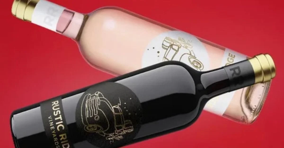
Amateurs just want to make things look nice on a laptop screen. Pros build files that survive international shipping, pass incredibly strict federal legal rules, and completely justify a premium price tag.
Getting your artwork approved by the federal government is a total nightmare if you do not know the exact legal parameters. They reject thousands of submissions every single year over tiny, seemingly insignificant font issues. You cannot just guess at the rules. You will fail, and your product launch will be delayed by months.
Here is what needs to happen perfectly before anyone ever sends a file to the commercial printer.
The Step-by-Step Production Checklist
Mandatory Government Verification - You have to get the alcohol percentage, origin appellation and net contents exactly right. The government mandates specific millimeter heights for the warning text based on the exact fluid ounces of the bottle. Getting this wrong is absolutely non-negotiable.
Spatial and Typographic Hierarchy - Clutter kills conversion. If the layout is packed with way too much text, people get confused and walk away. You need massive breathing room in the layout. The eye needs to naturally flow from the brand name down to the varietal.
Pre-Press File Preparation - Digital colors on a computer monitor do not print correctly on physical paper. A professional wine label designer converts everything perfectly to custom ink mixes. Failure here results in muddy, dark and highly inaccurate print runs. And that costs thousands of dollars to fix.
Adhesive and Substrate Selection - Ever seen a beautiful bottle turn into gray mush after ten minutes in an ice bucket? It is incredibly embarrassing at a high-end restaurant. You need specific wet strength papers and heavy-duty waterproof adhesives. They have to survive condensation and extreme cold without peeling off.
Custom Die-Line Creation - Stop using basic squares and standard rectangles. Mapping out custom physical shapes allows the bottle to cast an instantly recognizable silhouette on the crowded shelf.
Plus, there are a hundred other tiny details. If you want the absolute nitty-gritty breakdown on all the legal, structural and artistic requirements, you have to read this complete guide to wine bottle label design.
Telling Your Story with beverage label graphics
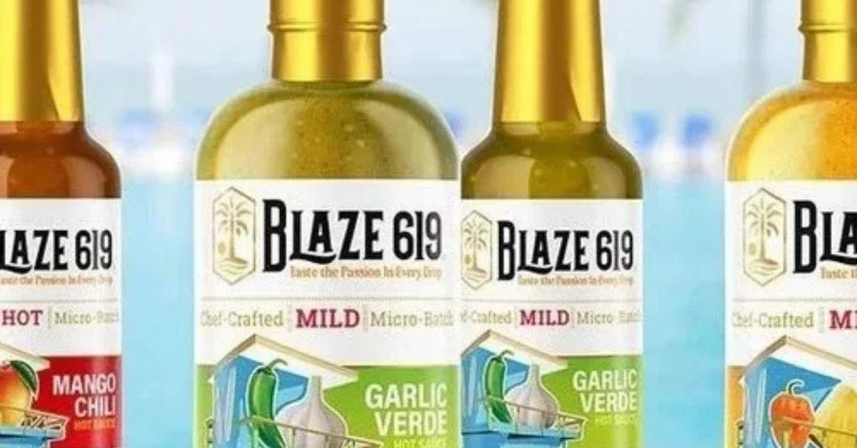
Your family history is important. Your sustainable winemaking process matters. But let's be real. Nobody is going to read a massive website page if the bottle doesn't catch their eye first.
A good designer takes your entire complex history and boils it down into one fast and aggressive visual hook. You have to translate all that passion into sharp imagery that people understand in three seconds flat.
Here is how you actually connect with modern buyers today-
Show the exact location - Use minimalist line art topographic maps or custom sketches of your specific vineyard elevation. It grounds the product in a real physical place. It proves authenticity to a skeptical buyer who thinks everything is mass-produced.
Update the family crest - If you have an old historic family crest, do not just slap the old pixelated version on the bottle. Clean it up. Modernize the linework so it looks classic but incredibly sharp and highly intentional.
Signal your farming practices - Using raw recycled looking paper aesthetics and earthy color palettes tells buyers you care about the environment. You signal organic farming instantly. And you do it without having to write a massive, boring paragraph about it.
Target the right age bracket - An older traditional collector wants heavy fonts and classic layouts. A younger buyer looking for natural blends wants abstract art, neon colors and zero pretension. You have to match the art to the wallet of the person you are trying to sell to.
Aligning these visual choices with your ideal buyer profile is the fastest way to accelerate revenue. Want to know more about matching your exact look to your ideal customer? Read these branding and packaging tips for wine labels.
Stealing the Best Ideas from Craft Brewers
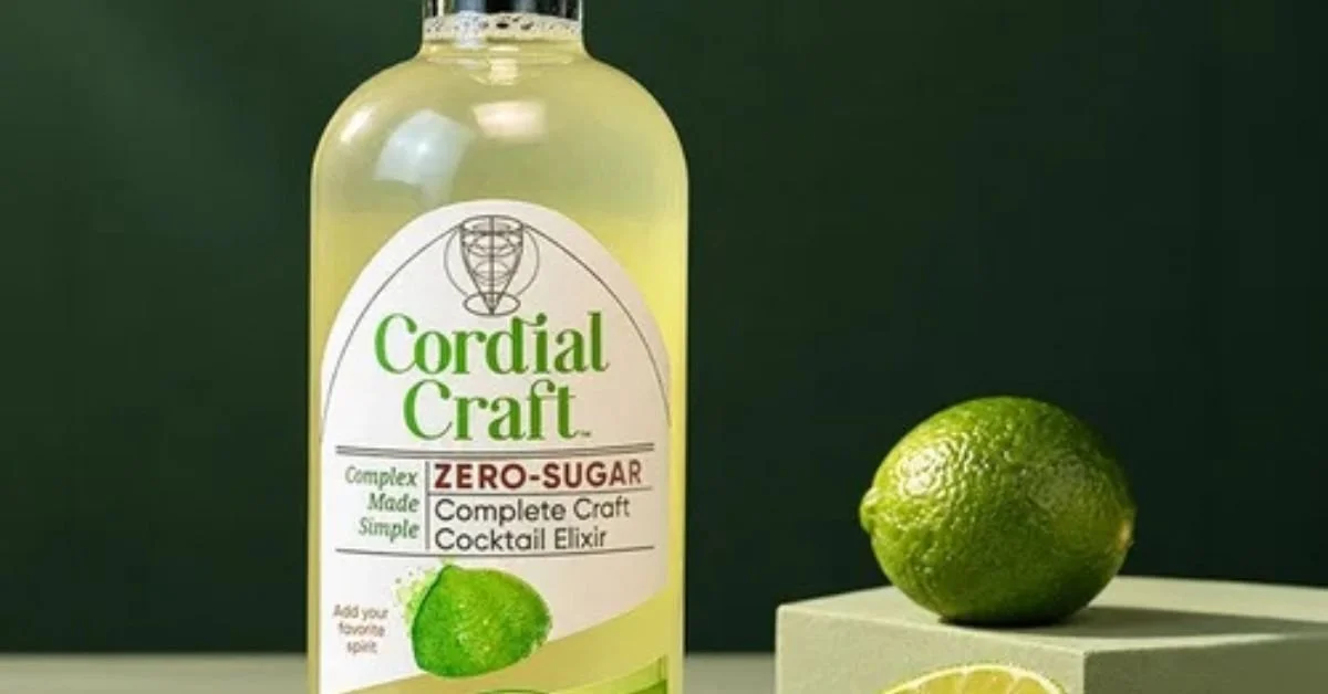
The industry gets stuck in a massive rut. Everyone just looks at what other local vineyards are doing. They copy the same cream paper and the same boring gold foil. Over and over again.
But genuine innovation usually comes from outside your immediate circle.
Look at what happened with craft beer. Over the last decade, they completely revolutionized the retail shelf. They threw out the traditional rulebook entirely. They started using crazy, character-driven art, aggressive colors and wild typography that forced consumers to stop and stare. A smart wine label designer knows exactly how to steal the most effective tactics from beer label design to make a traditional brand feel completely fresh and dangerous.
Try integrating some of these cross-industry tactics-
Dynamic and wild cutouts - Moving away from standard shapes. Using asymmetrical laser-cut borders that actually reveal the liquid inside the glass.
Hidden interactive elements - Incorporating peel away layers and/or putting hidden artwork on the back of the front sticker. It rewards the buyer with a hidden story. And it makes the bottle a massive conversation piece at a dinner party.
Vibrant aggressive color palettes - Ditching the standard safe cream backgrounds. Swapping them for bright custom spot colors that practically vibrate under the store lights.
Casual bespoke typography - Swapping rigid formal fonts for custom hand-lettered typography. It feels gritty, personal and highly approachable.
The thing is- staying on top of wider trends across the beverage space allows smaller boutique producers to outmaneuver massive, slow-moving corporate distributors. You have to be agile to survive.
Taking Your Look Beyond the Glass Bottle
A great aesthetic is not just for the glass container.
If your artwork only looks good on a tiny piece of paper you have a massive structural problem. You need a robust visual identity that translates perfectly across digital platforms, physical merchandise and large-scale event marketing.
Here is why your design has to scale everywhere-
Trade show dominance - A professional gives you fully vectorized digital files. That means you can blow the art up for a massive trade show display banner without it getting blurry or pixelated. When you pitch to massive distributors, you have to look like a million-dollar company.
Digital impact - Your bottles need to look just as good on a tiny mobile phone screen as they do in real life. High contrast layouts pop on social media feeds and drive direct ecommerce sales hard.
Merchandise adaptation - Clean, instantly recognizable brand marks can be easily isolated. You can screen print them onto tasting room apparel, expensive tote bags and high-end glassware without losing any detail whatsoever.
Wholesale pitches - When your sell sheets- your digital pitch decks and your physical bottles all share a rigid premium aesthetic- distributors take you seriously. They open their checkbooks because you look like a safe bet.
Consistency is everything. When a buyer sees your tasting room signage, scrolls past your online ad, and then spots your bottle in a boutique grocery store, the visual experience must be completely identical every single time.
Key Takeaways
How your bottle physically feels in the hand dictates the perceived financial value.
Professionals keep you out of serious legal trouble with strict government compliance.
Artwork needs to communicate a massive brand story in a three-second glance.
Borrowing bold ideas from craft beer helps dominate a boring retail aisle.
Design files must scale flawlessly from a small mobile screen to a massive physical banner.
Wrapping Up
Turning a regular bottle into something people actively hunt down takes real calculated work. Amateurs guess at what looks pretty. Experts know exactly how to grab attention- build deep consumer trust and drive massive retail sales. You need an aesthetic that works flawlessly everywhere. Partnering with an expert wine label designer ensures your external presentation perfectly matches the superior quality of the vintage inside.
Whether launching a brand-new estate or aggressively rebranding a legacy vineyard, get in touch with the experts at Lien Design to ensure your wine stands out from the competition.
FAQs About Wine Label Designer
What exactly does this designer do?
They handle complex typography, government legal compliance, paper stock selection and print-ready file creation. Their specific work connects visual storytelling directly with a target market to aggressively drive retail sales.
Does packaging really affect sales?
Absolutely. Visual presentation acts as the ultimate differentiator on incredibly crowded shelves. Premium aesthetics directly influence split-second purchasing decisions, establish immediate trust and easily justify a much higher price point.
Can they design for other drinks?
Yes. Skilled professionals easily adapt their typography and illustration expertise to create stunning graphics for spirits canned cocktails craft sodas and emerging non alcoholic alternatives across the board.
How is beer design different?
Beer labels often utilize incredibly loud colors, bold typography and crazy character art. Wine usually stays highly traditional but modern vintners are actively borrowing those loud craft tactics to attract younger buyers.
Why match the banner to the label?
Absolute visual consistency builds instant brand recognition. Matching colors and fonts across all physical assets makes you look highly professional and memorable to massive wholesale buyers and distributors at events.