
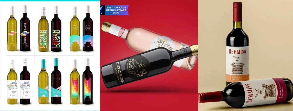
Picture this- A wine bottle sits on a crowded retail shelf right next to thirty identical counterparts. You have about seven seconds before a casual shopper makes a split-second decision to pick it up or walk right past it. In that impossibly short window, the packaging is doing all the heavy lifting and talking- not the carefully crafted liquid inside. Effective wine bottle label design is the strategic combination of typography, imagery, print finish, and layout that confidently signals quality while telling a compelling brand story. Ultimately, these visual cues are exactly what drive someone to reach out for your specific bottle over the steep competition.
Having designed labels for everyone from boutique, small-batch producers to widely established regional vineyards, we see a consistent, undeniable pattern. The labels that actually move units are rarely the ones with the most chaotic decoration; rather, they are the ones that make a single, clear promise to the consumer and keep it. This complete guide covers exactly what goes into a winning strategy. We will explore the core design elements, how label aesthetics shape price perception, the critical mistakes we see most often, and what we will cover in 2026 industry trends.
What Makes Wine Label Design Different from Other Beverage Labels
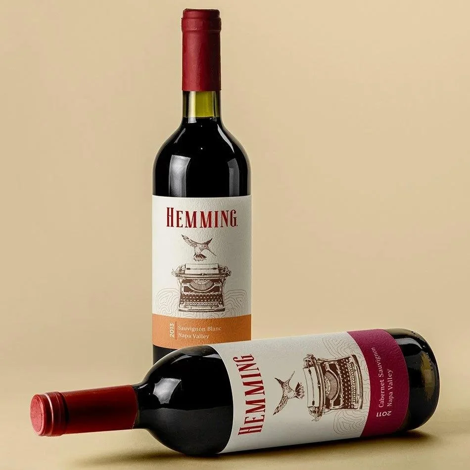
A wine label design differs drastically from other beverage labels because it must communicate complex provenance and meticulous craft in a tiny format, often read at arm's length in low store lighting. If you are researching how to design a wine bottle label, you first have to understand these highly unique category nuances that dictate consumer behavior-
No Dominant Flavor Cue on the Packaging- Unlike soda, juice, or craft beer, there is absolutely no literal flavor cue on the pack. Because of this, the design must carry a significantly stronger trust signal to reassure the buyer of what they are getting.
Incredibly Deep Category Conventions- Classic, historical elements like heavy foil capsules and traditional script serif fonts run extremely deep in this industry. While breaking them can be highly effective, it must be a deliberate, calculated positioning choice, not just a default artistic whim.
Strict Regulatory Compliance and Legalities- You cannot just design whatever looks pretty. You must successfully navigate rigid TTB label approvals, highly specific appellation claims, and strict varietal labeling rules before you even think about printing.
A Completely Unique Retail Context- Wine is typically browsed vertically and very often at eye level in a quiet, dedicated aisle. This is a completely different shopping experience than quickly grabbing a cold, highly saturated can from a brightly lit convenience store cooler door.
Core Elements of Wine Bottle Label Design
The foundational elements of wine bottle label design work harmoniously to signal a specific, immediate price tier to the casual shopper before they even read a single word of your copy.
Typography
Label typography alone has the immense power to shift your product's perceived price tier entirely.
Serif and elegant script faces consistently and universally read as highly traditional and premium.
Clean, minimalist, and geometric sans-serif typography generally reads as modern, approachable, and highly accessible to younger demographics.
Neither style is objectively better; the final choice must match the specific, unique story the brand is actively trying to tell the world.
Varietal & Vintage Cues
The specific grape variety, geographic region, and vintage year are often the very first things a discerning wine buyer scans for.
Visual hierarchy matters immensely for these specific varietal cues, as consumers have deeply ingrained reading patterns.
If you make the mistake of burying the vintage in a tiny, unreadable type, you will immediately lose a shopper who is specifically searching for that exact detail.
Imagery & Iconography
From detailed, sweeping estate illustrations to ultra-minimalist abstract line art, your imagery sets the emotional tone incredibly fast.
We strongly advise brands to avoid overly literal, actively expected grape-and-vine clip art.
Relying on generic imagery is hands down one of the fastest ways to make a genuinely fantastic product read as a cheap, budget bottle.
Print Finish
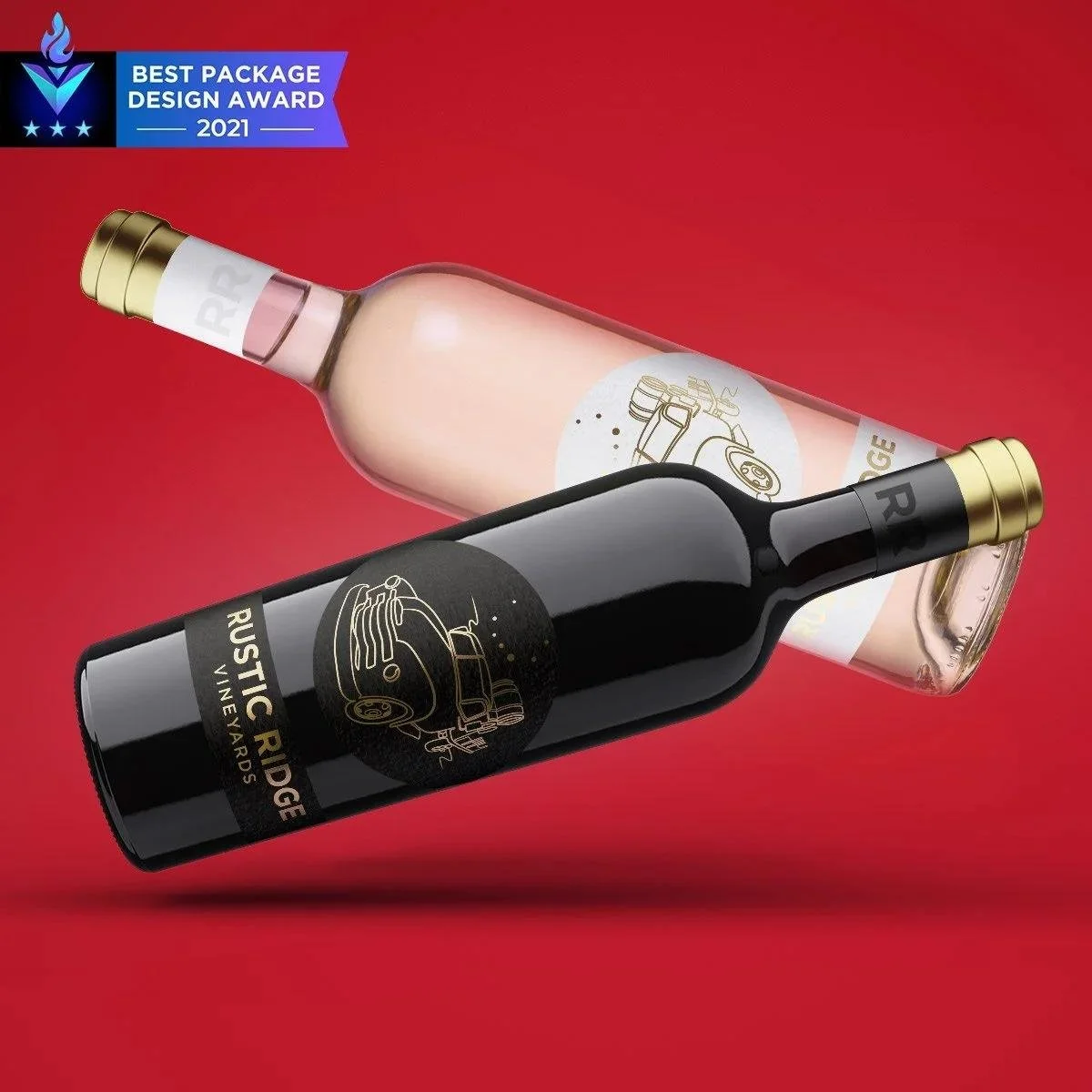
The chosen print finish is easily the single biggest physical lever you have for establishing perceived quality on the retail shelf. Mastering wine label printing techniques allows you to leverage these luxurious tactile qualities to your full advantage.
Applying high-end foil stamping or deep embossing elevates the brand's perceived value almost instantly in the consumer's hands.
In our Rustic Ridge Vineyards wine label design case study, we specifically highlighted a boutique 300-case production originating from the stunning hills of Jamul in Southern California.
This project utilized a stylized vintage Chevrolet truck and the Corona Borealis constellation, beautifully paired with premium varietal cues and a sophisticated, eye-catching foil finish to elevate the brand's visual and tactile appeal drastically.
How Wine Label Design Affects Price Perception
A carefully considered wine bottle label design affects price perception directly, working entirely independently of what high-quality liquid is actually resting inside the bottle. When evaluating the true impact of wine label on price, tactile material choices and printing techniques do the heavy lifting to achieve successful premium wine branding-
Premium & Celebratory Signaling- Intricate foil stamping and deep embossing consistently and reliably signal a much higher price point to shoppers looking for gifts or special occasion bottles.
Artisanal & Small-Batch Aesthetics- Dull matte finishes paired with significantly heavier uncoated paper stock immediately indicate a boutique, lovingly crafted product with a rich backstory.
Value & Mass-Market Indicators- Alternatively, a high-gloss laminate and standard default digital print are universally interpreted by consumers as basic, budget-tier finishes.
For a much deeper, psychological dive into this fascinating effect, read more about why wine label design is important to price perception.
2026 Wine Label Design Trends
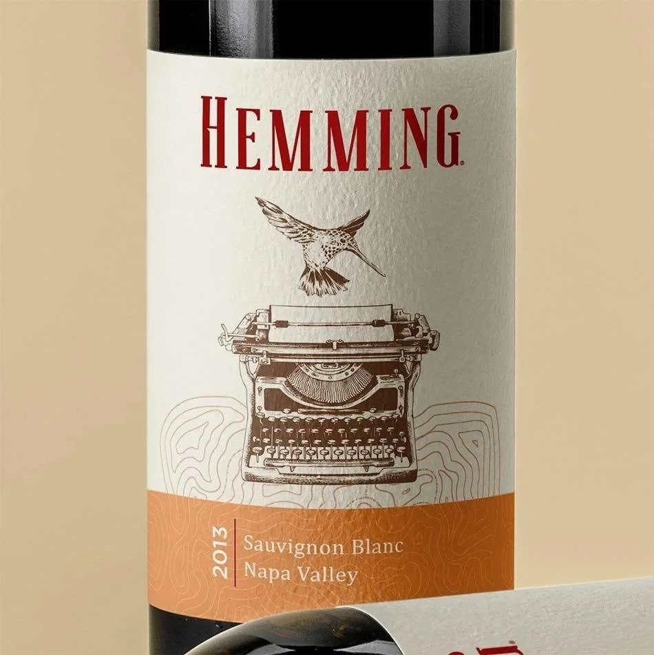
The upcoming year points strongly toward a much more refined, deeply earth-conscious aesthetic across the entire beverage space. If you are actively researching the best wine packaging trends to stay ahead of the curve, expect a massive shift away from heavy, chaotic ornamentation toward grounded, authentic storytelling-
Much Lighter Foil Use- We are seeing a more strategic, restrained, and minimalist approach to metallic accents rather than covering the whole label.
Hand-Drawn Illustrations- Brands are adopting authentic, highly tactile imagery, completely replacing generic, soulless digital vectors.
Aggressive Sustainability- Expect a heavy, industry-wide reliance on eco-friendly, sustainability-driven label stock that feels good to the touch and the conscience.
Check out our dedicated, in-depth post on the best wine bottle label design ideas and trends for 2026, and see exactly how this fits into the broader, rapidly shifting industry in our comprehensive guide on Beverage Packaging Design Trends for 2026.
Common Wine Label Mistakes
Even highly experienced winemakers and veteran vineyard owners can stumble hard when translating their brilliant liquid vision into retail packaging. The most common, expensive errors in wine label branding include-
Burying the Essential Details- Hiding the crucial vintage and varietal in incredibly small type means frustrated shoppers simply cannot find what they are actively browsing for.
Leaning on Literal Clip-Art- Relying on generic graphics of grapes, tangled vines, or standard rolling hills instead of developing a distinct, highly unique brand mark.
A Severe Finish Mismatch- Applying a cheap glossy laminate on a bottle priced as an artisanal masterpiece, or conversely, using bare uncoated stock on a low-cost, mass-market price point.
Way Too Much Text- Cramming exhaustive, back-label-level technical details onto the primary front face, which immediately creates overwhelming visual clutter.
Ignoring Shelf Distance Reality- Using gorgeous, fine details that only read well up close but get completely lost and muddied entirely from three feet away under harsh, fluorescent store lighting.
How Do You Choose a Wine Label Designer?
When searching for the right partner for your wine bottle label design, you absolutely need a team that seamlessly blends artistic vision with rigorous, tested market science. How to choose a wine label designer in San Diego, California essentially comes down to evaluating their strategic methodology and proven industry expertise-
Deep Strategic Expertise- Lien Design are experts from San Diego, CA, who go way beyond just making things look conventionally pretty; Lien Design actively creates strategic visual experiences that mesmerize shoppers and inform them using proven shelf presence science.
Unmatched Market Knowledge- Lien Design meticulously studies shifting market trends and complex consumer behavior to guarantee highly measurable, profitable results for our clients.
Data-Driven Execution- By choosing to hire Lien Design, you ensure your packaging acts relentlessly as a silent, effective salesperson, elevating your specific product in a brutally crowded, competitive marketplace.
FAQs About Wine Bottle Label Design
Does wine label design affect how a wine tastes to buyers?
Yes. Label design powerfully shapes taste expectations before the first sip, measurably influencing how people actually rate flavor, even when the wine remains completely unchanged.
How much does wine label design cost?
Cost depends heavily on the overall design complexity, the total number of SKUs, and the chosen print finish. A dedicated, detailed cost breakdown is coming in a separate post.
What print finish looks most premium on a wine label?
Foil stamping and elegant embossing are the strongest premium signals. Heavier uncoated paper stock follows closely, while high-gloss laminate universally reads as the most budget-tier finish.
Do I need different label designs for different varieties in the same product line?
Not always. Most successful wineries keep a highly consistent core layout and simply vary color, iconography, or a small varietal indicator across the entire line.
How do I make sure my wine label design meets TTB requirements?
Confirm mandatory elements like brand name, class, alcohol content, sulfite statements, and government warnings are perfectly legible. Always secure strict COLA approval before mass printing.
Should my wine label design change with each vintage?
Usually, only the specific vintage year and unique harvest-specific notes should change. Keep the core brand layout completely stable so repeat buyers recognize the bottle instantly.
Final Words
An effective wine bottle label design is never just mere decoration; it is genuinely the absolute fastest signal a hurried shopper gets about what is actually inside the bottle and what it is truly worth. The wineries that get the absolute most out of their retail presence treat their chosen typography, layout hierarchy, and tactile print finish as powerful, strategic levers rather than careless, last-minute afterthoughts. They understand the psychology of the shelf and know exactly how to speak directly to their target buyer in just seven seconds.
To achieve this level of success, you must stay incredibly disciplined about what your packaging doesn't need to say, keeping the core message pure and visually uncluttered. Whenever you are planning a brand new launch or a comprehensive redesign, always start with the specific price tier you are actively trying to signal to the market, then work backward to choose your finish and typography accordingly to match. For more fresh wine bottle label ideas and proven strategies to aggressively elevate your brand, explore our complete beverage packaging design guide.
If you are ready to transform your vision into a shelf-dominating reality, reach out to the branding experts at Lien Design today to discuss your next packaging project and receive a custom consultation. Contact the team today to get a quick estimate!
Why You Should Trust the Experts at Lien Design
Behind every single successful, recognizable brand identity is a dedicated team that intimately understands the delicate intersection of fine art and ruthless commerce. Lien Design is a boutique, award-winning branding studio proudly based in San Diego, California.
Decades of Established Expertise- The studio was founded in the late 1990s by Tom H. Lien, a widely recognized art director, best-selling author, and masterful designer with over two decades of hands-on experience.
Unrivaled Personalized Attention- When you choose to collaborate with Lien Design, Tom serves directly as your primary point of contact and personally handles about 90% of the creative work himself.
An Elite, Curated Network- For highly specialized, complex projects, Tom seamlessly integrates the unique talents of vetted master illustrators, hand-lettering experts, and printing gurus to ensure your product truly leaps off the shelf.