
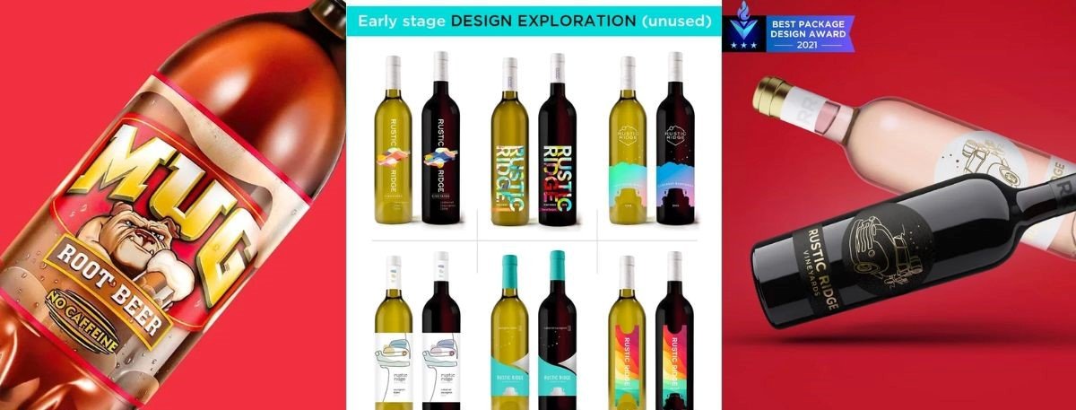
If you want your product to stand out in today's crowded retail market, it takes a lot more than just brewing a great-tasting liquid. A smart beverage label design acts as a secret weapon. It grabs consumer attention, shares your brand's core values, and ultimately drives retail sales. Whether you're launching a refreshing craft soda or a sophisticated spirit, the visual identity wrapped around your bottle is your most powerful marketing tool.
Figuring out how to design a successful beverage label comes down to balancing great aesthetics with real-world functionality. In this guide, we'll cover what makes a label effective, budget-friendly premium strategies, shelf visibility techniques, substrate choices, and real-world case studies to elevate your product.
What Makes Beverage Label Design Effective
A highly successful beverage label design acts as the silent, round-the-clock ambassador for your brand, instantly conveying a deep sense of quality and trust to the consumer. To achieve maximum visual impact, packaging designers must relentlessly focus on core strategic elements that effectively guide the buyer's journey directly from the store shelf to the shopping cart.
Did you know? Consumers take an average of just three to five seconds to evaluate a product on a crowded store shelf before deciding whether to pick it up or walk away.
Information hierarchy- It is absolutely crucial to prioritize essential details such as the brand name, product type, and key selling points so consumers can digest them at a glance.
Target audience alignment- You must meticulously tailor your overarching visuals, color palettes, and typographic choices to directly resonate with the specific demographic you intend to reach.
Clear brand messaging- It is imperative to ensure your unique value proposition is instantly understandable without causing any unnecessary friction for the hurried retail buyer.
Shelf appeal and differentiation- Brands must utilize distinct, calculated visual cues that effectively separate your product from adjacent competitors on highly crowded retail shelves.
How to Make a Beverage Label Look Premium on a Budget
Achieving a luxurious, high-end aesthetic does not strictly require utilizing the most expensive printing production techniques available. Strategic design choices can beautifully simulate luxury, providing cost-effective premium beverage packaging that appeals heavily to sophisticated buyers. Proving this financial concept, California Quiver's CQ Mixer successfully targeted a high-end, sophisticated audience with a smart, cost-effective design that maximized profit margins.
Strategic use of negative space- Implementing clean, minimalist layouts naturally conveys a supreme sense of luxury and quiet confidence, allowing your primary logo plenty of room to breathe.
Typography size- Utilizing elegant, highly customized fonts can drastically elevate the perceived value of your drink label design without adding a single cent to your commercial printing costs.
Faux metallic finishes- Clever, calculated use of specific CMYK color builds can surprisingly mimic the lavish look of expensive metallic foils without incurring the hefty setup fees.
High-contrast palettes- Utilizing rich, deep background colors against stark, bright text instantly creates a highly premium, moody feel that easily commands instant visual authority.
Matte over gloss- Opting for a standard, smooth matte varnish instead of a highly reflective gloss finish often gives bottled products a much more refined, artisanal appearance.
Shelf Visibility - Color, Contrast & Standing Out in the Cooler Door
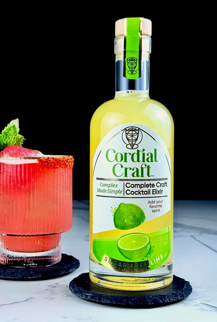
Winning the daily battle at the congested cooler door requires a thorough understanding of the best strategies for drink label visibility. Shoppers view these chilled products through glass doors, dealing with harsh glare and heavy condensation, meaning mastering how to make beverage labels stand out on shelves is essential to continuous sales growth.
High color contrast- It is vital to use bold, complementary colors that pop vibrantly against the actual liquid inside the transparent bottle or the raw aluminum of the can.
Bold, readable typography- You must meticulously ensure that the overarching brand name and the primary flavor identifier are fully legible from at least a few feet away.
Distinctive shape or layout- Brands should confidently break away from standard horizontal text layouts by creatively utilizing striking diagonals, custom die-cut borders, or unexpected vertical orientations.
Consistent brand blocking- When displaying multiple flavors, rigidly use a unified layout structure so your brand effectively creates a massive, continuous billboard effect when lined up together.
Optimal shelf visibility packaging- You should specifically choose highly vibrant, light-catching inks that boldly maintain their sheer brilliance even under the washing-out effects of fluorescent store lighting.
Navigating TTB Labeling Regulations
Compliance is unequivocally just as critical as visual aesthetics when safely bringing a brand new alcoholic or specialized drink to the commercial market. Failing to strictly adhere to mandatory government guidelines can result in severely costly delays, making it utterly crucial to integrate legal requirements directly into the early design process.
Mandatory warnings- Designers must carefully ensure the standard government health warning is placed correctly and strictly meets all minimum font size requirements based entirely on the specific container volume.
Alcohol by volume (ABV)- It is a strict requirement to clearly and accurately state the ABV on the front panel according to specific TTB labeling regulations tailored to your exact product classification.
Net contents declaration- You must accurately and prominently display the fluid ounces and their exact metric equivalents in high-contrast text on the primary display panel to avoid federal rejection.
Class and type designation- The packaging must unambiguously identify whether the enclosed product is officially classified as a beer, malt beverage, wine, or distilled spirit to protect consumers.
Materials & Finishes
Selecting the right physical printing substrate is vital for both the premium appearance and the long-term survival of your beverage label design. For a much more comprehensive breakdown on this highly technical topic, be sure to check our detailed beverage label printing materials and compliance guide.
Moisture-resistant materials- You must consistently utilize durable BOPP (biaxially oriented polypropylene) or high-grade vinyl- which are the best materials for refrigerated beverage labels- to ensure the artwork does not prematurely peel.
Tactile varnishes- We highly recommend incorporating raised spot UV treatments or gritty, textured varnishes to actively encourage passing consumers to touch and interact with the bottle physically.
Sustainable substrates- Brands should seriously consider opting for post-consumer recycled papers or innovative biodegradable materials to strongly appeal to the rapidly growing demographic of eco-conscious retail shoppers.
Temperature-grade adhesives- It is strictly critical to clearly specify industrial adhesives designed for extreme cold-fill or hot-fill manufacturing processes so the substrate adheres perfectly during the initial bottling run.
Beer Label Design as a Case Study
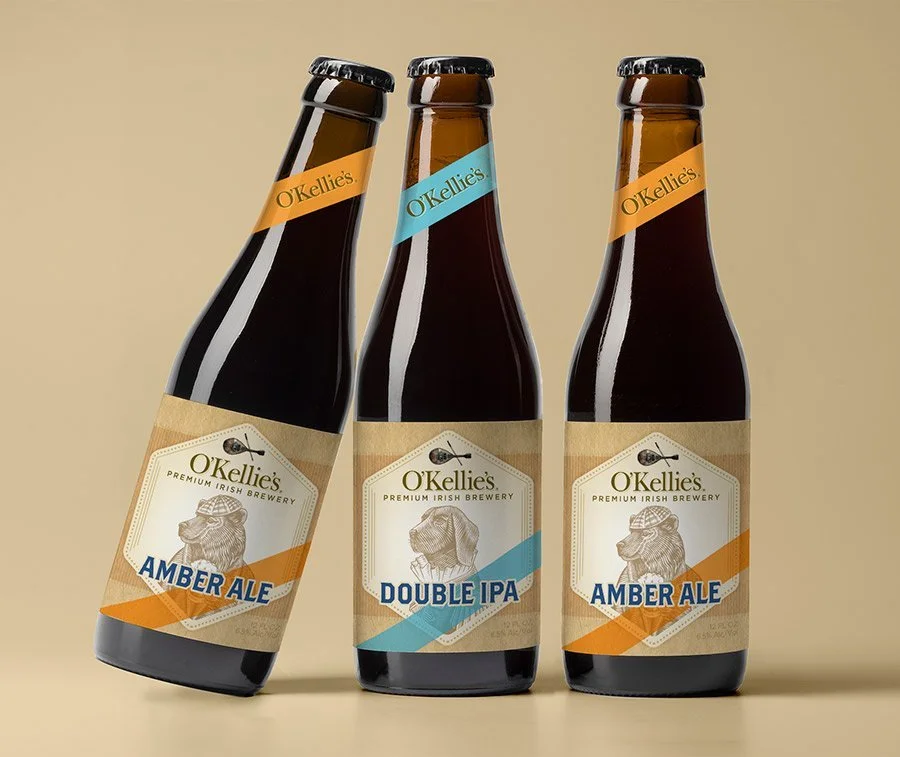
The modern craft beer industry is notorious for its incredibly fierce visual competition, making it the perfect arena to analyze highly impactful, disruptive design deeply. For even deeper insights into this booming market, explore why beer label design drives craft beer sales, though these design principles easily apply across all liquid categories.
Narrative-driven illustration- The most wildly successful craft breweries consistently use highly intricate, narrative-based artwork to connect on a deeply emotional level with their passionate, dedicated fanbase.
Striking brand characters- Developing a memorable mascot or a recurring visual theme helps effortlessly build instant, undeniable brand recognition across various seasonal and limited-edition releases.
Case Study ROI- The California Quivers beverage label case study exemplifies how targeted packaging succeeds. Aimed at a sophisticated high-end hotel clientele, CQ Mixer cleanly separated itself from competitors, resulting in a massive, measurable sales lift within its very first year.
Non-alcoholic adaptation- The Miller Premiere non-alcoholic beer label case study brilliantly shows how strictly maintaining premium visual cues ensures that alcohol-free alternatives look just as incredibly appealing as their traditional counterparts.
Consistent typography- While the background artwork may change wildly between different experimental flavor profiles, firmly anchoring the overall design with highly consistent logo placement ensures long-term brand cohesion.
Key Takeaways
Effective packaging strictly prioritizes an intuitive information hierarchy and entirely clear brand messaging.
Simulating luxury through intentional negative space and bespoke typography saves substantial production money.
Dominating shelf visibility relies heavily on stark color contrast and bold, immediately readable text.
Always mandate moisture-resistant substrates and industrial cold-temperature adhesives to survive harsh refrigeration.
Strategic, audience-targeted beverage label design ideas directly correlate with massive, measurable increases in your retail sales.
Final Words
In an incredibly saturated retail market, your product's exterior presentation is undeniably just as important as the delicious liquid contained inside. By intelligently applying these best practices, you can successfully transform a completely simple bottle or standard can into an absolutely irresistible purchase for the consumer. Whether you are actively optimizing for maximum visibility at the cooler door, carefully navigating strict government compliance, or aiming for a luxurious, premium aesthetic on a tight budget, your strategic visual choices are the ultimate key to achieving long-term commercial success. For significantly more comprehensive insights into this industry, please review our complete beverage packaging design guide.
Always remember, investing in highly professional, data-driven beverage label design is never just an expense; it is a direct, measurable investment in your brand's ongoing growth, retail visibility, and bottom-line sales. If you are ready to dominate the shelf and dramatically increase your product's revenue, reach out to the professional team at Lien Design today to start crafting your winning visual identity!
Why You Should Trust the Experts at Lien Design
When actively searching for an expert beverage label design agency to elevate your product, you absolutely need a reliable partner with a proven, documented track record. Lien Design, proudly based in San Diego, California, is a highly specialized, boutique, award-winning branding and package design studio. The agency is expertly led by its founder, Tom H. Lien, a widely recognized art director, best-selling author, and innovative designer with over two decades of robust industry experience.
As your primary point of contact, Tom personally handles about 90% of the creative work, meticulously ensuring a personalized, highly tailored approach to scaling your brand. Drawing on his background working with some of the most decorated design firms in the U.S., Tom proudly brings big-agency expertise and pairs it with small-agency customer service. We are fiercely passionate about creating striking, memorable brands that not only look beautiful but are strategically engineered to sell like crazy.
FAQs About Beverage Label Design
What is the cheapest way to make a beverage label look premium?
Utilize generous negative space, elegant custom typography, and high-contrast matte backgrounds. These strategic design choices brilliantly simulate luxury without the need for expensive custom printing finishes or costly metallic foils.
How do I ensure my label survives in a cooler?
Always request fully moisture-resistant materials like BOPP (polypropylene) or high-grade vinyl. Additionally, you must specify cold-temperature adhesives to prevent the substrate from peeling when exposed to heavy condensation.
What is the most important element for shelf visibility?
High color contrast is absolutely the most critical element. Your brand name and primary flavor identifier must pop vibrantly against the liquid's color and remain highly legible under fluorescent lighting.
Do I need a different design for non-alcoholic beverages?
No, non-alcoholic drinks should strictly maintain the exact same premium visual cues and high-quality aesthetics as traditional spirits to successfully appeal to adult consumers seeking sophisticated, zero-proof lifestyle alternatives.
What makes a drink label look premium to consumers?
Consumers instantly associate premium quality with clean, uncluttered layouts, tactile physical finishes like matte varnishes, refined color palettes, and confident typography that clearly communicates the brand's unique origin story.
Why is complying with TTB regulations so critical for labels?
Failing to meet strict government guidelines for health warnings, ABV declarations, and exact net contents can result in severe federal rejections, drastically delaying your product's expensive commercial market launch.