In a busy grocery aisle (or a crowded shopping app), shoppers decide fast. The brands that win attention usually communicate three things instantly: what the product is, why it's different, and whether it fits a buyer's lifestyle. That's exactly where packaging labels for food do the heavy lifting, quietly shaping first impressions and building trust in seconds.
Great labels aren't just pretty- they're purposeful. The best ones balance clarity, compliance, and brand personality so people can understand the product quickly and feel confident picking it up. In this blog, we will discuss what makes these labels stand out, and some top styles that help a food brand get noticed.
What Makes a Food Packaging Label Stand Out?
A standout label has structure. When the layout guides the eye in the right order, shoppers don't work to understand your product, they just get it.
Fast recognition: Clear product name, variant, and key benefit
Credibility: Ingredients, allergens, certifications, and batch/date information that's easy to find
Brand memory: Consistent colors, type, and layout across SKUs
If you're building a system across multiple products, treat the label as part of your overall food packaging design, not a one-off artwork. A strong system scales to new flavors and formats without losing brand recall.
Top Packaging Labels For Foods That Help Brands Get Noticed
1) Minimalist, High-Contrast Labels
Minimal labels work well for premium items because they look confident and modern.
Large product name with generous spacing
One hero color plus a neutral base
Two or three proof points (not a full paragraph of claims)
Did you know: Removing one unnecessary element can improve readability more than changing the font.
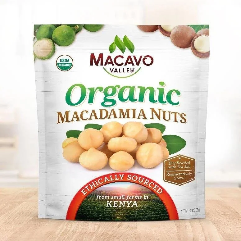
2) Transparent or "Window" Labels
If the product itself looks great (granola, nuts, candies, spices), show it.
Clear film labels or pack windows that highlight texture and freshness
Simple typography so the food becomes the hero
Careful placement to avoid wrinkles around curves and seams
This approach often pairs naturally with healthy food packaging design because it signals simplicity and honesty without needing excessive claims.
Did you know: Consumers often interpret "visible ingredients" as "less processed," even when the recipe is the same.
3) Kraft-Paper & Natural-Texture Labels
Textured substrates create an artisan cue quickly.
Kraft, matte, or uncoated finishes for warmth
Earthy palettes and hand-drawn illustration styles
High-contrast printing so important text remains readable
Did you know: Uncoated papers feel premium to touch, but they can smudge if the ink and finish aren't chosen carefully.
4) Metallic Accents & Spot Finishes
Premium finishes can make a pack feel gift-worthy, if used selectively.
• Foil accents on logo or one key callout
• Emboss/deboss for tactile recall
• Spot UV to highlight a single design element
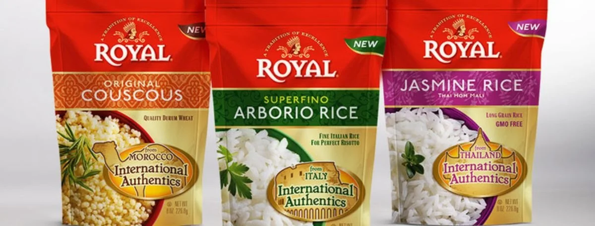
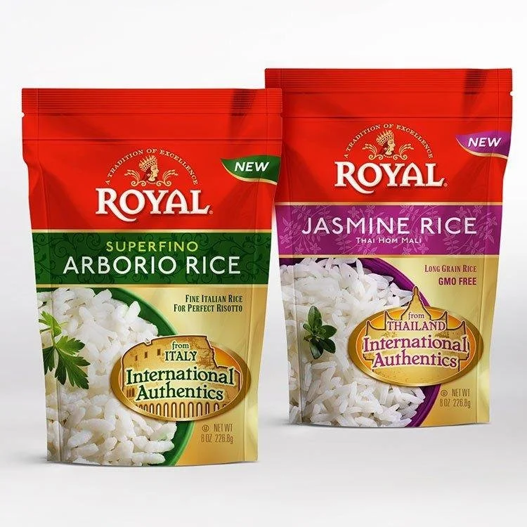
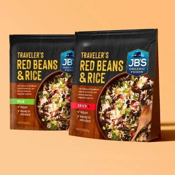
5) Color-Coded Variants for Quick Browsing
If you sell multiple flavors, color systems reduce decision fatigue and speed up selection.
Same layout across all products
One dominant color per flavor/variant
Stable "brand block" so your range looks unified
This is a reliable method in food packaging labels because it supports both in-store browsing and online filtering.
6) Peel-Back or Multi-Layer Labels For Info-Heavy Products
Some products need room: nutrition tables, detailed instructions, bilingual copy, or export requirements.
Top layer: brand, product, and primary benefit
Inner layer: ingredients, allergens, nutrition, storage, QR content
Cleaner front panel with less clutter
Did you know: If buyers can't read your ingredients easily, many won't buy- especially for health-led categories.
7) Tamper-Evident Seals That Look Intentional
Security can be part of design, not a last-minute add-on.
Neck bands, seal labels, or breakable films
Simple wording like "Sealed for freshness"
Matching colors so it feels brand-consistent
8) Smart Labels with QR Codes
QR works best when it answers a real question.
Link to recipes, sourcing info, or batch traceability
Add a short prompt (what the scan provides)
Keep the landing page fast and mobile-friendly
Did you know: QR codes perform better when placed near a benefit, not buried near mandatory text.
9) Illustration-Led Labels for Distinctive Storytelling
Custom illustration can separate you from "template" design quickly.
Ingredient icons that feel ownable
A consistent illustration style across SKUs
Controlled detail so it remains legible at small sizes
Did you know: A recognizable illustration style can become a brand asset as strong as a logo.
Key Takeaways
Instant Clarity Wins: Effective food packaging labels communicate product name, variant, and one core benefit at a glance.
Design with Purpose: Standout labels balance visual appeal, regulatory compliance, and brand consistency rather than relying on decoration.
Material & Finish Matter: Label substrates, textures, and finishes directly influence perceived quality, durability, and consumer trust.
Systems Beat One-Offs: Color-coded variants, consistent layouts, and scalable design systems improve recognition across multiple SKUs.
Test Before You Scale: Real-world print and application testing ensures legibility, durability, and shelf impact that screens can't predict.
Checklist: How to Choose the Right Food Packaging Design?
Use this process to design or refresh packaging labels for food without losing clarity.
Define where the product is bought: shelf, online, or both
List the top 3 buyer triggers: taste, health, origin, convenience, price, or dietary fit
Set front-panel hierarchy: product name first, variant second, one core benefit third
Pick materials based on reality: moisture, oil, heat, cold chain, and handling
Lock typography rules: minimum sizes, strong contrast, avoid thin fonts on busy backgrounds
Build a variant system: color, icon, or pattern rules that scale across the range
Confirm compliance early: allergens, net quantity, dates, manufacturer info, required declarations
Prototype: print, apply to real packs, and check under store lighting
Stress-test legibility: view at 1–2 meters, then on a phone screen
Iterate once: improve clarity before adding more decorative elements
Did you know: Most label "problems" show up only after a real print-and-apply test, not on screen.
Trust Factors: Clarity, Compliance & Durability
Design can't compensate for confusion or poor print performance. Strong packaging design makes the required information easy to find and easy to read, while the label material holds up to storage conditions.
Prioritize:
Allergen visibility with consistent placement
Date/batch printing that resists smudging and rubbing
Claim discipline so "high protein" or "no added sugar" is supportable
Contact/origin details to reinforce credibility
Did you know: Calm layouts often outperform "busy health" designs because they feel more trustworthy.
Final Words
Even with the best ingredients and food products, there is always a possibility of a situation where your products are not receiving adequate attention in the market. Careful planning of a packaging label of food products can prevent this. Nevertheless, the problem is that when there are so many kinds of labels to select from, it is not always easy to select the correct one to promote your product. It is at this point that a professional label designer can assist you in making the correct decision and also guarantee that your brand receives as much exposure in the market as possible.
If you are looking for an experienced label designer, check out Lien Design for all your needs.
FAQs
What makes packaging labels for food stand out the fastest?
Clear hierarchy: product name, variant, and one key benefit that's readable at a glance.
How many claims should go on the front of food packaging labels?
Usually 1–3 strong proof points; more than that can look cluttered and reduce trust.
What's the simplest way to upgrade healthy food packaging design?
Use cleaner spacing, higher contrast, and consistent brand elements across every SKU.
Are QR codes worth adding to food packaging design?
Yes, if they lead to something useful like recipes, sourcing, or batch details, otherwise they add noise.
What should I test before printing labels at scale?
Real printed samples on real packs: legibility, smudge resistance, moisture handling, and shelf visibility.