
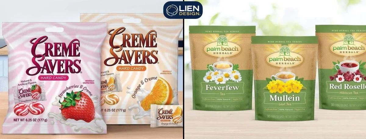
Picture this. You are scrolling through your phone on a Tuesday. You probably see a dozen computer-generated images before breakfast. Anyone can type a quick prompt and spit out a colorful picture in ten seconds. But making a pretty picture for a screen is wildly different from building a file that actually prints correctly on a physical box. Professional graphic design takes real strategy. Algorithms just guess. They scrape the internet and mash random things together. They do not understand how to build real trust with a human buyer.
When someone picks up your product in a store, they instantly judge its quality. A weird, robotic-looking label breaks that trust immediately. The thing is, sacrificing your brand's credibility just to save a few bucks on automated art is a massive mistake. This blog covers exactly how to tell the difference between fake and authentic artwork, common algorithm mistakes, print production realities, and the exact elements that separate cheap visuals from premium packaging.
The Strategic Value of Authentic Graphic Design
Most people think design just means making things look nice. It doesn't. Real graphic design is pure visual communication that guides the human eye exactly where you want it to go. Algorithms fail hard at this because they just create messy clutter, whereas a real designer actually understands visual hierarchy and pacing.
Increases Reading Comprehension – Strategic empty space enables the eye to relax- and assimilate your main content without becoming totally overloaded.
Eliminates Visual Fatigue – Fake, algorithm-generated art always feels excessively busy when you look at it. Computers have a tremendous difficulty with restraint- they just don't know when to stop adding stuff. Every corner is loaded with odd gradients, artificial shadows, random textures, and it generates rapid visual fatigue that makes viewers just look away.
Protects Brand Consistency – Real graphic design requires tight brand consistency, which means you need your exact brand colours and certain fonts. Every time you push Enter- a computer creates a brand-new, random visual design. Your real brand personality is gone when you need a consistent look to survive out there.
Did you know? Utilizing negative space properly across your packaging design actually increases a consumer's overall reading comprehension by up to twenty percent, allowing them to absorb your core message instantly.
The Ultimate Guide on How to Spot AI Graphic Design
Spotting fake art is actually really easy once you know the basics. Your brain usually catches the mistake before you even realize it. That weird, unsettling feeling actively costs you sales.
Here is exactly what gives a computer-generated image away in seconds-
Zero White Space - Computers hate empty space. They fill every single gap with random decorative junk. If your eye has nowhere to rest naturally, the image is probably fake.
Font Chaos - Algorithms do not understand how humans read. They mix bold, script, and modern fonts right next to each other. They all fight for attention at the exact same time.
Melted Details - Zoom in on the picture. Look closely at the edges of things. You almost always find warped lines, fused objects, or massive AI text rendering mistakes.
Fake Words - The computer does not actually read English. It just draws shapes that look like human letters. You end up with words that look like "Grand Opening" from a distance but read like pure gibberish up close.
Clashing Styles - You might see a hyper-realistic 3D object sitting right next to a flat cartoon icon. A human picks one style and sticks to it. A computer just glues totally different worlds together.
Why Automated AI Flyers Constantly Fail
A digital promo gets scrolled past in about two seconds flat. You need total clarity to make an impact. But when brands rely on automated AI flyers, they usually just get a messy blur of bright colors. The layout is totally chaotic. The core message completely disappears into the background.
The thing is, a flyer is not a full website. It does not need five different slogans and three huge paragraphs of text. It needs an event name, a date, and a clear call to action.
Here’s why these computer-generated promotions tank your sales-
They lack a single focal point to grab attention.
The text is usually flattened directly into the image, making quick edits literally impossible.
The layouts completely ignore how things look on a small mobile screen.
They suffer from obvious generative AI flyer design errors that confuse the reader.
When you pack too much stuff into tiny text, people just keep scrolling. Nobody wants to squint to figure out what you are selling. You need a human to strip out the junk and focus strictly on the hook.
The Hard Truth About Packaging Structural Design
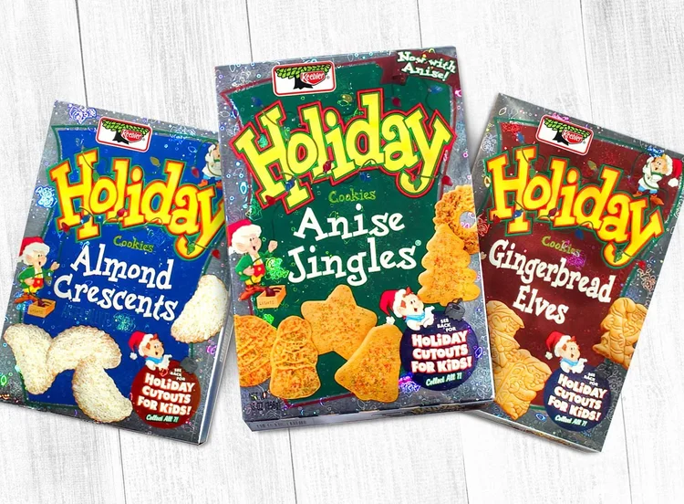
Digital design is incredibly forgiving. Physical print is ruthless. A digital mistake gets deleted with one click. A print mistake sits on a grocery store shelf for a month and completely destroys your brand reputation.
Computers suffer from total structural blindness. They view a package as a flat, endless canvas. They do not understand that a real box has folds. They do not know what a heat seal area is. They ignore barcode scanning zones entirely. This is the brutal reality of packaging structural design.
When you try to print computer-generated art directly, you run straight into CMYK print conversion failures. Screens use glowing RGB light. Printing presses use CMYK ink. When you convert a fake neon blue to physical ink, it turns into a muddy, depressing purple. You cannot just send a fake JPEG to a commercial printer. It will fail spectacularly.
Step-by-Step Checklist for Production-Ready Files
Before any artwork hits a real printing press, a human has to step in. Follow this checklist to make sure your packaging actually works in the real world-
Convert to Vector Format - Rebuild all critical logos and fonts into scalable vector files. Standard pixel images will print incredibly blurry.
Verify Color Mixes - Convert all colors to CMYK. Assign specific Pantone spot colors for your crucial brand assets so they pop under store lights.
Check the Die-Line - Map the artwork perfectly onto the physical fold template. Make sure no text falls over a fold or a glued seam.
Confirm Legal Rules - Manually verify that net weights, ingredient lists, and barcodes meet strict industry laws.
Run a Physical Proof - Print a small-batch test on the actual material. Check the colors under real store lighting before buying ten thousand boxes.
Building Real Trust with a Professional Partner
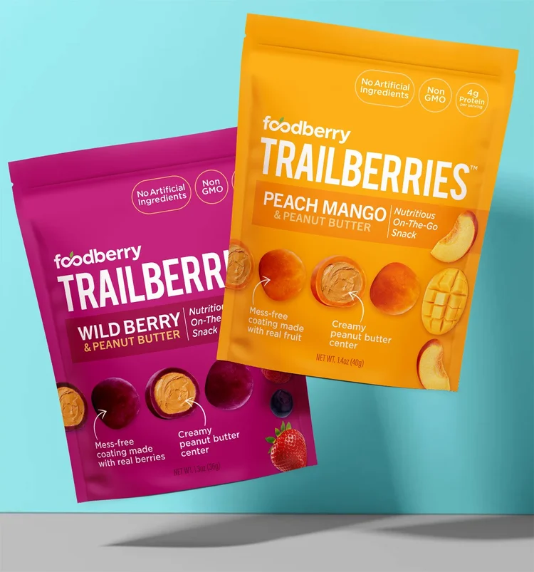
Speed is great. But sacrificing your reputation for a fast image is never worth it. You need a visual look that actually scales. If your artwork only exists as a flat, uneditable picture file, you have a huge structural problem.
Partner with a real packaging design agency to ensure your brand looks good everywhere. Your design needs to be entirely consistent, from a small social media post to a huge trade show banner. This is precisely how you develop human-made brand credibility.
Professionals know how to balance art with the strict science of physical retail shelves. They make files that will resist the severe commercial printing process. They make your physical product attractive and indicate it deserves a high price tag.
Key Takeaways
Strategic empty space is crucial so people can actually read your message.
Mismatched fonts and melted edges instantly expose fake, automated artwork.
Computer-generated promo materials usually lack a clear focal point.
Algorithms completely ignore the physical realities of boxes, seams, and folds.
Screen colors must be carefully converted to printer ink to avoid muddy, dark results.
Final Words
Navigating the modern retail world takes absolute precision. Buyers are hyper-aware of cheap, fake-looking art today. You cannot afford to let a computer guess at your brand's physical presence. Real graphic design is about deep strategy, flawless print execution, and building genuine human connection. Relying on automated shortcuts just hands your hard-earned money straight to your competitors.
When you are ready to build packaging and promotional materials that actually dominate the shelf, the expert team at Lien Design delivers the premium, production-ready artwork required to elevate your brand and drive real sales.
FAQs about Graphics Design
How do you recognize AI graphic design?
Look for a total lack of white space, mismatched fonts fighting for attention, and weird uncanny details. Melted edges and alien-looking text are massive giveaways of fake artwork.
Why is AI bad for physical packaging?
Computers do not understand structural limits like folds, heat seals, or die-lines. They also generate files that often turn muddy and dull when converted to ink for commercial printing.
Can AI create print-ready marketing flyers?
No. Automated flyers usually lack visual hierarchy and cram too much text into messy layouts. A human must always edit, reduce clutter, and rebuild the text properly.
What is the biggest mistake in synthetic design?
The biggest mistake is the total lack of restraint. Computers fill every single pixel with unnecessary details, leaving absolutely no empty space for the human eye to rest.
Why hire a professional packaging agency?
Professionals ensure exact brand consistency, legal compliance, and flawless print production. They turn concepts into structurally sound packaging that grabs attention and actually drives sales.