
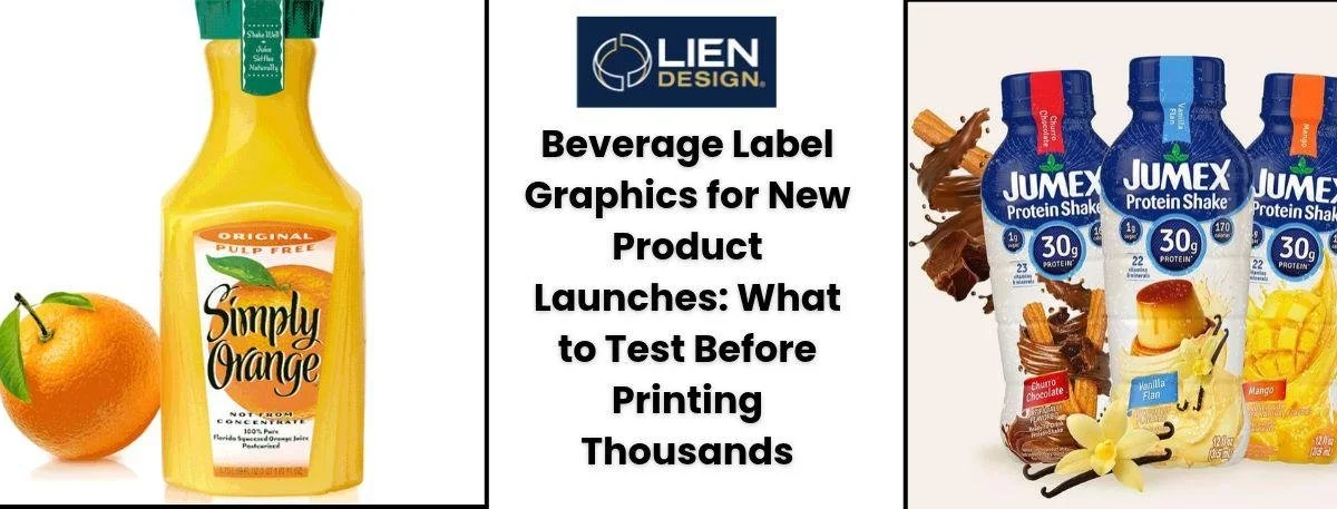
Picture this. You are sweating in line at a convenience store and grabbing a cold drink from the fridge simply because the frosted bottle and minimalist text looked cool. You did not even read the flavor first. That split-second human decision is exactly why getting your beverage label graphics right before hitting print is a massive deal. Launching a drink costs a fortune. And honestly the best tasting liquid will just collect dust if the packaging falls flat.
Physical printing behaves completely differently than a bright digital mockup on a computer screen. The visual layout has to survive material quirks, mechanical design rules and heavy retail environments. Rushing this process leads to devastating financial losses. The thing is, an amazing concept means absolutely nothing if the physical execution fails. This blog will cover exactly what needs testing before paying for a massive print run today.
Why Beverage Label Graphics Actually Drive Sales
It is never just about looking pretty. It is about reducing financial risk and proving market viability. When someone walks down a busy grocery aisle, a product has maybe three seconds to grab their attention.
Did you know? Nearly seventy percent of people make their buying choices right at the store shelf, making your physical packaging the most powerful sales tool you actually have.
Here’s why testing the artwork matters:
Products have to visually contrast with the heavy hitters dominating the category.
Shoppers need to understand what the drink is without thinking too hard.
Colors and fonts have to match the company identity perfectly across every flavor.
Premium-looking artwork is the only way to justify a higher price point.
The retail environment is totally chaotic, and lighting changes wildly from harsh aisles to dark corner fridges. Evaluating the artwork in a simulated store space ensures the design does not disappear in the shadows. Setting up shelf impact testing gives real data on how fast people find the product compared to the competition.
Surviving The Cooler with Smart Beer Label Design
The brewing space is incredibly crowded right now. And the visual identity usually dictates whether someone tries a new brew or sticks to their usual. A functional beer label design has to balance creative art with strict mechanical printing constraints.
Craft breweries often experiment with heavily textured papers. But those porous materials soak up condensation fast. A bottle pulled from a thirty-degree cooler into a hot summer afternoon sweats heavily. If the paper stock lacks a proper wet-strength treatment, it turns to mush in minutes. Plus, the glue backing completely dissolves. You end up with naked bottles sitting in a cooler.
Look at these testing points:
Cold storage means heavy condensation. Standard ink will bubble and peel off when wet.
Glass bottles bump into each other during transit. Scuff-resistant coatings are non-negotiable here.
Foil stamping looks amazing but requires extreme precision during the factory run.
Before ordering a hundred thousand units, always request a physical press proof on the exact material. A digital file cannot simulate how lamination feels in the hand. And it definitely will not show how the sticker glue holds up when plunged into melting ice.
What A Professional Wine Label Designer Really Does
Wine buyers rely heavily on visual clues to guess the quality of the liquid inside. A seasoned wine label designer knows exactly how paper texture, negative space and classic typography directly influence what people buy.
But their job goes way beyond picking nice fonts. They navigate the brutal technical requirements of mass production. The thing is, an experienced professional stops expensive mistakes before they happen. Experts understand color separation limits and custom ink mixtures that actually work on physical paper.
They apply tricks from other industries too. Techniques used in premium juice bottle label design, like using completely clear film, are being adapted for modern vineyards. Plus- the harsh compliance rules found in food label design prepare creators for the aggressive government regulations controlling alcohol packaging.
Testing physical elements under professional watch includes:
Checking paper grain direction so the sticker wraps around curved glass without wrinkling.
Picking the right adhesive based on the bottling temperature.
Setting strict color variance limits before the factory machines start running.
Running predictive visual analytics before printing helps refine these choices by using computer models to guess exactly where a shopper will look first.
The Financial Hit of Skipping Pre-Press Checks
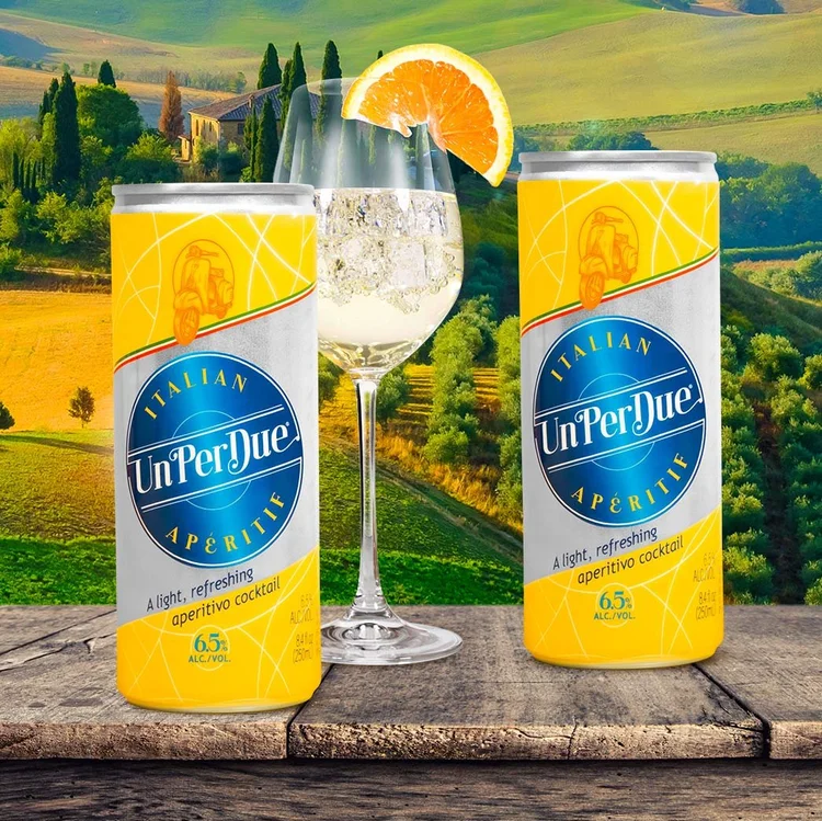
Skipping testing phases feels like a great way to save a few bucks upfront. But the long-term financial hit is massive. A single spelling mistake on the legal nutrition panel makes an entire warehouse of packaging illegal to sell.
Think about the supply chain. If your factory realizes the artwork is completely misaligned after printing fifty thousand units, they stop the line. You still pay for that machine time. And you pay for the wasted paper. Then you have to pay a rush fee to a prepress team to fix the digital files over the weekend. Finally, you pay for expedited shipping to get the fixed materials back to the bottling plant. One tiny oversight easily cascades into a five-figure loss.
Look at the hidden costs of rushing the process:
When badly formatted artwork jams a high-speed factory machine, the facility charges you for wasted time.
Retail chains issue aggressive fines if your barcode fails to scan fast.
Delays in fixing broken beverage label graphics mean the liquid sits around losing its shelf life.
Companies lose thousands throwing away printed materials just because someone forgot to account for the physical curve of the bottle. A tiny taper makes a straight sticker flag out at the corners.
The Step-By-Step Pre-Print Checklist
Rushing this phase is basically asking for a disaster. Follow this sequence to make sure the files are actually ready for the factory.
Print the file at full size on a regular office printer. Cut it out and tape it to your bottle to check for weird overlaps.
Print a test barcode and scan it with a smartphone app. Make sure there is plenty of blank white space around the black lines.
Audit the regulatory text. Measure the government warning font with a ruler to ensure it hits the exact millimeter requirement.
Never approve the mass run using a digital file. Force the printer to mail a physical proof.
Run a brutal environment test. Submerge it in water. Leave it baking in a hot car.
Ask a stranger to read the ingredient list from two feet away. If they lean in, the font contrast is terrible.
Stick the sample to the bottle and wait a full day. Try scraping it off.
Modern machinery allows for cheap short runs. You can easily set up AI-driven A/B label testing by printing two different layouts in very small batches to see what people actually prefer holding.
Dealing With Eco-Friendly Limitations
Buyers want green packaging today. But sustainable materials cause massive headaches for printing machines. Recycled papers soak up ink like a sponge- which makes small text look blurry.
Testing eco materials always requires:
Confirming that water-based inks stick to plant-based plastic films.
Making sure the sticky adhesive does not ruin the recycling process later.
Subjecting green options to the exact same friction tests as heavy-duty plastics.
If a brand wants to go green, they budget extra weeks just for material testing. A beautiful design means nothing if the printed graphics fall apart in a delivery truck. Using algorithmic design optimization helps adjust the digital file automatically to compensate for how much ink bleeds on cheap recycled paper.
Typography Legibility Across Different Distances
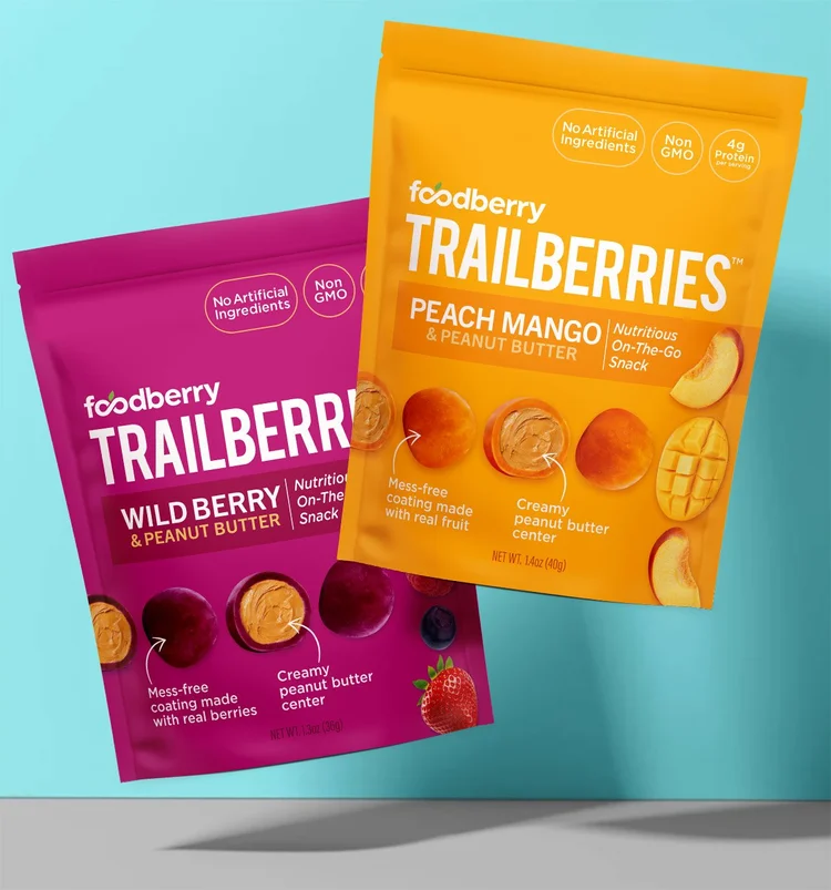
Words on a bottle do two things. They show off the brand personality, and they deliver legal information. Yet a ton of designs fail the basic distance test.
Legibility also changes based on the ink color and background contrast. Printing dark blue text on a black background looks sophisticated on a bright computer monitor. But put that physical bottle in a dimly lit dive bar or a corner bodega fridge. The text completely vanishes. You have to force artificial contrast into the physical design to compensate for terrible real-world lighting.
Look at the three reading zones:
The aisle view is five feet away. The logo and flavor must be instantly obvious.
The arm length view. Supporting details and selling points come into focus here.
The close-up view. Ingredients and legal warnings get parsed when holding it.
Place the physical mockups on a bookshelf and walk backward. If the main selling point vanishes at three feet, the font hierarchy is totally broken. Plugging layouts into consumer neuroscience in packaging software can fix this fast.
Key Takeaways
Always test paper mockups on the physical glass to check for awkward wrinkling.
Demand physical press proofs on the real material instead of trusting a computer screen.
Subject the packaging to brutal heat and water tests before approving the mass run.
Measure all warning text manually to avoid aggressive government fines.
Check how the colors look under cheap retail store lighting instead of just natural sunlight.
Ready to Print the Right Way?
Bringing a new drink into the world is incredibly stressful. Skipping the boring testing phases just leads to wasted money, legal fines and terrible sales numbers. Testing the environment limits material reactions and ink accuracy, ensuring the final product looks exactly how you imagined it. The main goal is making sure those beverage label graphics demand attention and move units the second they hit the supermarket.
Do not gamble a massive print budget on a digital file. Work with people who actually understand the brutal mechanics of factory printing and material science. Reach out to the design professionals at Lien Design today to ensure the next product launch is technically flawless and ready to sell out.
FAQs About Beverage Label Graphics
What is hard proof in printing?
A hard proof is a physical printed sample on the final production material that lets you check actual color accuracy and texture before spending money on the mass run.
How does condensation destroy packaging?
Extreme temperature shifts cause cheap ink to bleed and standard paper to disintegrate completely. You need specialized moisture-resistant materials if your product sits in a cold fridge.
Why does barcode placement matter so much?
Bad placement or tight crowding stops standard retail laser scanners from reading the code. This causes massive checkout delays, and stores might literally refuse to stock the product.
Is a professional designer actually necessary?
Yes. Professionals understand strict mechanical limits like color separation, dieline creation and legal compliance, which stops you from making extremely expensive manufacturing mistakes.
What does a dieline actually do?
A dieline is the digital blueprint file that tells factory machines exactly where to cut, fold and glue the flat paper so it perfectly wraps your physical bottle.